4

I am software developer that has a job to create database for storing contracts.

Contracts have annexes and construction reports ( I don't know how to translate this better, English is not my native ). Both contract and annex can have none or only one Payment report.

Annexes and construction reports are optional, and if contract does have them, their number is unknown. User should be able to add them by filling out their corresponding data and then hitting Add button, for example.

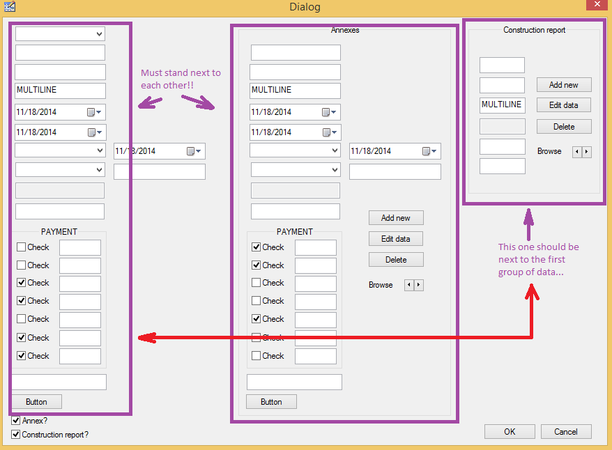
To make things even worse, data about contract and annexes should stand next to each other, because user needs to compare all of their entered values.

Data about construction reports should be a part of the contract data.

Here is a quick illustration of what I have described above:
enter image description here

In the image above, I have added every control that exists in the project, except labels that describe the purpose of the text fields and other controls. Some of the text boxes ( edit controls ) are multiline, meaning user will 100% enter large text. In the image, they have been pointed out by text MULTILINE, in their box.

EDIT:

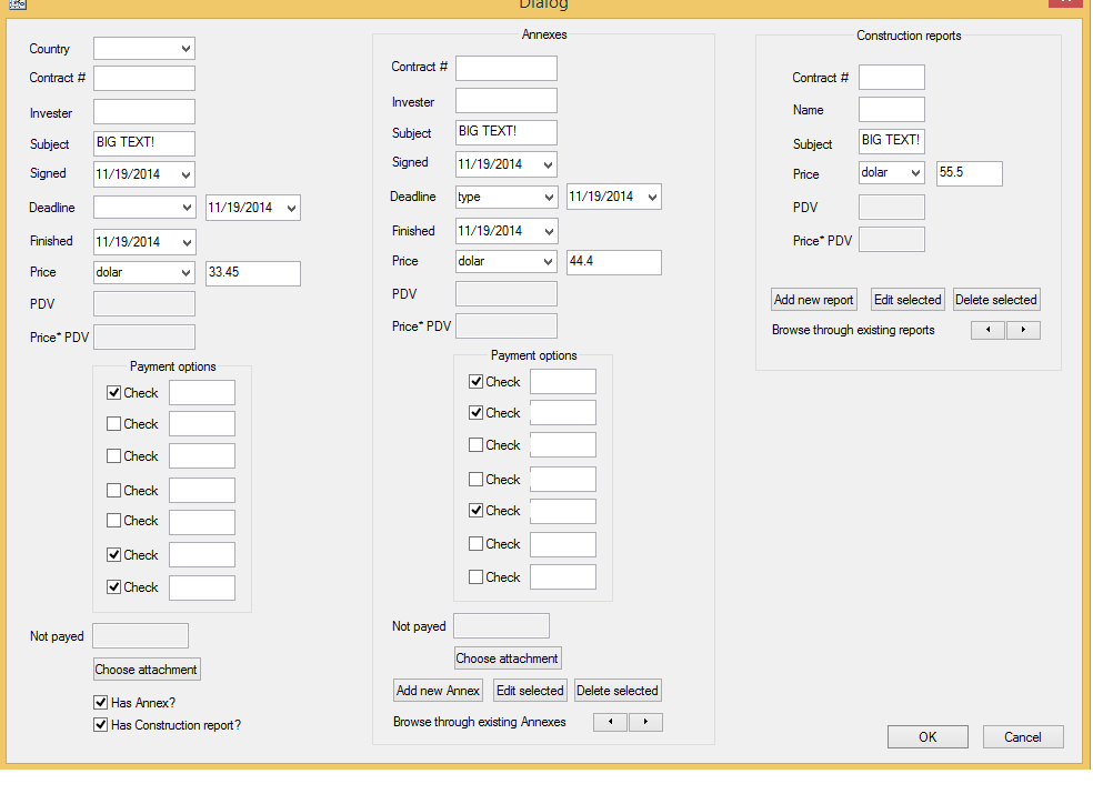
Below is the image with added description of every field. Hopefully this will make things easier.
enter image description here

QUESTION:

How can my mockup from above be properly redesigned to meet the requirements described earlier?

Thank you. Best regards.

3 Answers 3

6

Why does your boss need to compare the two forms? Think about what your user is doing, not what your user is saying. In other words, try to look for the deeper "story" your boss is telling you about how she wants to use the software, and try to provide that, even if it doesn't look like what she describes.

Is it because the Annex is mostly identical to the original contract, but a few fields need to be changed? If so, add a button that offers to "pre-fill" the Annex with the entered values of the original contract (even if the original contract is on a different page/tab).

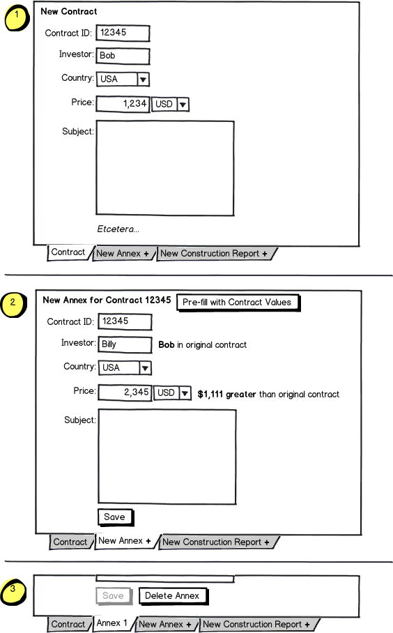
Do they want to compare the values to the originals? If so, you can provide a "real time" label after each box in the form (like the password strength indicators on a lot of websites) that says "This is $3,456.45 greater than the original contract". For example:

mockup

download bmml source – Wireframes created with Balsamiq Mockups

This prevents you from having to show two duplicate forms side by side.

If you can tease this out, you can design a better layout using the suggestions others have given and deliver software that's even easier and more intuitive to use than your boss originally imagined.

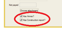
(Also, you can minimize inputs to the form by inferring as many relationships automatically as possible. For example, you don't need the "Has Annex" and "Has Report" checkboxes as separate inputs- they can be inferred by if the user has added either:

Redundant checks

If your user has already added annexes and/or reports to the contract, they shouldn't also have to check a box indicating that as well.)


Putting it all together (and you should definitely consider the advice given in the other answers when designing your form), I would recommend something like this:

mockup

download bmml source

At any time, the user can see/browse the annexes/reports that are associated with the contract (so there's no need for checkboxes indicating whether they exist or not, or navigational buttons). After filling out the main contract (1), they add a new annex by clicking the "New annex" tab, which is a blank annex form (2), but this form can be automatically filled in with the values of the original contract, and the values they enter are compared with the original values as they change them (whatever makes sense for each field). When they click save (3), that tab becomes the new Annex and can be edited or deleted.

9
  • Thank you for helping. I am not native English speaker so I have a problem understanding the following part: (Also, you can minimize inputs to the form by inferring as many relationships automatically as possible. For example, you don't need the "Has Annex" and "Has Report" checkboxes as separate inputs- they can be inferred by if the user has added either.) Another thing: Do they want to compare the values to the originals? I think you are on the right track with this but am not 100% sure ( I talked to her only once ). See the next comment: Commented Nov 20, 2014 at 3:16
  • Continuing from above: I have never seen "real time" label. Can you offer some "examples" that demonstrate waht you suggest in your answer? If that is not too much asking of course... Thanks again. Commented Nov 20, 2014 at 3:18
  • I've edited my original post. Please let me know if you need additional clarification.
    – J. Dimeo
    Commented Nov 21, 2014 at 19:50
  • I really like the idea with the labels next to textbox. I think it will solve my problem of saving space. As for "inferring part" of your post: middle and right group of controls should be initially disabled, and only when user checks those checkboxes at the bottom should application enable entry. This, however can be better solved with tab control and usage of labels ( the way you suggested ). My only problem now is to design the mechanics for entering multiple Annexes and Construction reports. My design with 3 buttons + arrows makes my programming task difficult. Can you help me? Commented Nov 21, 2014 at 20:21
  • 1
    Changed my mind, I will officially accept anyway... :) Thanks so much for helping! Best regards until next time! Commented Nov 23, 2014 at 23:54
4

I have a personal rule that no single form should contain more than ~20 visible form fields because after that threshold the screen just becomes unusable.

The solution to this problem will change depending on your client's actual needs.

e.g. If there is a workflow where a user can create a contract (by itself first) I would have that as a simple form. Upon saving the contract I'd provide a "read-only" (no form field) view of that contract, with the option to add annexes and construction reports.

My assumption is that realistically you have the following business objects/relationships:

Contract - 1:N - Annex
Contract - 1:N - Construction Report

That said, if the client does need a way to see/browse a contract and it's related annex/construction reports I would do my best to only show 1 of each (annex/report) at a time and observe the following "rules":

  1. If a field does not need to be shown (when comparing) hide it
  2. If a field does need to be shown but can't be edited show it as plain text not a form field
  3. Size the form controls as best as possible to the data (e.g. if your dates do not have time, shrink them
  4. Try to group "dates" together in vertical alignment in chronological order
  5. If the "Browse < >" bit flips between annexes/reports - I would consider this a "high level" navigation and move it to be more obvious it isn't just a field within each "sub form"

Beyond all this, it is always highly subjective. Without having more info on what all the labels are and how this application would actually be used it is difficult to give concrete advice.

1
  • I have added another image that uses labels to describe the control's function. Commented Nov 19, 2014 at 4:54
2

In your case i would split up the whole input form in a wizard-like step by step input area. When looking at your layout it appears that you already started grouping the input fields with boxes. Consider that names of countries, persons and so on could be much longer than the input fields, so give them the space they need to properly display their entered value. Did you considered smaller screen sizes? how does this dialog look like on 1024 width (or 800px)?

I would recommend a process widget, which allows the user to get through the whole form step-by-step. So the user can focus on the currently needed input fields and is not overwhelmed by this huge amount of possible input fields (and possible wrong entries).

For inspiration have a look at: The effect of showing “wizard” style steps in a multistep process

I hope this helps :)

1
  • Unfortunately, my boss wants to have first two sets of controls next to each other so she can compare entered values. This is actually the problem. Otherwise, I would put everything in a tab control and be done with it. All that I can think of is to create 2 separate child modeless dialog boxes for Annexes and Construction reports, so user can place them next to each other... Commented Nov 19, 2014 at 15:56

Your Answer

By clicking “Post Your Answer”, you agree to our terms of service and acknowledge you have read our privacy policy.

Not the answer you're looking for? Browse other questions tagged or ask your own question.