63

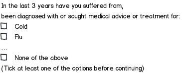
I am working on a series of complex life insurance forms and trying to optimize using standard conventions...

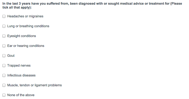
I have this nasty list of medical diseases and a mutually exclusive option, "None of the above".

In the case where the user does not have any conditions, the client requires users to explicitly state this for legal reasons.

Any advice?

enter image description here

13
  • 7
    What about just having the checkboxes function as normal, but add a bit of javascript that makes the "None of the above" checkbox also clear any other already-checked boxes?
    – dennislees
    Commented Nov 13, 2014 at 0:47
  • 1
    Why wouldn't it be? YouIf the user clicks just clicks on 'None of the above' the form behaves exactly as expected. If they click a few other options, and then click 'None of the above' they'll either notice you've foolproofed the form or not : ) You're essentially building in a form of validation, so don't worry about the UI police pulling you up for non-conventionalism. I'll add this as an answer.
    – dennislees
    Commented Nov 13, 2014 at 2:47
  • 13
    I would not clear out checkboxes under the nose of the user. That might annoy them when they click it by mistake. Simply grey out the 'None of the above' checkbox when any of the others is selected. Then require users to select at least 1 checkbox before they can continue. They can still select 'None of the above' if applicable.
    – Dorus
    Commented Nov 13, 2014 at 9:35
  • 1
    @Dorus Nice touch on the greying out. But I don't agree re: clearing checkboxes. I don't see the point in complicating things for everyone just because some users 'might' get miffed that we've helped them understand the concept of none. "Hey! I have gout and NOT gout! How dare you clear my checkboxes!" : )
    – dennislees
    Commented Nov 13, 2014 at 14:55
  • 1
    "Hey i have gout and NOT gout. Lets fill that in" ... "Oh that program cleared the gout check box... Oh well, i clicked it before so it should be fine, they know what i clicked".
    – Dorus
    Commented Nov 13, 2014 at 17:29

9 Answers 9

100

The key point

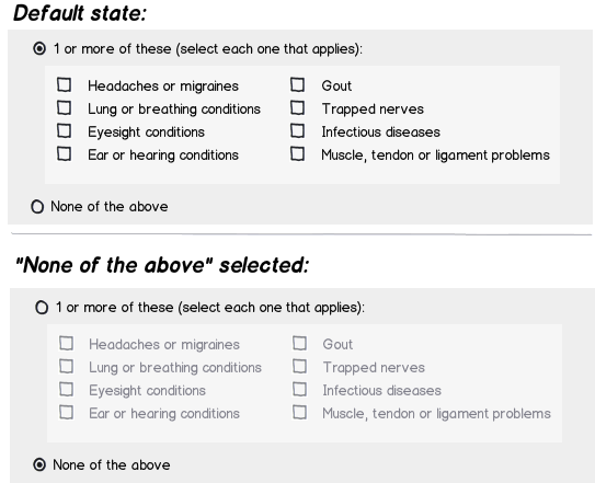
The most important thing to tackle here is making the dichotomy between "None of the above" and any other option as visually explicit as possible.

Option 1

mockup

download bmml source – Wireframes created with Balsamiq Mockups

I think in this case it will be better to set the first radio button as default, because the "explicit" action needed is the 2nd, and setting the first one as default will save 1 click and probably avoid the most of the chances of the "what if the users decides to just click the first radio button?" situation. Btw, IMO that situation would be the same as the user leaving all checkboxes empty (in a design without radio buttons), a later validation will be needed anyway. I think several answers are mainly concentrating in user behavior (based in the presented UI) and losing some attention on questioning the visual design which plays a huge role in the UX changing/inducing users' perception and behavior when using the application.

Option 2 (KISS)

This is a simpler approach, that also makes that differentiation clear:

mockup

download bmml source

Alright, but then why not using this last approach?

Recently I saw this question about accessibility which made me aware of things like contrast levels in inputs. The "simpler" approach will not support that necessity unless you start placing info messages everywhere or assuming that the users understand/is comfortable with the app behavior.

When legal/health stuff is involved, I'd prefer to play defensive, making users select options that precisely states their input, even if it envoles a bit of extra complexity.

As always, I recommend trying these designs with real users, they are the ones that will have the last word on what emerges as the better solution.

18
  • 3
    Default state seems to violate many guides regarding radio buttons. e.g. RFC1866 "At all times, exactly one of the radio buttons in a set is checked.". See also ux.stackexchange.com/questions/37037/… and stackoverflow.com/questions/3457073/… Commented Nov 13, 2014 at 11:22
  • 3
    I see some issues with this design, apart from the one mentioned by above. When you click the 1 or more radio button, but have not (yet) clicked any of the check boxes, you have a strange, inconsistent state. And logically, checking the None radio button should clear any checked boxes, but only with special coding will that be reversible.
    – André
    Commented Nov 13, 2014 at 11:38
  • 19
    @Angelo.Hannes Sorry to say - but the recommendation is idiotic. There are gazillions of examples where the user must make an exclusive choice, but you don't want to provide a default. Perhaps a prime example is likert scales - any default will prime the users. That's exactly why no browser implements the standard.
    – Izhaki
    Commented Nov 13, 2014 at 12:07
  • 2
    @Angelo.Hannes Could you propose a better design in the SO question you have referenced? I argue there isn't a better design, and really hope I'm wrong!
    – Izhaki
    Commented Nov 13, 2014 at 12:33
  • 3
    In this case I consider that setting the first radio as default will be okay, because the "explicit" needed action is the 2nd, and setting the first one as default will save 1 click and probably avoid the most of the chances of the "what if the users decides to just click the first radio button?" situation. Btw, IMO that situation would be the same as the user leaving all checkboxes empty (in a design without radio buttons), you would have to validate it anyway. Commented Nov 14, 2014 at 1:31
23

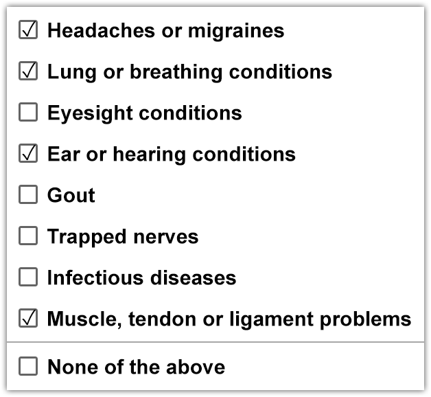
Rewobs' answer is good, but it involves two levels of complexity: first clicking one of two ratio buttons, then selecting the checkboxes. The user experience of that design can be improved by simply having a visually separated None of the above box at the bottom.

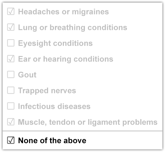
Someone suggested clearing the users' choices, but that is bad because accidentally checking the box will clear your progress. Instead, just gray out the other choices, but still make them selectable. If the user checks or unchecks one of the grayed out boxes, it should uncheck the None of the above box to make them visible again.

If the user tries submitting the form with none of the checkboxes selected, not even the None of the above checkbox, then it knows that the user forgot to select something so they may return to it and fix the issue.

With options checked

With "None of the above" checked

0
18

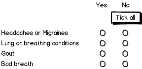
Check boxes are not ideal in your case since they are used for multi-selection (in theory, one can choose none of the above and another option - while Javascript can 'fix' this, it's not exactly obvious to users).

I may not be answering your question directly, but consider this format instead:

mockup

download bmml source – Wireframes created with Balsamiq Mockups

I think it'll serve your client better because it requires users to explicitly say no to each item (if your wish to have this done in a single click, add the tick all button).

The controls are radio buttons and per line only one can be selected. You can start with neither ticked to force user action, saying no.

6
  • 3
    This is definitely another way, but requires more clicks, which might be a tough sell to the client. Thanks :)
    – Adam Stone
    Commented Nov 13, 2014 at 1:17
  • 2
    You could select "No" as default answer for each one, unless the client has to specifically "denied" each option for some legal reason. Commented Nov 13, 2014 at 1:20
  • 9
    I'm pretty sure the client requires explicit action for the 'No'. That's why I though more 'No's would mean for the client less 'I didn't pay notice'. It's an example where business goals win over usability.
    – Izhaki
    Commented Nov 13, 2014 at 1:21
  • 1
    @AdamStone You can always provide a 'Mark all as No' button.
    – Izhaki
    Commented Nov 13, 2014 at 1:22
  • @Izhaki "It's an example where business goals win over usability" Agreed :)
    – Adam Stone
    Commented Nov 13, 2014 at 1:37
12

Make the "None of the above" Checkbox Clear All Others

Keep the UI you have, but add a bit of JS that makes the "None of the above" (NoTA) checkbox also clear any other already-checked boxes

If the user clicks just clicks on NoTA, the form behaves exactly as expected. If they click a few other options first, and then click 'NoTA,' they'll either notice you've foolproofed the form or not : )

I can't think of an example right now, but the experience of clicking an option in a group that affects other parts because of differing logic is hardly unconventional. You're essentially building in a type of validation. So don't worry about the UI police pulling you up for non-conventionalism.

Regarding objections on the basis of "mental model" and "complexity"

Adding a clearing function to a checkbox is hardly so disruptive to the user's mental model and expectations to cause them to come crumbling down. From what we are seeing here, the alternatives seem to involve adding more UI and instructions, decreasing clarity, and adding complexity.

This strikes me as putting the cart of theory before the horse of practicality.

9
  • I, too, think this is a good solution. Visually, I would make sure to set the NOTA option slightly apart from the other options though.
    – André
    Commented Nov 13, 2014 at 11:39
  • 6
    I disagree with this view. You should consider mental models and visibility. Checkboxes, by convention are boolean controls and can be composed into a multi-selection group. That's what users expect. Any 'behind the scenes' logic is invisible to users. That is, if you put a user in front of a wireframe and ask them how this would behave (their expectations - which we all build while interpreting an interface) they could easily be confused. The controls imply one thing, the labels - another.
    – Izhaki
    Commented Nov 13, 2014 at 11:53
  • 1
    But we shall also account for the fact people are intelligent and given the context, the option "none of the above" implies that choosing it will disable all other choices. But is this the optimal design? I'd argue it isn't. You should also consider errors and recoverability - invisible logic makes the whole story far more complex.
    – Izhaki
    Commented Nov 13, 2014 at 11:55
  • @Izhaki I'd argue that this solution is more optimal than the other one we're commenting on above, primarily because it gets the job done with much less UI - Your point about "putting users in front of wireframes" isn't helpful because we know end users aren't fully conscious actors assessing every detail in the context of their mental model, especially checking boxes on an insurance form - The only non-conventional thing about this design is that a checkbox also has a clearing function. Is that enough of an issue to cause the user's mental model to crumble? Hardly (cont.)
    – dennislees
    Commented Nov 13, 2014 at 15:16
  • @Izhaki Your comment about invisible logic making things "far more complex" is barely applicable to this scenario, and is mildly ironic given your promotion of a solution that to the end user is undeniably more complex.
    – dennislees
    Commented Nov 13, 2014 at 15:20
12

tl;dr Make the form behave as if the user is filling a paper sheet while someone stands beside them to nag them when they make mistakes.


I'd keep your design adding real-time validation:

mockup

download bmml source – Wireframes created with Balsamiq Mockups


If something is not right, change the last line:

mockup

download bmml source


If the user gets it right, the last line can simply disappear (user would think "okay, it stopped complaining"):

mockup

download bmml source


Of course, the same validation should occur when the form is submitted. If something isn't right stop right there, popup an error (the exact same message shown in real time is best, for consistency) and auto-scroll back to the question(s) which need to be fixed.

6
  • 1
    +1 for noting that, whatever we do on the client side, the input still needs to be validated on the server after being submitted. Commented Nov 13, 2014 at 14:31
  • 1
    @Alex this puts the responsibility for validating the form on the user, and requires them to read and act more than they're going to want to. Not the best approach.
    – dennislees
    Commented Nov 13, 2014 at 15:23
  • 1
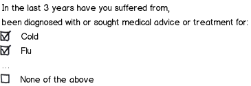
    @dennislees Since this is related to "life insurance forms" I think it's safe to assume users would triplecheck their input before submitting anyway. Since user input is never to be trusted anyway, and must always be validated, and the form can't predict what the user means if input isn't semantically consistent (flu or none or the above ? they can't be both correct, which one is ?), all that remains is slapping the user while going "this, wrong! you, fix!"
    – Alex
    Commented Nov 13, 2014 at 16:35
  • 1
    This would be my recommendation as well. It's the least complex of all the solutions and does exactly what is needed.
    – DA01
    Commented Nov 13, 2014 at 16:44
  • 2
    I agree with @DA01. This solution requires more action on the part of the user if validation fails, but it ensures no information is lost, the form controls always behave as expected, and there is minimal change in behavior if JavaScript is disabled.
    – Brian S
    Commented Nov 13, 2014 at 23:03
8

Don't use checkboxes.

I would try to split it into two questions:

  1. In the last 3 years, have you had any nasty illnesses?
    ○ yes
    ○ no

  2. Which ones?
    ○ headaches
    ○ colds
    ○ flu
    ○ arthritis
    etc.

Only show question 2 once they answer "yes" to question 1.

The drawback is that the user might have had a disease which isn't on your list, so they would choose "yes", and then ... be flummoxed as to what to answer for question 2.

In which case, perhaps you could add a final (catch-all) "other" option to question 2. Maybe your business logic doesn't allow for that, I don't know.

1
  • 13
    Another issue with this is that the user might only think of a condition when they read its name. For example I wouldn't have thought of "eyesight conditions" -- wearing glasses is so routine for me that I don't even think of it as a medical condition. Commented Nov 13, 2014 at 13:33
5

TL;DR Based on an informal usability study conducted on a similar need (but in a different problem domain):

  1. Separate the "none of the other options" option from the list of other options.
  2. Place the two lists side-by-side, such that the most common list comes first.
  3. The "none of the other options" option should be a check box, like all the others.
  4. The checkboxes should act as a toggle: if "none" selected, others are disabled. If any one of others is selected, "none" disabled.
  5. Use text color/font weight/font style to separate "none" from the others.
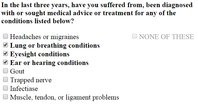
Sample implementation

JS Fiddle


We faced a similar problem with a long list of facility condition problems (mold, broken windows, chipped paint: you wouldn't believe the minutiae of categorical problems a room could have). When a person performs a room condition walk through, they must explicitly check something to assert they've actually reviewed the room's condition.

The reported usability problem: while all rooms can have lots of problems, more than 95% of rooms have zero, one, or two problems. By far, the most common option is "none", the second most common options are "one" and "two" with about equal probability. Rooms with three or more negative conditions almost never exist.

I ran an informal usability study with four different scenarios:

  1. A long list of the options with a "none of these" checkbox at the bottom.
  2. Same as 1, but with a "none of these" toggle button instead of a checkbox.
  3. A long list, but with a "none of these" checkbox offset out of the flow.
  4. Same as 3, but the button is offset.

The control, and original implementation, was #1. All scenarios were presented with similar formatting: same font, same line spacing, etc. If the "none" option was selected, there was no "graying of the list". (If you care, the population stats: 62 users, avg. age 37, 59% reported as female, 5% reported experiencing a form of color blindness.)

My theory was that #4 would receive the highest usability because the "none" option was both visually offset and a visually distinct element.

In ASCII art, these scenarios looked like:

#1
[ ] Mold, walls
[ ] Paint, chipped
[ ] Paint, faded
[ ] Window, glass, cracked
[ ] Window, frame, broken
...
[ ] No negative conditions

#2
[ ] Mold, walls
[ ] Paint, chipped
[ ] Paint, faded
[ ] Window, glass, cracked
[ ] Window, frame, broken
...
 +----------------------+
| No negative conditions |
 +----------------------+

#3
[ ] Mold, walls                |
[ ] Paint, chipped             |
[ ] Paint, faded               | [ ] No negative conditions
[ ] Window, glass, cracked     |
[ ] Window, frame, broken      |


#4
[ ] Mold, walls                |
[ ] Paint, chipped             |  +----------------------+
[ ] Paint, faded               | | No negative conditions |
[ ] Window, glass, cracked     |  +----------------------+
[ ] Window, frame, broken      |

To my surprise, users preferred #3. The use of a button beside the list was "non-intuitive", "confusing", and "disruptive". Further feedback suggested creating three side-by-side lists: one with zero options, one with the most common, and one with the less common (and interestingly more urgent issues). Like so:

NO PROBLEMS IN ROOM          COMMON DEFICIENCIES      URGENT NEEDS
---------------------------- ------------------------ --------------------------
[ ] No negative conditions  |  [ ] Paint, chipped    |  [ ] Uncommon problem 1
                            |  [ ] Paint, faded      |  [ ] Uncommon problem 2
                            |                        |  [ ] Uncommon problem 3
                            |                        |  [ ] Uncommon problem 4

Subsequent trials indicated the two state error condition (no negative and another choice both selected) occurred only during edits. The feedback led us to implement a highlighting scheme:

  1. When no negative condition selected, mark it in bold green and disable the other inputs. This effectively makes it a toggle button, but visually remains styled as a checkbox.
  2. When another deficiency is checked, mark it in italic red and disable the "no negative conditions" checkbox

You likely can't weight your options along most common/less common lines, so that would limit you to two lists. Depending upon the length of this list, you might need to investigate forms of in situ ordering. Alphabetic might suffice, but it may be better to categorize by functional system (diseases of the heart, diseases of the liver, diseases of weight, etc.) using headers.

I'm a big fan of both coordinated usability tests and A/B testing. If you have the time and budget, go for one of those. If not, go with what your gut says!
1

An option I encountered today is to make the "none of the above" option a radio button, like so:

mockup

download bmml source – Wireframes created with Balsamiq Mockups

When the radio button is selected, the checkboxes become deselected, and when the checkboxes are selected, the radio becomes deselected.

1
0

Separate the 'None of the above' checkbox from the list of checkboxes with a horizontal rule or some other separation aid.
This will help the user understand that this option is a different one from the normal options present in the list.
Also, I would suggest that checking this option will disable or remove all checked items from the list above.
If you feel this is intruding on the user's choice, you can provide a message to the user saying "It looks like you select xxx from the list. Do you want to go ahead with this choice or select 'None of the above' ?"

Your Answer

By clicking “Post Your Answer”, you agree to our terms of service and acknowledge you have read our privacy policy.

Not the answer you're looking for? Browse other questions tagged or ask your own question.