1

A user (conductor) will pick a destination taking the minimal amount of time. Since this is a ticketing system which user can tap or swipe.

Check the Example of 2 set of images below:
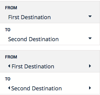
From 1st set is a dropdown and the second set is a sliding

The 1st set is a dropdown and the second set is sliding.

What do you think will be easier to user to choose a destination?

One thing I observe is if I choose the dropdown it's will be a longer process for the user since first they will tap the from then choose the location; so what if your destination are too many? You need to scroll it. Unlike Sliding/ Swipe the user can choose by swiping. Yeah I know it's almost same with dropdown.

Any idea or suggestion to make this more user friendly and more easier for user to pick or choose?

8
  • 2
    Single select rule of thumb: 2 states or options → toggle button. 3–4 options known beforehand → swipe. 3–8 options → drop-down list. 9+ options → reduce/split options or use different, specialized interface widget (map, color picker, calendar …).
    – Crissov
    Commented Nov 5, 2014 at 7:14
  • Why not use autocomplete? Let the user type and show a list of possible destinations.
    – BrunoH
    Commented Nov 5, 2014 at 9:04
  • 2
    Too little information about the size of the lists, I think. When I read "conductor", I imagined someone in the train flicking sidewise through several thousand train stations... Additional Qs: Can "From" be retrieved via GPS? Are "To" locations influenced by "From" locations? Maybe you want to update the question for better answers... Commented Nov 5, 2014 at 9:37
  • @Crissov, could you provide a reference for this rule of thumb please?
    – Izhaki
    Commented Nov 5, 2014 at 22:52
  • @Izhaki No, that’s mostly just my personal guideline.
    – Crissov
    Commented Nov 6, 2014 at 10:01

2 Answers 2

1

Why not use autocomplete? Let the user type and show a list of possible destinations.

Extension to the answer above: I presumed, that the list of destinations is quite long. If your user has to swipe or scroll through a long list (say more then 20 items) it's quite dificult to find the right item.

The target here is, that the user finds the right destination in a minimal amount of time. If the user can typ e letter and therfor has only to swipe (or scroll) throg a few items instaed of the whole list, this would be faster.

As told, my answer is based on the assumption, that the list is long. If this is not the case, the dropdown would be a better option. I'd prefere the dropdown. The dropdown alows the user to see more then just one destination at once. Therefore the user has not to scroll to the exactly rigth spot.

1
  • autocomplete required typing user can't type due of lots of customer(need to be quick to get a ticket and paid) and bus are moving so it have tendency can be wrong destination. (sorry for my bad english) Commented Nov 8, 2014 at 16:35
0

I would suggest you to go with the dropdown because it makes the work easier than the sliding wherein you will have to swipe until you get the desired destination. If you have lesser destinations to choose from then you can use the swipe used in google+ comments view in iOS App. When you swipe right or left on the Comments view it works as a carousel swipe effect.

enter image description here

1
  • yeah swipe is a bad way for user since it's have to quick and find the location. Thank you for suggestions. Commented Nov 8, 2014 at 16:37

Your Answer

By clicking “Post Your Answer”, you agree to our terms of service and acknowledge you have read our privacy policy.

Not the answer you're looking for? Browse other questions tagged or ask your own question.