11

Usually I just choose this spontaneously and without much thought, but I have a feeling that's not the best idea: How can I size my font and its container for an optimal reading experience to my users?

If the container is just the width of the whole page, it's incredibly hard to read for users with wide screens, and their eyes have to keep jumping all the way back across 1200+ pixels. However, if it's too small, the user will have to scroll too much, which is also an unpleasant experience.

As an example, the bodies of Stack Exchange posts are 660px wide, with a 14px font size (on most sites in the network).

Background:

  • This is a blog-like site, where the content is mostly if not all plain text.
  • The format of the site is simply a header and a footer, with the body text taking up the entire rest of the page.
  • The container would have a max-width rather than a hard number as a width, so that users with small screens don't have to horizontally scroll (ick).
  • I will also have to support mobile as well as desktop. Should I be changing font size / container width depending on how wide the screen is, or should the font size stay constant so that it's just as easy to read on any screen (but more scrolling is required on mobile)?

I'd preferably like answers backed up with evidence as opposed to idle speculation not based on facts or research. I know I've read papers and articles about this before; I just can't find them.

1

2 Answers 2

12

A common number I've heard thrown around for font size, the "new 12pt font for websites", is 16px. Nearly all modern posts I've seen on the subject suggest it or something very similar for desktop websites with more disagreement about a good font for mobile. For a full font-size list, Typecast has some good recommendations.


To me, the best way to pick an appropriate font and font size is to look at a blog or site that is easy for you to read and use the same or similar values.

As is the case with most everything in design, how your content is presented should differ based on what you're presenting and who you're presenting it to. StackOverflow has great type (IMO) for it's use because it conveys a lot of information in a relatively small space while staying clean. However, I would never use a font so tight and small as this on a personal blog.

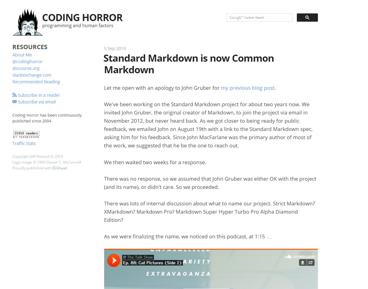
Personally, I love the type on Jeff Atwood's blog Coding Horror. He uses 17px font size for desktops and a line height of 27px (both determined by ems). For mobile he takes the text down to 15px and the line height to 24px. The font he chose is Open Sans, a very common and solid choice, with sans-serif as a fallback.

In most cases I think it's wise to use a slightly smaller size for mobile than for desktop. This is because from a progressive enhancement perspective, we should first make the text readable on mobile in an attractive way and then use the increased space we have on desktop by making it a little bigger. Plus people are generally further way from the screen on a laptop or desktop than they are on a phone, so the text should be a little bigger.

This is in addition to other features helping readability including ample white space brought by padding and margin, restricting the width (as all large text blocks should have) from taking up the full width, using an off white (#D6EDFF) background and off black (#222) text color.

A screenshot of the CodingHorror blog

By varying the size and color of the font, it's very easy to tell what the main content is, what's a link, and all of the important information.

8

Your container width and font-size are linked. Both are dependent on the reading experience you're looking to provide.


So how big should my type be? It depends. At Stack Exchange, we opt for smaller type and tighter line-heights because users don't read everything. They scavenge, looking for keywords, phrases, and headlines that could possibly answer the question they have. Jeff's blog however is different. There users want to read what he writes.

User scrolling should be a factor, but not a determining one. The fact is people do scroll. Your goal is to provide a font-size that accomplishes your goals of reading or scavenging. This can only be determined by trying it out for yourself. If your goal is to promote scanning, then a smaller font-size would be suitable to allow for more content to be parsed more quickly. If you're looking to provide a better reading experience, especially for longer reads, then a larger font-size is best. Larger font-sizes are preferred as it helps reduce eye strain.

The Elements of Typographic Style Applied to the Web states this concerning creating comfortable measures:

“Anything from 45 to 75 characters is widely regarded as a satisfactory length of line for a single-column page set in a serifed text face in a text size. The 66-character line (counting both letters and spaces) is widely regarded as ideal. For multiple column work, a better average is 40 to 50 characters.”

Trent Walton wrote a great post on applying this comfortable measure to fluid layouts. A key quote from his article:

In a fluid layout, browser width and typographic measure are linked: the wider the viewport, the more characters per line. Keeping in mind that a range of 45-75 characters per line is generally accepted as safe for comfortable reading, there are a few things that can be done to avoid extra long lines of text in fluid layouts. (Emphasis Added)

Your Answer

By clicking “Post Your Answer”, you agree to our terms of service and acknowledge you have read our privacy policy.

Not the answer you're looking for? Browse other questions tagged or ask your own question.