10

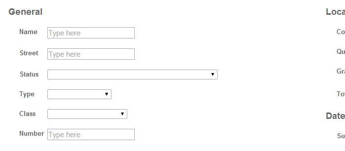
Attached is a screenshot of a web application I am building. It shows where the user can enter input to perform a search.

My question: should the text boxes/comboboxes all be the same width?

The widest one, Status, is that width because that is the width of the widest entry (which you would see upon pulling down). Should I make all the other boxes be the same width as the Status box?

enter image description here

0

3 Answers 3

-3

Yes, for aesthetic purposes, the text boxes and combo boxes should all be the same width.

It is possible to style the combo box so that the field portion is a fixed width and the hidden dropdown portion is a variable width to match the content. See this stack overflow answer for an example.

enter image description here

5
  • Yes, it is possible to narrow the Status box, but on dropdown the text would overlap the 2nd column of the form (which you can see in the image, but is way off to the right because I widened the browser window). Is it acceptable for that text to overlap like that?
    – user52292
    Commented Jul 28, 2014 at 20:26
  • @user52292 - I think that would be fine. When the dropdown is expanded, the most important thing the user is doing is trying to select something in that dropdown. Unless you think there's some information in the second column that is critical to picking an item in the dropdown and the expanded dropdown could potentially cover it up, I would narrow the status box and let the dropdown get as big as it needs to be.
    – Bobwise
    Commented Jul 28, 2014 at 20:30
  • why should they all be the same width? The problem with this example is that if they select the long value, the long value won't be properly displayed. This may be acceptable, or may not be, depending on context.
    – DA01
    Commented Jul 28, 2014 at 20:38
  • I think that in general, having all of the fields the same width is more aesthetically pleasing and easier to read. Of course there is always going to be an exception to every recommendation. If the full text of the dropdown selection needs to be displayed at all times, or if it is completely unacceptable for any content to be obscured by the extra-wide text in the dropdown, then of course this won't work. In those cases, you may need to have fields with different lengths, or use a different control that is more flexible.
    – Bobwise
    Commented Jul 28, 2014 at 20:52
  • 1
    Actually studies show that users tend to enter information to fit the space. Typically the ideal length for a text field is about how much information you expect to gather without causing the user to go beyond the edges.
    – Hynes
    Commented Jul 29, 2014 at 3:26
4

It depends.

If they are all off by a bit, then yea, from a pure visual consistency point of view, they probably should be tweaked to all be the same length.

But if they are containing entirely different values, then it may not make sense.

For instance, perhaps once drop down is state abbreviations, and the other is a list of ingredients found on a Twinkies wrapper. Probably doesn't make as much sense to force them to the same length in that situation.

Also note that if you artificially shorten a select field to be shorter than some of the options, upon selecting the option, it will be truncated visually. This isn't necessarily bad, but something to consider as well.

As for text boxes, no, they should not all be the same length.

The size of a text box can offer some needed context to make filling out a form easier. The size of the text field should offer some hint as to what is expected.

A field labeled "ZIP Code" but is 50 characters long could be quite confusing. Alternatively, a form field asking for street address but only 5 characters long isn't intuitive either.
0

First, you should check your initial assumption that plain vertical layout of the form is good for your users: some of the fields are related to each other and some of them likely allow very short input and, thus, can be grouped on the same line.

If you are confident, that all fields should be put on separate lines of the form, you are asking this question because you feel discomfort seeing different size of the fields. This happens because field boundaries too contain some information for users: a visual key to where the user can input the text, and, if chosen appropriately, the hint about the maximum length of this text. If the fields have different width, it may look like this information is not organized and harder to read. By setting equal width you will increase readability of field boundaries, but remove the hint about maximum length, so it's not perfect solution. Another option can be a visual grouping of the fields with equal width and sorting by width may help to increase readability and make the form more comfortable for users. If this will not help, go back to initial assumption again and try another layout.

Not the answer you're looking for? Browse other questions tagged or ask your own question.