1

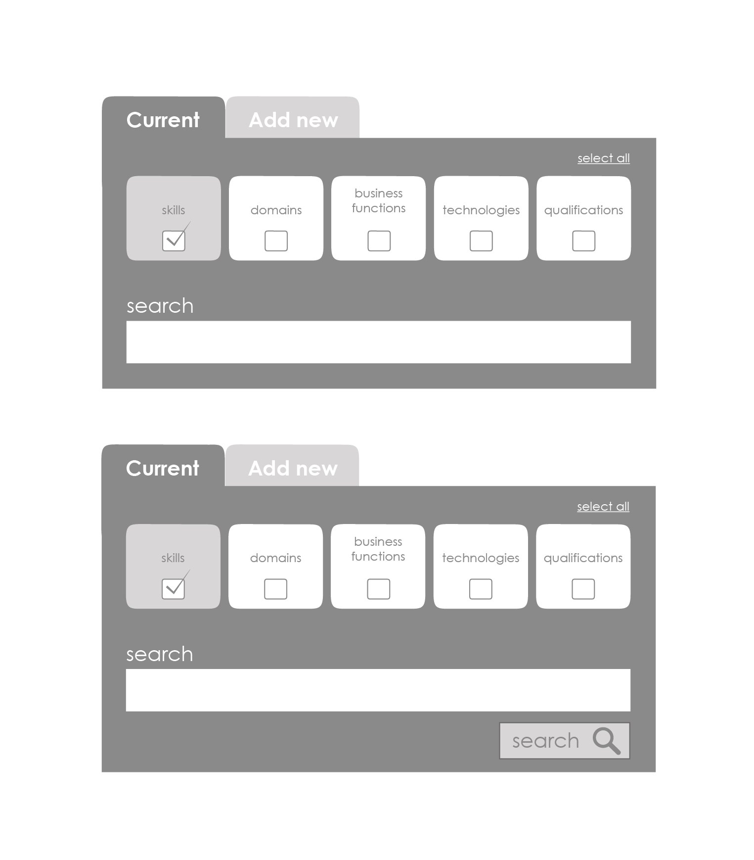
My question revolves around search results and how they are initiated from the criteria selection.

Two options I'm looking at:

  • Auto-suggest results depending on criteria selection i.e the results start feeding in from something such as a letter being typed in the text field or a category being selected (without a 'search' button being clicked)

  • Criteria selection and then results initiation on 'search' button click

My users are advanced and we are looking to have less clicks and faster results selection within our app. Although, thinking about the psychology of such an interaction, I believe that there needs to be a initiating button click, even just to satisfy the users want for initial confirmation of back end processing.

So to summarise, am I just playing doctor too much and auto-suggest results are actually the logical way to go?
Wire frame

3 Answers 3

3

Why not try a hybrid approach where you provide a button, but it's size and position is secondary to the user interacting with the recommended results?

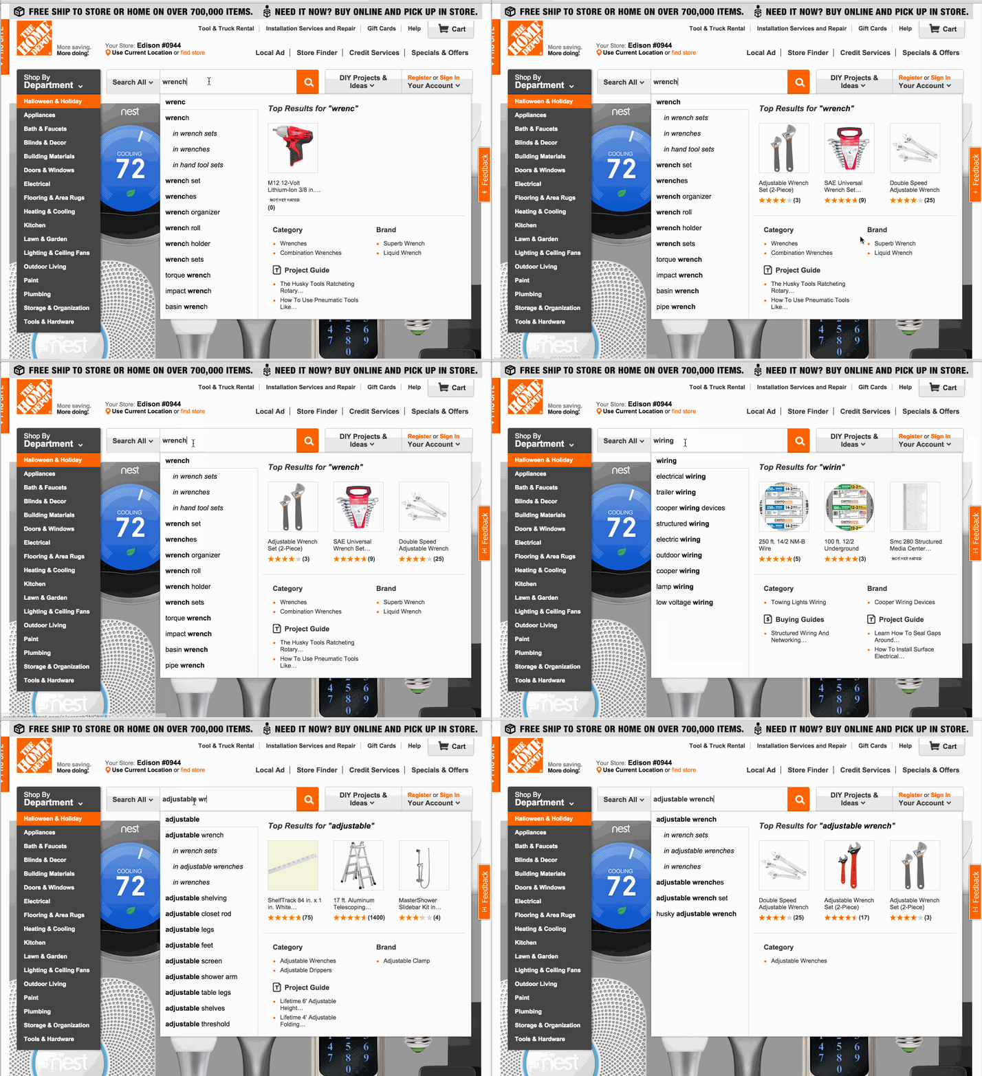
Take a look at the search interaction on HomeDepot.com:

HomeDepot.com Search Ahead Interface

I've worked on sites with similar interactions and have seen solid proof in the usage data that these types of search interfaces are effective.

That said, delivering such an experience could require a significant investment in tuning the engine to return relevant results. I think it's worth noticing that the HomeDepot interface succeeds in two other important areas beyond recommending results:

  1. recommended search queries/autocomplete
  2. relevant product categories

Both work to make sure that the user has options if the search fails to return results desirable to the user.

If you want to get up to speed on search tuning, the metrics you'll want to focus on are:

  • Precision at K, where K is the number of results you'll be recommending.
  • discounted cumulative gain which is a measure of how well the results are ranked.

Finally, search is an area where you have to rely on usage data to drive UX decisions. If the search quality isn't there and you can't readily improve it, your UX strategy needs to be different than if you have high confidence in your site's ability to return solid results that match the user's query and intent.

1

Removing the search button like in your first design can be perplexing to some users.

One suggestion to solve your issue could be to reverse things and promote the following thinking sequence :

  1. typing the search keywords
  2. selecting (or filtering) the source

A way to implement this could be to :

  • place the search input field above the sources/filters
  • keep a responsive results list refreshed everytime a key is pressed
  • add a "search in" caption above your five buttons
  • dynamically adapt the results list everytime a button is pressed (checked) or pressed again (uncheck)

EDIT : To inform your users that a search query is not needed, you might want to use a "leave empty to show all results" placeholder in the search field that disappears when this field gets focus.

Please note that placeholders, although widely spread and interesting in terms of space optimization, also have drawbacks as mentioned in the following study : nngroup.com/articles/form-design-placeholders.

You might then want to compare the pros and cons to go for the compromise that best suits your and your users' needs.

5
  • Yep, the orientation of the how the search criteria is filled was something I was thinking about. However we are wanting to allow the user to search just by category selection, there doesn't need to be a query for results to appear. Updating the results every time criteria is changed and do it in real time, is something we are looking to implement also. Commented Jul 4, 2014 at 13:20
  • To the edit Placeholder text is proven bad UX so would rather make it obvious in other ways. The thing is though, if they select a category, which is first in priority, results will begin to show. This in itself will inform the user that a query is not needed. Commented Jul 4, 2014 at 15:42
  • 1
    @MartyDunlop Can you elaborate about placeholders being proven bad UX ? Maybe you have articles or studies that you could share ?
    – Pierre
    Commented Jul 5, 2014 at 9:11
  • Although I myself wouldn't personally mind using placeholder text, as I find it useful when you need it and gone when you don't. There are studies/assumptions from industry leads. The one here is from the NN Group. nngroup.com/articles/form-design-placeholders Commented Jul 7, 2014 at 7:37
  • @MartyDunlop Thanks Marty. This is very interesting and the drawbacks mentioned in the study you shared make perfect sense. As a takeaway, one could then say : placeholders have advantages but if available space and chosen design principles are not an issue, persistent hints outside of the field are preferable.
    – Pierre
    Commented Jul 7, 2014 at 10:12
1

We have had a similar problem to resolve. The way we have done it is as suggested by @pierre move the search to the top. The problem is that if we have "Search In" options initially in the deselected state then semantically it is inconsistent because if the users initiate a search without any selection then it is going to be run across all the fields (much like what would happen if you selected everything). You also may not like to keep all the options selected because then the users would have to work hard to focus the search on only one field. A simple tweak that did it for us was change label to "Only Search In" instead of "Search In"

As far as the decision of when the results are refreshed that entirely depends on the initial state of the page. Ideally if on every click the results are being filtered down then it makes sense for the initial page to load with the entire data (you may have seen this behavior with tables and how searches on tables work, even gmail works in the same way)

Your Answer

By clicking “Post Your Answer”, you agree to our terms of service and acknowledge you have read our privacy policy.

Not the answer you're looking for? Browse other questions tagged or ask your own question.