0

I have an input box that submits content on the push of enter/return.

To the right of the input, a submit-button will be placed to give users the possibility to click to submit content.

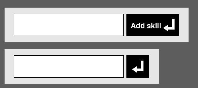
Will an enter/return arrow work as a symbol for the submit-button? The wanted behavior is that the users will understand that a push on the keyboard also submits the input.

enter image description here

Update after feedback:

What about doing some progressive reduction that changes after user behavior? enter image description here
6
  • So the button submits content AND adds a new input? Commented Jun 2, 2014 at 12:12
  • Just submits content :) Edited op
    – Velkommen
    Commented Jun 2, 2014 at 12:15
  • Are you sure that you need a button ? You may simply submit the field when users press "Enter"
    – Renaud
    Commented Jun 2, 2014 at 12:44
  • This is the cleanest solution, yes, but I do think people not familiar with the behavior of computers tend to look after buttons to submit content.
    – Velkommen
    Commented Jun 2, 2014 at 12:46
  • I sometimes get hung up on button-less inputs, when a type-ahead dropdown appears after a few characters. Selecting one of the options in there sometimes just populates the field without submitting the entry. Then I'm left looking for a "Search" or "Go" button. In that case, clicking in the field and typing Enter seems like such a waste of a click and a keypress. Commented Jun 2, 2014 at 14:09

6 Answers 6

2

This icon symbolizes "Carriage return" since the typewriter and it simply adds a new line.

It would be confusing to use it as a submit button

4
  • A lot of input fields like search inputs submits the search input on the use of "carriage return", is this all wrong behavior?
    – Velkommen
    Commented Jun 2, 2014 at 12:36
  • 1
    I agree. Simply put 'Submit' on the button. Users know they can hit return because that is a function of the input field, not a function of the button.
    – user43251
    Commented Jun 2, 2014 at 12:41
  • I wouldn't say it is "wrong" but it is definetly not the perfect solution that you are looking for.
    – Renaud
    Commented Jun 2, 2014 at 12:44
  • "Used to" now it means submit, return, new line, enter. All of which are relevant to the functionality of this form. Commented Jun 2, 2014 at 15:10
0

Consider that not every keyboard has this symbol on it. If you label the button what it does ("Submit" as you said and not "Carriage Return"), it is clear to the user, which action will occur. Btw it is easier to localize for various cultures.

I think what you want to achieve, is done with the focus highlight of a button (primary button is blue/shadowed for example). Thus, it depends on which platform this GUI component is visible. For desktop use it is common understanding, when a button is highlighted. For web applications, i think (because i have not concrete studies yet) that people tend to avoid shortcuts to not make wrong entries/experience unexpected behaviours. It is not consistent, that websites (aka webapps) support such "shortcuts". (If somebody knows more about it, plz tell me)

Hope this helps

3
  • Updated OP based on the answer
    – Velkommen
    Commented Jun 2, 2014 at 12:36
  • 1
    I don't quite understand what you're saying about shortcuts. Yammer, Tumblr, Facebook, and Gmail all use keyboard shortcuts (such as j/k for next/prev list item) to help power users.
    – Dan Hulme
    Commented Jun 2, 2014 at 13:06
  • Yes I know, but are these consistent to each other? I don't want to say that nobody uses shortcuts, just that there is no consistent common pattern over all (most) websites of the www. Back to Bluewater's question: i think that people are used to click buttons on the web, in favor to use keyboard buttons (as long as you are no power user, who uses the gui constantly...).
    – wassx
    Commented Jun 2, 2014 at 13:17
0

I am not sure if this is a design for web or mobile and what kind of demographic spread of your target audience. Let me be device agnostic and handling all demographic spread in making my reply.

To answer this the right way will be user profiling based on how your organisation is ready to spend. Initially you can present it with label and icon together. Later over a definite period you remove the label and just show the icon. Now you should start profiling the user based on bounce rate or even getting opinion feedback in worst case. Based upon the user profiling you can have or remove label and keep it personalised to every user.

For simple implementation, you can use hover-to-expand button (progressive disclosure) or as simple as a tooltip saying it is 'submit' button.

Honestly for better UX, simple and quick reply is to add both icon and label.

1
  • Thats what I had in mind with the second update, where I wrote: "What about doing some progressive reduction that changes after user behavior?" :) And of course, this is going to be user tested, i'm just trying to get some feedback from others experience around this matter. The question is still: Will the users understand the return arrow?
    – Velkommen
    Commented Jun 2, 2014 at 13:03
0

I'd KISS and make the button text "Press enter to add skill", with or without the return symbol. It will use more space, but is very easy to understand.

0
  • If this is a single item that gets submitted, then just label the button "Submit". One word, short and easy to understand.

  • If you are (potentially) able to add more than one item with this text imput, then I would put a + symbol on the button.

0

If we put a focus on keyboard navigation this is completely acceptable as that is the keyboard icon for the button you press to submit your input, however you then need to remember to turn off form submission on the use of the return key and use some ARIA code to let the tabbing user know its just the input field they're submitting.

Then remember to set focus on the new input once the previous input as been "submitted" and make sure your submit button has the ability to be selected using keyboard tabbing.

Also on a note of accessibility you should use the icon AND the text as your update shows.

Your Answer

By clicking “Post Your Answer”, you agree to our terms of service and acknowledge you have read our privacy policy.

Not the answer you're looking for? Browse other questions tagged or ask your own question.