I'm developing a online clothing store where the user could save their measures of the body in the cloud, so we'd calculate the size of the garment automatically.
Then I have a form to do this which contains:
- Paragrah explaining briefly the purpose of the form.
- Combo box to choose the body part to measure.
- Tab with two sections (measure yourself and garment I have - In garment I have the user can input the data of a garment that already has on which we rely to take the body measures- ).
- Button to submit the info.
The dilema is in the measure yourself section. Where I have the following:
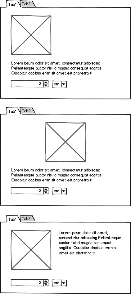
- Photo of the part of the body (200x200px). If you click on the image, you cloud see it in a popup at 400x400.
- Brief explanation of how to measure this specific part of the body.
- A input number where the user will put the size.
- And finally, a select box where the user chooses the unit of length (inches or centimetres).
I though in this three different choices:

download bmml source – Wireframes created with Balsamiq Mockups
The third option looks great, but may be the information is a little piled.
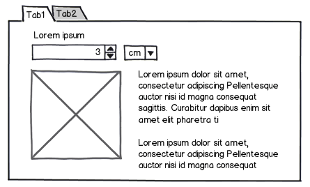
What do you think is the best choice to structure the tab? Why? Do you have any alternative?

