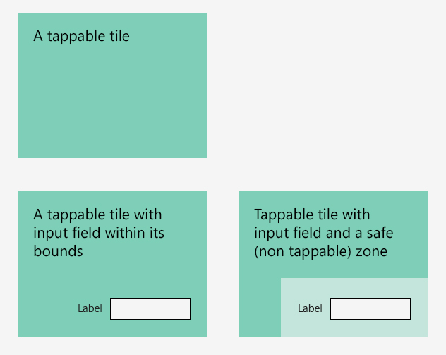
Interesting question.
Rather than having a dead zone (safe zone) that does nothing, you should make your "safe area" trigger the label editing. If you do this, then tapping the tile will either trigger the navigation, or editing of the text box. This way there will be no sense that the tile is "broken", and the user can easily cancel out of editing the text box. They will soon get the idea.
For touch, the Nokia developer guide suggests that a touch target should be at least 1 x 1 cm (many other guides seem to give the size in pixels, which doesn't seem as reliable over different devices). I think this is a good guide for how big your detection zone should be for the text box.
Is this is a Windows 8 style tile? Their guidelines for interacting with tiles might give you some inspiration.
If you want to make the edit vs navigate distinction clearer, perhaps you could go further and introduce some concept of "selecting" a tile for edit?
- Have 2 modes for your tile; normal and "selected"
- Have some gesture (e.g. tap and hold) that moves the tile from the normal state to the selected state.
- When in normal mode, the entire tile is tapable for navigation.
- When in selected mode, user has access to edit the label, but navigation is disabled.
You need to have some kind of affordance to indicate the difference between the 2 modes. Perhaps in this case enabling / making visible the text box control is sufficient.

