To my knowledge most projectors' "No Signal" screen uses a blue background:

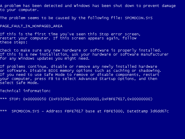
This might also apply to the legendary Blue Screen of Death

So why is blue the color of choice for such error messages?
To my knowledge most projectors' "No Signal" screen uses a blue background:

This might also apply to the legendary Blue Screen of Death

So why is blue the color of choice for such error messages?
Just a guess:
If they used black (minimum intensity for all three color channels) or white (maximum intensity for all color channels) you might think they are off, so instead they use only one of their base color channels (out of Red Green Blue).
Red light may remind some people of an alarm and others of a district in Amsterdam.
Green may seem like everything is OK to go (like a green traffic light).
That leaves blue.
Any other color would require someone to actual think of what levels of colors to use and why.
Regarding the BSoD, if it where white, some users may not understand why their open document has strange text in it. If it where black, some may not understand why DOS is open instead of Windows and the same reasoning behind red and green from the projectors still applies.
A brief search online does provide results for other colored SoDs e.g. Various colors, RSoD, GSoD, WSoD. The last three links, are however, from questionable sources.
Edit:
If I had to choose a color for SoDs I use the following conventions:
B(lack)SoD - Void SoD - Nothing wrong happened... just turn on/plug in your device/the screen/the power mains and start using.
B(lue)SoD - OK SoD - Everything's OK... everything was saved and is being recovered, you can continue using the device shortly.
G(reen)SoD - Ready to go SoD - Your device is ready to resume operation... just click Enter/OK/Return or enter password/card/finger/DNA and it's good to go.
R(ed)SoD - Danger SoD - Your device is on fire/may electrocute you/harm you/someone in some other way.
G(ray)SoD - Borderline SoD - Your device may or may not be working or have experienced a problem, fiddle around with it and see what happens.
P(urple)SoD - Mysterious SoD - Something unknown has happened, try finding an expert.
W(hite)SoD - Dead SoD - Your device is now bricked, all you can do with it is look at this message and then replace it.
I think the blue goes back to the days of consumer-grade video cassette recorders with on-screen message displays. Superimposing an image on a video signal requires that one know which parts of the signal will be displayed where on the screen. If the video signal includes valid horizontal and vertical sync pulses, one can measure the time since the last horizontal sync pulse, and count the number of horizontal pulses since the last vertical sync pulse, and know where that part of the signal will be displayed.
If, however, a video signal has no horizontal or vertical sync pulse, a television set's horizontal and vertical scanning circuitry will start "free-running", and there will be no predictable relationship between signal timing and screen location. On-screen message electronics that are built into a television set can be triggered by free-running vertical and horizontal sweep generators well enough to produce a legible (though often slightly garbled) overlay, but electronics built into a VCR have no way of knowing the timing of a television set's horizontal and vertical sweep in the absence of sync pulses. The only way for a VCR to produce readable on-screen messages in the absence of a valid input video signal is to generate a video signal itself.
Generating a black and white video signal is slightly easier than generating a color signal, but not hugely so. With NTSC (North American) video, one can get color by adding a pulse of a 3.579545MHz reference signal at the start of each line, and adding a 3.579545Mhz signal to anything that should appear in color. The hue of a colored object will depend upon the phase relationship with the reference signal, but lightness and saturation are a little less predictable. Yellow is the easiest hue to generate (same phase as reference), but blue is the second-easiest (exactly-opposite phase), and variations in lightness and saturation are less noticeable with blue. Thus, generation of a blue screen has technical advantages versus any other color.
Once video cassette recorders started including the blue screen as a standard no-signal indication, many television sets started following suit. From a technical standpoint, a television doesn't need to generate an "idle" signal in the same way that a VCR does, but consumers wondered why the feature should be unique to their VCR, and television sets had no particular reason not to include it, so the behavior is included in many sets.
A good question which has its natural historical reference:
The Blue Screen of Death (also known as a stop error, bluescreen, Blue Screen of Doom, BSoD, bug check screen or Stop screen) is an error screen displayed after a fatal system error.
The term "Blue Screen of Death" originated during OS/2 pre-release development activities at Lattice Inc, the makers of an early Windows and OS/2 C compiler. During porting of Lattice's other tools, developers encountered the stop screen when null pointers were dereferenced either in application code or when unexpectedly passed into system API calls. During reviews of progress and feedback to IBM Austin, the developers described the stop screen as the Blue Screen of Death to denote the screen and the finality of the experience.
Reference: Blue Screen of Death
So the color blue stands for fatal system error?
Not really. Blue is not equal to danger or harm in any way. Blue represents knowledge, power and seriousness....
Use blue to suggest precision when promoting high-tech products.
Dark blue represents knowledge, power, integrity, and seriousness.
Reference: Color Meaning
And a "fatal system error" is no kidding. "This is serious stuff your dealing with, so pay attention"-color which would be blue. This is not the color of error (which would be red) but the color representing the whole thing as the sky and the sea and everything. Serious!
So now you also know which wire to cut (red or blue) and which pill to take (red or blue).
The red pill and its opposite, the blue pill, are pop culture symbols representing the choice between embracing the sometimes painful truth of reality (red pill) and the blissful ignorance of illusion (blue pill).
Reference: Red pill and blue pill
As one of the respondents already mentioned, blue is the color of the sky and the sea, and in general represents tranquillity. So, psychologically, so that the user does get upset, seems ergonomic designers picked a blue blank screen for when things go wrong.
I suppose this has physical reasons:
rod cells register light with smaller wave length (blue tones)
The rod cell density is higher on the peripheral part of the retina and the the cone cell density is higher on the center part of the retina
So viewing blue detailed information with a red/orange background is quite exhausting. This would also explain why many default desktop backgrounds from Windows and MacOS use blue tones:


So since blue-ish tones are peripheral less obtrusive I guess this is why the color blue (unconsciously) made its way to your mentioned areas.
Edit: Source (german)