0

I'm working on the Image Gallery of a webshop. There are 6 thumbnail-images, that can be clicked and are displayed in full-size above.
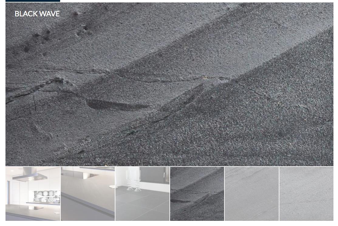
Image Slideshow with currently selected

How should you show the currently selected thumbnail?

Version A: Selected thumbnail in full opacity, less opacity for the others

To put an emphasize on the currently selected image and show clearly that it is "selected".

Version B: Selected thumbnail in less opacity, full opacity for the others

To reduce redundancy (you see the selected image in full-size and full opacity above) and emphasize, that the other images are clickable.

What do you think?

1 Answer 1

1

What is missing is the visual separation of the UI elements.

You need to separate them, and for that, changing opacity does not help much in this case.

I would try t add wider borders between main image and thumbs - to indicate that separation, and another, even wider border around the current thumbnail, indicating that it is currently "separated out" in the row,

,I think reducing opacity of the selected thumb makes no sense - it's not somehow hidden, it's the most important! (And possibly used as overview). I would keep the opacity of the other thumbs at 100% too, but make them darker, like somewhat in a shadow, while still visible.

For the separating borders, I would try dark grays - maybe the wider thumb border darker than the other.

2
  • I agree, a dark overlay makes more sense. On hovering the overlay can temporarily be removed to show the original thumbnail.
    – jazZRo
    Commented Apr 18, 2014 at 11:54
  • But take into account that removing it temporarily breaks the function as visually structuring element. Commented Apr 19, 2014 at 12:37

Your Answer

By clicking “Post Your Answer”, you agree to our terms of service and acknowledge you have read our privacy policy.

Not the answer you're looking for? Browse other questions tagged or ask your own question.