18

I have a form that the users will use a lot of times becouse is the main funcionality of my webapp.

It has select boxes with large options, so they are quite wide. Looks something like this:
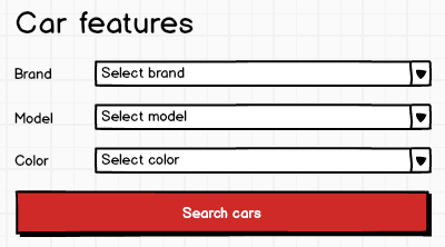
enter image description here

May be the button is too wider, isn't it? is that a bad practice? The good point is that the user doesn't have to scroll down to complete the form each time their have to use it. Note that I have a navbar at the top of the page too.

The other alternatives that I've thought:

Labels at the top

With the labels at the top of each select box, the form is too long and then I force users to scroll, and as I said, I don't want to.

Placeholder

Using placeholders without labels the form looks really great. I don't want to fall in this terrible mistake, but maybe in this case I could make an exception. I mean, as the form will be very used, and the fields to fill are quite intuitive and I think in a case of this features, wouldn't confuse the user.

This is an empty form:
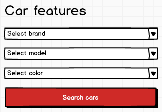
enter image description here

This is a filled form:

enter image description here

Do you keep your position against the only-placeholder method in this case, or could I use it?

5
  • Does the user ever need to go back and edit existing values? Then it might be a good idea with labels. Commented Apr 11, 2014 at 12:47
  • Yes, they could search the times they want. But if I put labels, then the button is to wide, don't you? Thanks Commented Apr 11, 2014 at 13:04
  • You could have top-aligned labels as well if that's the case I suppose. Commented Apr 11, 2014 at 13:13
  • Select boxes are the one time I might not use a label, since the first answer is usually your label. Also your choices are rather intuitive. It could work to leave the label off in your scenario
    – pathfinder
    Commented Apr 11, 2014 at 19:35
  • 1
    Keep in mind that labels have positive accessibility implications. You should make sure your placeholder-only solution still works well with a screen reader (and by "make sure" I mean have someone unfamiliar with the form do it). Commented Apr 12, 2014 at 6:27

8 Answers 8

10

In your case I don't think there is an issue removing labels,Since you are using only select boxes in your form and there are no text fields, When users click on select box they are going to be presented with list of options so I don't think the issues of auto focus, lack of compatibility with browsers for placeholders plays an issue in your case.

2
  • Thanks for the response. I won't have browser support issues becouse I'm using select2 jquery plugin which does not use native placeholders. :) Commented Apr 11, 2014 at 10:11
  • Agree that one of the main issues with removing labels is when it is free text entry. As in drop downs/select boxes the user can still see the placeholder text, if it is includes as the default option. Not sure if this would have a negative impact on accessibility though?
    – Sheff
    Commented Apr 14, 2014 at 10:51
14

You might consider showing a tooltip on hover like:

TooltipOnHover

3
  • Hey! I like the idea. Commented Apr 11, 2014 at 12:14
  • 7
    Are you suggesting to use a tooltip instead of a label? Commented Apr 11, 2014 at 13:36
  • 1
    There might be a disadvantage in this design - mobile or tactile environments. Luckily this question seems to address this issue. Commented Apr 11, 2014 at 21:41
6

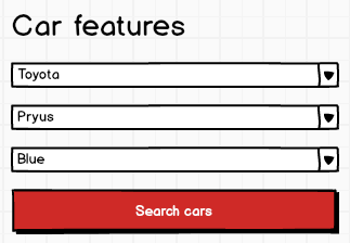
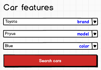
You can try use this pattern (for options already selected):

enter image description here

It lets you keep this placeholder look while still not resigning from having labels displayed within the field. You can use other text color (like light gray or something) to degrade the significance of the label of course.

4

From my point of view, the problem with using placeholders without labels is also relevant when using combo boxes and not only when using text fields. In both cases the "label" disappears when typing or selecting something. If the user is not familiar with your form and the order of the combo boxes, this could be confusing.

I suggest that you use labels as in your first example (Brand, Model, Color) and then use a placeholder text to illustrate an example of which options the combo box contains. I.e. in the Brand combo box it could be "E.g. Toyota" and so on. This will provide more support to the user instead of "Select brand".

As for the search button I prefer a smaller button aligned to the right.

2

Given your three options, I haven't seen a strong case for removing the labels. The reasons you're giving are personal preferences:

With the labels at the top of each select box, the form is too long and then I force users to scroll, and as I said, I don't want to.

-

Using placeholders without labels the form looks really great.

Even in this case I would use a label + placeholder text. Design for the best case scenario, but plan for the worst. You need to account for items such as slow connections, screen-readers, and mobile devices. Ask yourself the question if for some reason my CSS didn't load and all the user had was my raw HTML, would this still make sense? Is my HTML organized logically? Am I providing correct prompts where need at a base level?

As Anders Kjærby Jacobsen mentioned, I think your best option is your first one, but with the button smaller (not full-width). I would differ with Anders on the placement and align the button along the left edge in line with your form fields as it's a natural line your drawing down the form.

0

Quick answer

  • Display labels on the left of the form controls if you have enough space.
  • If not, hide the labels in a safe way (see below).
  • Align the form button with the form controls.

Accessibility point of view

From an accessibility point of view, all form controls should have labels. That allows all users -- included those who use assistive technologies -- to use the form effectively (more info about this).

Under some circumstances, however, you might want to hide the labels using CSS. In that case, make sure you use a safe technique.

Usability point of view

From the info that you provide, I believe that is not necessary to show the labels of the form controls:

  • Users will use this form often, so they will understand its structure.
  • There are only 3 fields.
  • The fields are closely related (brand, model, and colour).

Design point of view

Some designers have come up with creative solutions to display field labels. You might like to have a look at them:

  • Circle CI -- the placeholder becomes the label when the form control is filled in or has the focus.
  • Search in gov.uk -- you have to look at the source code to see the technique they used.
0

One thing you could consider is moving the placeholder text outside of the input. A perfect example, in my opinion, can be seen here:

http://littlebigdetails.com/post/82478225432/circleci-once-activated-the-input-placeholders

This way your input and placeholder text aren't "confliction" (couldn't think of a better word, sorry) and are actually becoming an opportunity for an interesting interaction within your UI.

0

You could use some nice CSS trickery to show/darken the placeholder text when focused or on hover.

You could fade the placeholder text to a light grey (to keep your form looking clean and light) then darken when focused or mouse over.

4
  • Well, you could do all sorts of things. You could make the placeholder text flash, you could have different colours for the text, you could make the buttons a funky shape... but would any of that make any difference? Why would you do all this?
    – JonW
    Commented Apr 14, 2014 at 11:34
  • To improve UX. 'Funky' buttons and flashing text would be really bad for UX and usability would it not? My suggestion seems like it might help provide a possible solution to the problem.
    – Paul
    Commented Apr 14, 2014 at 12:45
  • That's sort of my point though. Yes, funky buttons and flashy text may be bad for UX, but how do you know that fading in / out the text on hover is any different?
    – JonW
    Commented Apr 14, 2014 at 12:48
  • Because it would a subtle design change and will maintain his nice clean form using nothing more than pure CSS. To have flashing text would require JavaScript and using images as buttons is bad for usability. It's an interesting problem which I've also faced before, so i just wanted to share my experience.
    – Paul
    Commented Apr 14, 2014 at 13:04

Your Answer

By clicking “Post Your Answer”, you agree to our terms of service and acknowledge you have read our privacy policy.

Not the answer you're looking for? Browse other questions tagged or ask your own question.