I'll try to make it short, as the problem is simple but long to explain:
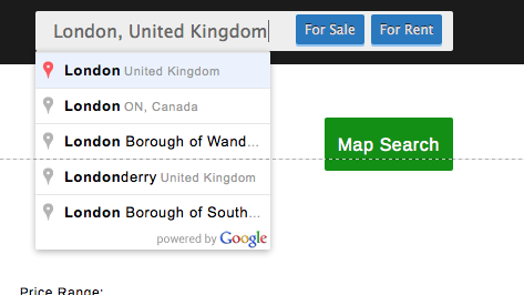
I'm using google autocomplete on a location search input. It's on the site's header so it should be quick and comfortable to use, this is how it looks (ignore the Map Search Button):

So as you might have noticed, it has two "submit" buttons, causing problems with the behaviour of the Autocomplete:
- If you click on any of the items, the form submits.
- If you hilight any item and hit Enter, the form submits.
You can try this out in google maps for example.
This would be perfect if there were no multiple options to be taken...
Because of the form element's behaivour it will submit using the first button as trigger by default.
But I would like to let the user to be able to pick between any of the 2 options, so through javascript I cancelled those 2 behaviours, so if you click on an item, it just places it in the input, and the same if you hit Enter, but a second hit on enter will submit the form. (This let you see the desired result in the input and pick one of the 2 options).
I feel that this will still confuse people. So I thought of some options, but can't decide myself:
Leaving it as it is, highlighting the first button when user clicks on an item or hits enter, so they are visually guided to click it ( or hit enter again ) or click on the other button.
Leaving as it is and showing a tooltip explaining what they can do for the first time.
Replace the two submit buttons for two radio buttons, and let the Autocomplete submit the form when the item is clicked or Enter is Hit.
A quick google search revealed that I would still need a search button for non-technical audience. On the other hand, having 3 elemts there, seems to me a bit too much, maybe it's just me being paranoid, but I wanted to keep the interface as simple as I can. So this option would be to have 2 radio buttons + a submit button, probably labeled "Search"
Any guidance and / or new suggestions will be welcome!
