0

We are having a debate on the design of an e-commerce website about the buy now button. I would appreciate your feedback and would be very grateful for a link backing up your opinion.

How different should the styling of a buy now button be from the site? Are there preferences on font, color & shape?

  • Different font?
  • Different color?
  • Different shape?

I look at Amazon and see they use the yellow, but that matches with their logo and it's squared with rounded edges, which in general the site is not. On the other hand, Overstock.com uses green, which actually clashes terribly with their reddish logo, but keeps the continuity of the "square" shape of their site.

I read related threads and did not see an answer to this question and they were also a bit old (2+ yrs ago). It seems like lately the buy now/add to cart buttons are more square than they used to be. Even the tags on this site are half rounded, half squared... leaving me confused.

Thoughts?

2
  • 1
    There isn't really a definitive answer as what works for one store, may not for another. Call to action buttons are just one element of the overall page that contributes to improved actionable events or conversion rate. You may find this collection of case studies on the subject useful though.
    – zigojacko
    Commented Mar 20, 2014 at 8:43
  • It's all going to depend on your brand guidelines. The 'Buy Now' button is just your primary CTA, so you should treat it as such.
    – JonW
    Commented Mar 20, 2014 at 8:43

3 Answers 3

2

Font:

  1. By usability guidelines: Must be readable and scannable on different real estates.

  2. By visual guidelines : Should be appealing and brand specific.

Color:

  1. By usability guidelines: : It must be standout from the rest of the theme.

  2. By visual guidelines : Should convey brand or create eagerness to click. Like red color( red color will not work if the site is all red :))[you need to study how human mind works with colors. Plenty of material is available online]

Shape and size :

  1. By usability guidelines: It should have affordance so that user can click.

  2. By visual guidelines : Should go with theme.

Last not the least to check if the design is as per user please test it with real user.

3
  • Very good reply. One thing I'd like to add, even if the website is in red or one of its matching shades, red color is mainly associated with warnings, errors etc. You can go with a green or yellow.
    – Zo Has
    Commented Mar 20, 2014 at 10:43
  • Thanks for the reply - it's a good checklist. The problem with the human mind and colors is that a lot of the articles seem to contradict each other. I think your point about standing out is key - red might work, but not if the accent color on the site is red. On the other hand, I see blue buttons on sites with blue accents - exact same color.
    – Rae
    Commented Mar 20, 2014 at 13:09
  • Thanks:) Red color is associated with warning and eagerness to touch/click (as per study red shirt wearing waitress gets more tip and same with red lipstick :) Even red color is also associated with weakness, when we see blood, most of the people get depressed. follow interesting articles here: cracked.com/…
    – UXbychoice
    Commented Mar 21, 2014 at 4:48
0

When it comes to a good call-to-action button (what a buy now button basically is) fonts, colors and shapes come 4th, 5th and 6th after placement, affordance and size.

It's all about standing out which you don't do by just making the button look good or flashy. It's placement is everything. Put it above the fold and don't be afraid to use whitespace around the button, it's the best way to put emphasis to it.

A button has to have affordance, it has to look like a button. This has somewhat to do with shape, but more with borders and gradients. If you're not using a flat style, use gradients. If you are using flat style, correctly use borders.

Size speaks for itself. Not too small and not massively big (that's just cheesy). Just know, the bigger the button, the bigger the whitespace.

When it comes to fonts, research says sans-serif fonts are easier to read on a screen, where as serif fonts are better for printed text. But it's not a rule, just a guideline. Slab serif fonts are very popular for buttons and menus lately.

The key word when it comes to color is accent. Some people choose to give it a color which is radically different from the rest of the website's color scheme. It creates an accent to the website. But using the same color as for example the header on a predominantly white website also creates that accent. The right color is a color that stands out from the background and the rest of the colors within it's immediate surrounding (x amount of pixels around it).

The correct shape of the button depends on the design of the rest of the website. If the design permits a rounded button, go for rounded, your choice. Rounded buttons or completely square, it doesn't really matter.

All that matters is your click through rate (CTR). The rules for a perfect CTR button are not set in stone. And you don't have to create the perfect button for your website right from the get go. Test and iterate after launch. Look at your analytics and try different buttons (A/B testing).

Here are some articles that kind of say the same as I just said. The fact that they're around 2yrs old doesn't matter. The theory doesn't change over night.

http://www.uxmatters.com/mt/archives/2012/05/7-basic-best-practices-for-buttons.php
http://www.uxbooth.com/articles/good-call-to-action-buttons/ http://www.hongkiat.com/blog/design-winning-buy-button-tips/ http://www.paulolyslager.com/call-to-action-buttons-shape-size/

2
  • Thanks for the answer. It's hard to isolate what to A/B test when there are so many variables, but it seems that shape isn't really an important variable. I know theory doesn't change much, I just saw a sort of trend in things becoming more squared off than in the past and thought maybe there was something to it.
    – Rae
    Commented Mar 20, 2014 at 13:28
  • @Rae it's a trend. Round buttons don't fit in most modern designs. Commented Mar 20, 2014 at 15:58
0

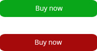
I prefer a green button above a red button. Cause a green button looks friendlier than a red one. If I buy something online and see a red button. I am more willing to look for another website.

Green and red button

See the difference? I just would make a buy now button acceptable to click on depending on designs I would not make it a very different color except if your design is red.

Hope this was helpfull!

4
  • 1
    What if the website is all green though? It's not going to be noticeable at all. Or if everything else is turquoise so you get a bit of an unpleasant visual clash. My point being - you can't design an asset completely out of the context of where it's going to be used; you need to take everything into account.
    – JonW
    Commented Mar 20, 2014 at 9:02
  • @Drogon, kindly post reasoning/stat to backup your answers not personal opinions . Have a look here: blog.hubspot.com/blog/tabid/6307/bid/20566/…
    – UXbychoice
    Commented Mar 20, 2014 at 9:14
  • What I tried to pointing out was that a buy now button has to look friendly and not very outstanding to your design. But it has to noticeable more than a cancel or other button though.
    – Drogon
    Commented Mar 20, 2014 at 9:17
  • The green does seem so much friendlier, but the data doesn't lie. The other issue is that the case studies are on different products. I think for our product (jewelry) there needs to be a bit more of a trust factor (think cooler colors). The button is on the product page, so I don't think people would confuse it with a cancel button.
    – Rae
    Commented Mar 20, 2014 at 13:33

Your Answer

By clicking “Post Your Answer”, you agree to our terms of service and acknowledge you have read our privacy policy.

Not the answer you're looking for? Browse other questions tagged or ask your own question.