6

My company is redesigning its corporate website. the CEO is not entirely sold on the business/UX case for going mobile (and the added bandwidth that entails). Part of his objection is that he believes pinching/zooming on a non-mobile optimized site is a better user experience than scrolling vertically through a long mobile-optimized site.

There is already a good deal of data that user attitudes toward scrolling are changing (they are more comfortable with it), but my question is:

Can anyone point to data that shows that pinching/zooming is a quantifiably bad user experience?

4
  • 3
    CEOs are quite often wrong. Perhaps a simple bit of data to help convince them: scroll = one hand. Pinch + zoom = two hands.
    – DA01
    Commented Mar 7, 2014 at 20:14
  • 2
    Your CEO needs to understand that no one person can ever represent the "typical" consumer; and even if they could, he wouldn't be it. (If engineers were the typical consumers of mobile phones, we'd still be lugging around 1950s-era army radio-backpacks.) May I suggest putting a survey out on Mechanical Turk? Ask questions that explore the differences between pinch/zoom and scroll. It'll cost you about $100 and you'll have two hundred people surveyed in about a day. Commented Mar 7, 2014 at 21:36
  • Going mobile shouldn't add bandwidth. Empathy is the defense here. If a user is on a mobile device, there is a considerable amount of latency that is inherent with mobile connections. For that reason, pages should be even smaller (not larger) than their desktop counterparts.
    – Nic
    Commented Mar 7, 2014 at 22:48
  • 1
    Mobile optimisation of a site, as you no doubt have told him, is far more than just layout. Optimising the navigation and UI elements, the way content is presented etc can make a big impact on usage for the user. Commented Mar 9, 2014 at 16:12

2 Answers 2

12

I think your approach to handle this must be two pronged

The need for mobile optimized websites

I would recommend looking at the ton of literature and articles that are there which highlight the need for a mobile optimized websites. To quote some articles and references

Here are five great reasons it matters:

  • People can read mobile–optimized sites.

A site that is designed for a mobile–sized screen is a great experience. People can see all the content you have to offer right away – no squinting, zooming, sideways scrolling, reaching for the reading glasses. Why would anyone bother doing all of that just for your site? More than likely, they’ll leave and spend time exploring sites that work well on their beloved smartphones.

  • Mobile–optimized sites load more quickly.

Who doesn’t get frustrated waiting for sites to load on their phones? Who waits around when it takes too long? Especially when someone is trying to take a quick look before crossing a street or before making a purchasing decision. You have a strong edge if you’re simply there when your customers need you.

  • Video and graphics look good on mobile–optimized sites.

A good mobile site does not use Flash. It won’t work on a lot of phones. Flash technology is frequently used on desktop sites to display videos, but it just doesn’t work at all or doesn’t work well on many smartphones or tablets, including iPhones, iPads, Windows 7 phones, Blackberries, and some Android devices. Your valuable content will be lost if it is not served in a way that actually works.

  • Smartphones are used by 58% of American consumers.

And smartphones are used by 76% of those under age 44, according to a 2012 study by Frank N. Magid Associates. That’s a lot of potential customers you can lose or gain in mere seconds based on their experience using your website on their mobile phones.

  • At least 46% of smartphone owners browse the Internet on their devices “several times per day.”

This is according to the Edison Research/Arbitron Internet and Multimedia Research Series. The percentage of smartphone owners who browse the Internet at least once every day is much higher.

Once you establish the business case in terms of conversion and potential benefits, you can focus on answering his second question

Do users prefer to pinch\zoom on websites on mobile

With regards to actual research on whether users would be willing to pinch\zoom through a non mobile optimized website I havent found any research but I recommend reading this article by Karen McGrane (also on stack overflow)

Meeting the needs of the mobile-only user doesn’t mean agonizing about “the mobile use case,” trying to determine which subset of content would be most useful to users “on-the-go.” Google reports that 77 percent of searches from mobile devices take place at home or work, only 17 percent on the move. Mobile users should get the same content. It’s frustrating and confusing for them if you only give them a little bit of what you offer on your “real” website. If you try to guess which subset of your content the mobile user needs, you’re going to guess wrong. Deliver the same content as your desktop user sees. (If you think some of your content doesn’t deserve to be on mobile, guess what — it doesn’t deserve to be on the desktop either. Get rid of it.)

Meeting the needs of the mobile-only user also doesn’t mean sending them to the desktop website on their smartphone. Asking mobile-only users to pinch and zoom their way through a website designed for a monitor five times larger is an ergonomic nightmare — and a cop-out. We can do better for these users than tiny fonts, untappable links, and broken hover states.

I also recommend reading this article : Responsive Web Design: What is it and why should I care?. To quote the article

Delivering an App-Like Experience.

Mobile environments require simpler navigation, focused content and fast page loads. If a website has a responsive design, the user does not have to manipulate the site using “pinch and zoom,” and the flow of content is more appropriate for a smaller screen. The site may reduce the amount of content presented to the mobile visitor, so it has less clutter and is easier to use.
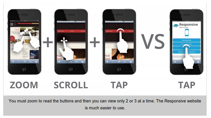
enter image description here

Using this you could build a compelling case highlighting the potential improvement for business and also the better experience for users for your pitch.

8
  • 3
    That last image is nice. Succinctly explains the major usability benefit.
    – DA01
    Commented Mar 7, 2014 at 20:32
  • 1
    Thank you, this is a very in-depth response. The problem I'm running into is making a strong enough cost benefit analysis to my CEO. To play devil's advocate, our main product is a data analytics web app (desktop). For mobile users we have a mobile app. Currently, only 5% of our website visitors are mobile. So the question is really--should we be devoting the design/dev bandwidth to building a mobile app or would that bandwidth be better allocated toward product improvement?
    – Maizello
    Commented Mar 7, 2014 at 21:32
  • If you already have an mobile app, you could do what linkedin does which detects if you are accessing from mobile and suggests you download the mobile app
    – Mervin
    Commented Mar 7, 2014 at 21:33
  • Our corporate website is thus more of a marketing outlet. This is our identity and what we are about. Will not just a well designed desktop app suffice (once again, devils advocate here)? Furthermore, look at other data analytics companies: Tableau, Simply measured, Moz, etc. None of them have mobile sites or mobile-optimized sites. This further complicates the business case.
    – Maizello
    Commented Mar 7, 2014 at 21:38
  • 1
    For me personally it's a no brainer. in 5 years mobile device saturation will be so high that this whole debate will be moot. But if we're not an ecommerce site, where mobile optimization has clear ROI benefits, the debate just comes down to personal choice and bandwidth. My CEO just doesn't think the pinch and zoom is that bad of an experience, or its not bad enough to warrant all the extra time needed to make a site mobile-optimized.
    – Maizello
    Commented Mar 7, 2014 at 21:39
3

It is stunning to me that this is still a question. Any developer worth his salt is designing to W3C standards and W3C/WCAG is very clear on this.

The W3C/Web Content Accessibility Guidelines (WCAG) version 2 Level AA 1.4.4 requires that sites be scalable without assistive technology up to 200%. This means that the mobile browser’s pinch zoom feature must allow for zooming up to 200% WITHOUT using the assistive technology zoom on the mobile device.

This is not up for debate. There are countless millions of people in the world with low and poor vision and developers think they can decide the one size that's close enough for all of them?

Ebay does not disable pinch and zoom. Amazon does not do it. W3C/WCAG is clear on it. Yet here we are.

Would you hire an engineer that ignores standards? An architect that does not follow best practices? An electrician?

Pinch and zoom is an accessibility aid that ships with the mobile browser. It's not some "feature" a developer can do with as they wish. It's a function that they should never ever disable.

1
  • I couldn't agree more. Pinch to zoom and mobile optimization are not mutually exclusive.
    – Cosmic
    Commented Oct 28, 2015 at 16:01

Your Answer

By clicking “Post Your Answer”, you agree to our terms of service and acknowledge you have read our privacy policy.

Not the answer you're looking for? Browse other questions tagged or ask your own question.