41

If all fields in a form are required should they be marked somehow (eg. with an asterisk)? I see this done a lot and find it redundant?

There could be a difference in big forms and small forms, but in big ones I would add a note at the top that all fields are required, but I wouldn't necessarily do that on small ones.

What do you think is the right approach?

11 Answers 11

37

You'll often find that users will just fill in all fields on a form regardless of whether they're required or not. People don't really read instructions and don't want to risk encountering an issue if they haven't filled in any fields, so they'll often just fill in them all regardless. (This has been somewhat supported by testing by the Baymard Institute - although in their case they were looking at how users interact with forms directly following on from previous errors). A better approach is to add in the text at the beginning of the form that 'All fields are required unless indicated as optional'. (Which as LukeW finds goes down well with users in testing)

That covers off the accessibility issues as you've introduced at the beginning of the form what is required of the user (although with HTML5 you can add the 'required' attribute into field tags to also cover this off) but it also removes much of the confusion from filling in forms as to what the user should and should not do.

If you have all the fields as required then you risk the user scanning all of them to see which ones aren't required. However if just just mark the optional ones as '(optional)' then that removes the confusion. And in your situation none of them are optional so you won't even need to display that against the label.
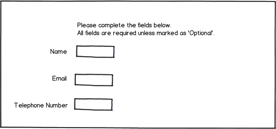
mockup

download bmml source – Wireframes created with Balsamiq Mockups

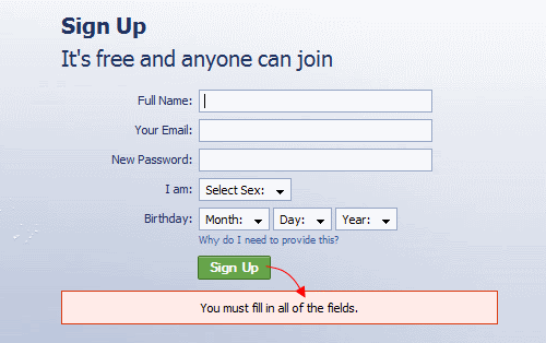
This is a similar approach to how sites like Facebook do things. As shown in this image below (as taken from the Smashing Magazine article on web forms) they don't provide any indication about what is and isn't required unless the user tries to submit the form without filling anything in. It could be assumed that they do this because they too have found that users generally fill in all fields they're presented with just to make sure).
enter image description here

1
  • Your first source seems to propagate solutions to sensitize the user to fill in all fields pro forma to prevent (further) errors. This in future will either make users retrieve more private information or feed databases with nonsense information.
    – uxfelix
    Commented Feb 9, 2014 at 13:46
13

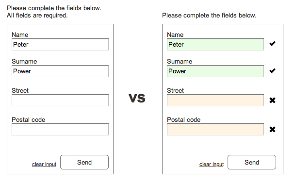
Unfortunately people read less and expect more during action. So regardless if all fields or only a set of fields are required, fields that need input need indication in some form. Every field in your case.

enter image description here

6
  • 11
    I'd say premature color-marking distracts the user from the actual form content. Better colorize only if "Send" has been clicked with incomplete form.
    – Ruslan
    Commented Jan 20, 2014 at 15:19
  • If those fields that are mandatory and have not been edited yet are marked red before the user hits send, chances are much higher he/she will fill them in before hitting send and running into an error. @Ruslan
    – uxfelix
    Commented Jan 20, 2014 at 15:52
  • 6
    @uxfelix: Disagree. Suggesting to the user that they made an error before giving them the chance to fill in the required information is not good UX. From the user's perspective "Stop telling me I've done something wrong. Give me a chance. I haven't even got there yet!"
    – Bill Dagg
    Commented Feb 3, 2014 at 21:51
  • My intention is to guide (and not force) the users focus to those fields that are required. My example might look a bit harsh: Exchange the "x"'s with a left pointing arrow, take away the red and surround the unfilled input fields with green (while keeping the filled in fields filled green). Then they won't look like errors but will prevent the user from making mistakes in the first place. @Bill
    – uxfelix
    Commented Feb 4, 2014 at 9:14
  • Don't use colour to convey meaning alone.... When Chrome et-al pre-colour the fields yellow overriding your explicit instruction. w3.org/TR/WAI-WEBCONTENT/#gl-color
    – GlennG
    Commented Nov 7, 2018 at 15:44
5

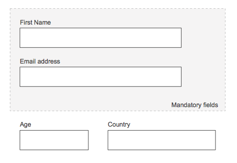
Maybe you can group them. Separate the required fields somehow, maybe inside of a box or with a dotted line. For example.

in this way you will remove the redundancy.

enter image description here

4

Error prevention is better than cure. True in 1995 and always will be - http://www.nngroup.com/articles/ten-usability-heuristics/

I had a usability test of a form only recently where, when presented with a message saying the equivalent of "D'oh! Fool! We only accept your answer in this format" the participant rightly said, "Well why didn't you tell me that first?"

If all your fields are required, say so. And the asterisk is, I believe, the universal shortcut for that.

2

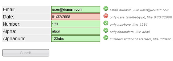
I don't feel it is necessary to mark fields as required when there are far neater solutions available for this. In the same way that fields are highlighted green/red for form validation, this would also suffice to highlight a field that is required or not validated correctly.

I guess the only user disadvantage to this however would be colour blinded people where red/green isn't much use to them - it is these cases where additional markup such as an asterisk would be most beneficial.

Similar to the below:-

enter image description here enter image description here

3
  • This is more about validation after attempted submission of the form. This doesn't really address the question about whether you need to indicate the fields as required or not up-front.
    – JonW
    Commented Jan 20, 2014 at 12:19
  • 1
    Sorry, it meant to explain that I don't feel it is necessary to mark they are required, something as my examples showed I feel is sufficient. I'll edit my answer. Thanks.
    – zigojacko
    Commented Jan 20, 2014 at 12:25
  • 1
    @zigojacko I really like how your solution touches on something no one has mentioned yet: disable the button. A great way to prevent forms from being submitted when the required info is not complete is to disable the button. Of course, it is also important to communicate why the button is disabled. That seems to be covered by plenty of others here.
    – Benjamin S
    Commented Jun 18, 2014 at 15:57
2

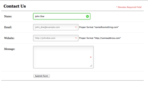
Definitely, no asterisks marking required fields. And in simple forms like the one attached, I use no instructional text. I could place a note above the form asking users to "Please complete all fields" but I don't think it will be read by most.

I recommend displaying an error message on submit if they forget to fill out a field. The error message should be inline, have clear instructions, and use an icon or large change in tone/color.

If a few fields are optional you can add (optional) to the label. If most of your fields are optional I would question why they are there. Perhaps there is a better way to capture the optional info than including it with data that is required.

enter image description here

1

Including a line of instructional text (as some have already illustrated) that states "All fields are required" should suffice. If you wait until users have submitted, this "surprise" will detract from the overall user experience. Inclusion of the instructional text will facilitate error mitigation efforts.

Color coding has limitations, especially when (not if) color-blind people use the form.

0

I try not to ask for anything unless I need it. It should be clear to the user why providing me what I'm asking for will help them.

There are a few cases where something is useful to the user yet not required to get the job done such as providing a Description. I don't usually find it necessary to put (optional) by these fields because a user isn't harmed if they assume it is required and always supply one.

Disabling the submit button usually works pretty well and providing both a hover text on mouse over and even red text below if the disabled button is clicked can inform the user why.

enter image description here

0

You all make really good points, always nice to get other people's opinion.

I also prefer not to provide an indication at all, only show it after the user tries to submit.

Coloring before submission is to distracting in my opinion, and in general I only think coloring should be used for validation of fields that require a special formatting, like a date or email addresses. These should be validated live when the user types, and not when the user submits.

1
  • Just an FYI (since you don't seem to be familiar with the stack-exchange way of doing things): UX (and other stack-exchange sites) aren't like other web forums: answers on a page are only supposed to be answers to the original question (at the top). Other questions should be asked on their own, not put into answers. It might seem strange at first, but you'll get used to it :)
    – paul
    Commented Jan 21, 2014 at 19:51
0

In a way to avoid form abandonment since the user may become overwhelmed with the number of rules he must apply and to reduce cognitive overload in, other words, mark only the fields that are not required by creating a cleaver design. Another option if management wants to mark the fields at any cost... write the word "Required" on the appropriate fields and mark only the field that is not required with an "informative" look.

-1

You could mark the mandatory fields with a stroke of a certain colour, like red. Non-mandatory fields can be unmarked. This way you dont have to add an additional asterix, and you also avoid adding a statement explaining the reason for the asterix.

1
  • 3
    You'd still have to explain the reason for the coloring. And if you color all fields, how does that distinguish anything? It just changes the styling of the form. Highlighting something only works if you're not highlighting everything, but only some things.
    – André
    Commented Jan 20, 2014 at 11:04

Your Answer

By clicking “Post Your Answer”, you agree to our terms of service and acknowledge you have read our privacy policy.

Not the answer you're looking for? Browse other questions tagged or ask your own question.