50

Lightbox UIs are becoming a lot more prevalent in mainstream web-design. You know the drill -- click on a link, the background fades darker, and up pops a UI for interacting with an object, making a change, viewing a picture gallery etc.

They do make it very obvious what is going on, and where the user's focus is to be at any one point in the experience. However, they often don't allow the user to open images or perform that task in a new browser tab, for example, which can frustrate many.

There seems to be a bit of a resistance by some well known web software developers:

So, has anyone done any user testing/usability tests with lightbox UIs, and how did they perform? What are the pitfalls? Where do they do well? Where do they do poorly?


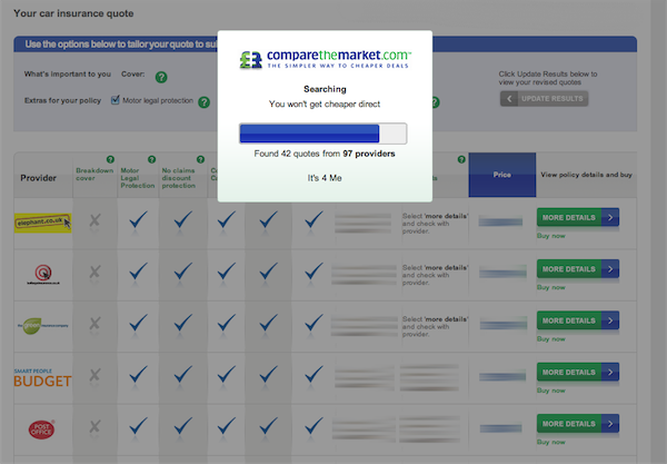
Edit: I saw an interesting use of a lightbox the other day, shopping for car insurance. I thought it worked quite well -- you select additional options on the page for adding things like breakdown cover to the base policy, click update, and the lightbox faded in and showed the progress of the update. Neat, direct, obvious what was happening.

enter image description here

6
  • 2
    I like that your links show both sides of the coin. It raises some interesting questions.
    – Janel
    Commented Mar 1, 2010 at 15:29
  • If the Lightbox plugin lets you point to the image itself in the image link, then I'm afraid you will be able to open it in a new tab.
    – Mashhoor
    Commented Mar 1, 2010 at 15:48
  • I'll update the question to clarify -- lots of lightboxes are being used as modal dialogues (see Find/Replace in one of the 37signals links).
    – Alastair J
    Commented Mar 1, 2010 at 16:40
  • If you want a comprehensive list of best practices for lightboxes you should check out uxmovement.com/content/…
    – user4549
    Commented Apr 7, 2011 at 20:57
  • 1
    @Mashhoor: Why "unfortunately"?
    – Jonta
    Commented May 23, 2011 at 19:24

9 Answers 9

24

I’ve no data other than some personal observations, but analytically modal lightboxes have such major usability problems compared the alternative that I can’t imagine what they’d be good for.

People have compared lightboxes to modal dialog boxes, which force the user to complete or cancel an act before proceeding, while still allowing users to see the previous content for reference. Assuming it’s actually a good idea to force the users to do something (and usually it isn’t), this forgets that dialog boxes have a major advantage over lightboxes: they’re fully moveable. The lightboxes I’ve seen can’t be moved, so the user can’t see all that’s behind for reference. Even if a lightbox were movable, you wouldn’t be able to move it outside the window frame so it is always occluding something.

If you need something modal in a web site, move to a new page. Like a modal dialog box, when the user moves to a new page, the user is forced either to complete what’s necessary or to cancel (via Back). Nielsen may talk about how well a lightbox captures user attention, but it can’t compete with presenting the user an entirely new page. If you need context from the previous page, copy the appropriate content to the new page.

Compared to a new page, lightboxes add mental workload, forcing the user to learn and remember yet another way of navigating. It’s bad enough that there are three inconsistent ways of dismissing some content in order to return to previous content. The user may need to use the Back button, or close the current window, or close the current tab. Now we add closing the lightbox, with its own idiosyncratic controls. Users don’t need this complexity.

Worse, it breaks the Back Button. If you leave the Back button enabled, users may click it intending to back out of the lightbox to return to the underlying page (or to move back a page within the lightbox such as when viewing a slide show). But instead, clicking Back moves the underlying page back, forcing the user to go forward and re-set everything up. If you disable the Back button, users may take it to mean the lightbox content is opened in a new tab or window, so they click the window/tab Close button to go back, blowing away the underlying page, its history, and maybe the entire browser session.

Lightboxes don’t look like popup windows, so they used to be a way to get around users dismissing new windows as advertisements, but now advertisers are using lightbox-like elements, so that advantage is fading if not already loss. Besides, new windows are modeless, so they’re for a different situation than the modal lightboxes we’re talking about here.

In summary, lightboxes represent a poor re-invention the dialog box with no advantage and new improved disadvantages.
14
  • 1
    Absolutely agree but they look so much better than traditional modal dialogues and especially alert boxes and that a big problem. Especially as the UI hasn't been standardised to the point that makes a consistent UI across different implementations.
    – Matt Goddard
    Commented Mar 1, 2010 at 20:09
  • I suppose looks are a matter of personal preference or fashion. As for alerts, I think most should be modeless, shown via things like in-line/on-page messages rather than modal dialogs/lightboxes (such alerts could use some standardization too). Commented Mar 1, 2010 at 22:00
  • Really interesting answer Michael, thanks. I'm not yet convinced they're wholly bad or good. Has anyone seen any usability test data to back up personal observations?
    – Alastair J
    Commented Mar 3, 2010 at 22:34
  • Yes, I'd like to see real data too. After I posted, I had second thoughts about my response, realizing it didn't really answer your primary question. Commented Mar 4, 2010 at 13:01
  • The very first time I used a lightbox, I had people calling me with "Hey the site looks good but I noticed the back button doesn't work"... I had to tell them that it was "their fault", which really sucked.
    – user4487
    Commented Apr 8, 2011 at 22:28
8

We did some user testing very recently that made us rethink the lightbox style approach, mainly due to reliance on browser controls within our target market. Seemed to fit the requirements so well at initial design phase, but the users were utterly confused.

I wondered if the lack of graphic design was a factor (we were testing on wireframes) but even tweaking the pages so the background was darker, boxes bigger etc. didn't help clarify how they should be used for our particular group of participants.

Yet another lesson that different audiences behave in very different ways.

0
5

This is just a personal observation, but lightbox-style modal dialogs have several useful attributes:

  1. They emphasize the contextual relationship with the page on which they appear (displaying the lightbox content in a new page would break that conceptual link)

  2. Displaying a lighbox dialog is much faster than navigating to a new page (No need to incur the latency of a server round trip)

  3. By staying on the current page, there is no issue of storing the page state (A user's in-progress edits would have to store somewhere if we were to navigate to a new page instead of showing the popup).

Lightboxes are definitely a usability enhancement, especially if they are kept small and concise.

1
  • A lot of the round trip issues don't matter in modern frontends that are totally javascript-based. In those cases the "page" transition is done almost instantaneously by rendering templates in the browser while still maintaining history and browser controls.
    – Soviut
    Commented Apr 24, 2014 at 17:59
5

One thing that has struck me is: why are lightboxes so popular if they are so unusable? Is it a fashion thing, like the great Frame debacle in the late 1990's? Or is it because they're easier for developers to code? Or is it because users like them?

Time will tell. I suspect that if they were truly unusable they would not have the level of adoption they currently enjoy.

2
  • My current job and my previous job both had some IAs that were enthralled with modal windows to the point where we seemed to have more modals than actual pages. Alas, these IAs had no real front end development experience and weren't really up to date on modern UIs (mainly due to them having to work on the enterprise software we were updating which, itself, was woefully behind the times), so I think the modal became a crutch...it's new, and 'feels' modern so we'll use it everywhere!
    – DA01
    Commented Jun 25, 2011 at 1:10
  • 1
    I can't speak for everyone, but I know a lot of people respond positively to lightboxes because of the animation, which can make old-school popup windows look very old-fashioned (regardless of whether or not they're easier to use).
    – Kit Grose
    Commented Apr 23, 2012 at 0:17
4

I find the popularity of these implementations quite disconcerting and a step back from trying to have the user feel in control. They also often have lengthy animations that gets in the way of a workflow. Image galleries with lightbox style blow-ups tend to keep the user waiting for the bigger image to load and while waiting - the user is unable to continue scanning the gallery or doing anything with the rest of the page.

I generally utilize non-modal dialogs in web applications clearly styled in a desktop window fashion, draggable and normally possible to open multiples of them from say a list of items that have details or can be edited.

There's also a neat little library called Highslide JS for image galleries in this fashion. JQuery UI has a simple popup dialog style that can be used for both modal and more important non-modal popup windows that looks like the thing too.

I'm still not sure this is the best way to go though. Sharepoint 2010 has their popups covering the entire page as if it's a new page (even though it's technically not). This gives an interesting degree of focus to the form or settings dialog that is displayed without actually going through a page reload cycle - but it only makes sense if the user is guaranteed to be fully focused on that task alone and can stand whatever loading time the lightbox incurs. Browsing an image gallery seems like a completely different world...

2

Interesting ideas Michael - it definitely seems that there is no consensus yet regarding the good/evil of lightboxes. I would disagree with the following though:

If you need context from the previous page, copy the appropriate content to the new page.

What happens when all the content on a page is relevant? It would all need to be duplicated, resulting in unwieldy websites with a lot of duplicated pages.

If you need something modal in a web site, move to a new page. Like a modal dialog box, when the user moves to a new page, the user is forced either to complete what’s necessary or to cancel (via Back).

If the page contains context-sensitive information (data entry forms, etc) then navigating away to a new page can cause uncertainty in the user as to whether or not the data has been saved. With a lightbox the user can see that their data is still safe, and will be there when they've dealt with the modal.

Just my twopenneth there.

1

I guess not so much a best practice, but something to consider.

Lightbox based pop-ups for marketing increase conversion rates by a very sizable % (depending on implementations I've personally seen 60-153% increase).

While the question is it good for the end-user is valid... the other question is it good for the site owner. And in these circumstances are a resounding yes.

Example use-case -

  1. person hits your site for first time to read a blog post
  2. wait 180 seconds, if they are still on the page - popup
  3. if you like this - subscribe to receive the blogs via email for free

I would argue this is good for the user as well because if they spent 3 minutes on the site reading the blog post it was something of value. Not everyone understands RSS and many people ignore the advertising/etc.

1
  • The flip side to this, when I initially navigate to a site, if it immediately pops up a modal/lightbox I generally immediately exit the site. Especially since this frequently happens with my cellphone, half the time I can't even physically close the lightbox because of their poor implementation. Commented Aug 5, 2014 at 18:47
0

See my answer the last time this question was asked - I still feel the same way: When should you use a modal dialog box?

I wanted to comment on a part of your question as well:

However, they often don't allow the user to open images or perform that task in a new browser tab, for example, which can frustrate many.

The point of the lightbox is that these actions aren't really necessary - there's no need to open a new tab when you aren't leaving the page to begin with.

1
  • 2
    That does frustrate users (like myself), who might want to read copy separately to looking at images. I know they're meant to keep things "on one page", but they fail for more advanced users.
    – Alastair J
    Commented Mar 3, 2010 at 22:36
0

I'm working on an implementation of a webpage that needs to feel like a flexible web app. There are multiple forms that the user can fill out.

For my purposes and users, here some assumptions (agreed on by stakeholders & SMEs, but may be overturned in user testing):

  1. Users coming to this web app know what they want to do. They are coming to complete a specific task known in advance. That is the purpose of this page. Users don't come here to look around.
  2. Because they know what they're doing, they know the required information to fill out the necessary forms.

I've been suggesting the use of lightboxed forms. I'd normally be against using modal windows, but I'm am also VERY opposed to just sending the user to new pages every time they attempt a simple update or add. And I don't think that accordions are the correct solution here (though they might be an alternative option).

In our context, the lightbox forms are only displayed upon user request. They allow quick, easy escape/closing. They focus the user on the action they just requested so there is no surprise at the change on the page. The users are not removed from the page/app they are working in.

One of the forms has three (3), discreet steps. So we are using a wizard in the lightbox with progress tracking. This has actually been a significant challenge point with a single person in our group, who (rightly so) is adamantly opposed to multi-panel modals. Usually I agreed in whole.

In this case, a wizard is an accepted pattern for this type of interaction. The users know what they are trying to do and the steps necessary to do it. The lightbox focuses the user on their requested action without leaving the overview page (which gives information on selections and previous action inputs), but allows for quick closing.

While I agree that modals/overlays/lightboxes/etc should be used sparingly, they are not evil or poor UX by nature. User requested versions for a focused task are a valid use case and in many situation may be superior than alternatives when implemented carefully.

Your Answer

By clicking “Post Your Answer”, you agree to our terms of service and acknowledge you have read our privacy policy.