4

What would be (from a UX perspective) better solution:

  1. Use radiobuttons to choose an amount (eg: 2,5/5/7,5/10) and use a large submit button or
  2. Use 4 buttons with the amounts on it (eg donate 2,5/donate 5/donate 7,5/donate 10) as a submit button in itself and remove the large submit button

What are your thoughts?

1
  • What is the amount for? You mention donate in point 2 - is that what this form is? Have you got a current mockup of what you're thinking of going with as it's easier to visualize your issue if we can see a representation of it.
    – JonW
    Commented Nov 27, 2013 at 9:21

4 Answers 4

6

If it is about a donation, the more "friendly" it is the better donation you will get. I suggest to make big clickable areas (so 1 button each time) and find a funny way to make the users want to give more >> Insist on how happy you will be instead of the ammount

Edit : My fault, i didn't see it's about mobile form. I updated my mockup whith a mobile version

mockup

download bmml source – Wireframes created with Balsamiq Mockups

2
  • 1
    I doubt this suggestion will work on mobile (the question is about mobile), but I agree with the basic idea.
    – Lovis
    Commented Nov 27, 2013 at 10:05
  • +1 for the nice smiley concept :) and for updating after receiving comments Commented Nov 27, 2013 at 15:54
3

I like the Renaud's answer very much. However I'd do it in a bit different way.

I'd fill the whole screen with large smiley face, and on the bottom put scrollbar with amount one wants to donate, and the donate button. The scrollbar should be 'discrete' (with only four values you allow users to donate). When someone swipes the scrollbar, the smiley should change accordingly. Even better if you create some pretty transitions between the faces.

mockup

download bmml source – Wireframes created with Balsamiq Mockups

2
  • 3
    Maybe it should start the other way round: The smilie goes "oooh" when you slide down.
    – kaiser
    Commented Nov 27, 2013 at 13:28
  • Slider will make user to donate more than a regular button. +1 for that
    – Abektes
    Commented Nov 27, 2013 at 23:53
2

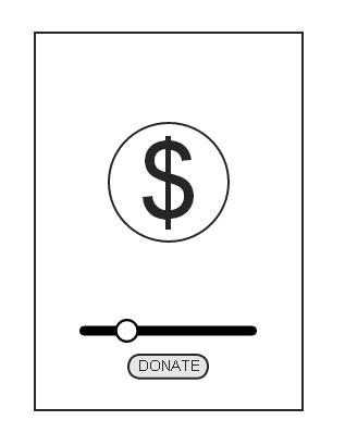
I really liked the ideas mentioned by Renaud, but it seemed his idea wouldn't suit mobile use. I simplified it a bit towards mobile use:

enter image description here (note: i'm a utter newbie using wireframes atm :) ).

I would suggest a simple slider bar, sliding per fixed points. I suggest smaller white dots along the scrollbar.

It might be an idea to increase the circle with the $ sign to increase with the amount donated.

1
  • 1
    Just so you're aware, UX.SE includes a copy of Balsamiq for producing simple wireframes in the browser. Just click the little icon next to the image icon in the editor.
    – Kit Grose
    Commented Nov 28, 2013 at 22:57
0
  1. Display four buttons in a vertical list, each with large clickable areas, for both desktop and mobile.
  2. Use "Donate [amount]" labels for each button to prevent ambiguity.
  3. List the smallest amount first as a courtesy to the user.

Your Answer

By clicking “Post Your Answer”, you agree to our terms of service and acknowledge you have read our privacy policy.

Not the answer you're looking for? Browse other questions tagged or ask your own question.