1

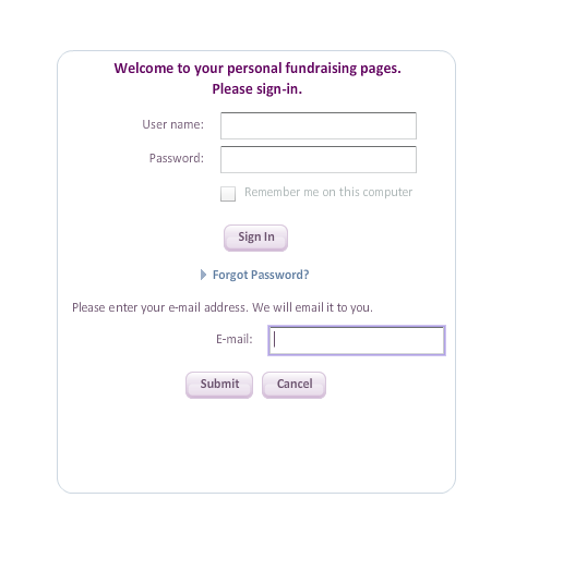
I recently encountered this approach for the Forgot Password link on the LLS site. When you select the link, you are not taken to another page. Instead, an email field is displayed. This seems to be a more efficent approach than the traditional solution, which navigates you to a separate page. It's faster and doesn't take you to another page, because you'll have to return to Sign In anyway when you retrieve your password. Does anyone see anything wrong with this approach?

enter image description here

enter link description here

2
  • I guarantee people will enter their email and click submit when they wanted to log in, or enter their username and password and then hit submit instead of sign in
    – jimSampica
    Commented Aug 21, 2013 at 22:01
  • In the mockup, there is definitely not enough distinction between the fields for the sign in and the fields for the forgot password. The Forgot Password section and its controls would need to be clearly different to the user in order to avoid confusion.
    – smoca
    Commented Aug 22, 2013 at 13:56

4 Answers 4

6

The problem here is NOT two forms at one interface, it is the transition. The new form appears in less time than a blink.

Here I've come up with nice solution:

http://codepen.io/jivanshr/pen/JhoHp

1
  • 1
    Same opinion as @Jivan even if its just by hiding one form and show the other. For better user experience the UI should only give to the user what he is asking. Commented Aug 8, 2016 at 12:14
2

If you're using javascript to pop that up, you might as well hide the other fields and buttons to avoid confusion.

1

Forgotten passwords are mentioned in this NNGroup article. Jakob Nielsen recommends doing what is best for experienced users:

"Efficiency for the experienced is an important usability criterion. Any extra step is annoying when you just want to get moving."

The larger context of that quote is accessibility. In light of your question, I would take the quote to mean that causing another page to load keeps users from getting moving. It's just another hurdle in the way of actually logging in successfully to see their content. Login walls themselves are increasingly deterring users from committing to the interaction cost necessary to see their content. (From personal experience, as someone who forgets passwords a lot as I have many to remember, the fewer hurdles there are in getting me in to what I want to see, the better.)

Anindya Basu's recommendation to wipe the current fields is good, with two modifications: I would add further visual cues and a helpful message to let users know what they need to do.

If a site just wipes a user's input data, the user's perception will be that something is wrong with the site, not their input. That problem becomes worse if it scales up to very long forms behaving like this. This is why they need a visual cue, such as a border on the form and different colors.

Users need a helpful message in addition to the visual cue because forgetting passwords is an experience that makes them feel stupid. The site needs to give them positive feedback. Consider this from About Face 3:

"But to be given negative feedback by a machine is an insult. The drill sergeant and professor are at least human and have bona fide experience and merit. But to be told by software that you have failed is humiliating and degrading. There is nothing that takes place inside a computer that will be helped by humiliating or degrading a human user. We only resort to negative feedback out of habit."

Their related design principle is this:

"Users get humiliated when software tells them they failed."
0

I would use javascript/ajax to just wipe the password field and then change the username field to a "Enter username/password" so that they can send a reset email to the email account entered, or the one attached to the username.

Doing it all on one screen makes for a much more smooth and seamless process.

There isn't much that can go wrong with that process, if you make sure to wipe the current fields and change them to the reset fields, there isn't a way for the user to accidentally enter the password reset/forgot step AND complete it without realizing what they're doing.

Your Answer

By clicking “Post Your Answer”, you agree to our terms of service and acknowledge you have read our privacy policy.

Not the answer you're looking for? Browse other questions tagged or ask your own question.