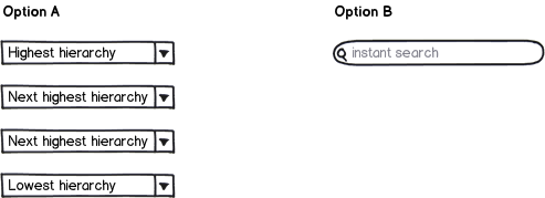
The user-friendly option is search. Sadly, the serch has to be good to be of use.
When a user wants an artefact, they are happy to just get it. Creating one's own good storage concept and applying it consistently is a hard cognitive task. Understanding a storage concept created by somebody else is even harder, and that is what you are doing in Option A.
There are countless examples for this, in and outside of software. Imagine going to a library in search of a specific book. Is it easier for you to start looking for it based on your knowledge of the (very logical and well thought out) ordering system, or do you go to a librarian or a catalog machine to find out its exact location? Even if you go there for browsing, you probably don't want to browse everything, and having somebody point you to shelves with the type of book you are interested in is easier than holding in your head that the ancient Greek drama is in the back left corner and gardening advice is in the middle left shelf in the second room. Even as an expert user, getting an answer to a concrete search query is preferable to navigating, because navigating is easier for you than for a novice, but not as easy as just being told what you want without the need to reconstruct the information from an abstract navigation schema.
Some prominent examples in the software field include:
Web search. Option A was widespread in the early days of WWW, with Yahoo becoming one of the early dotcom stars based on this principle of categorizing the Web. As soon as a convenient, simple search (Google) came along, their popularity started rapidly declining, even though they switched to the search model later. But as you will notice, a search had to offer a certain minimal level of usefulness before it got accepted, others tried this model before PageRank and failed.
Launchers on desktop computers. The start menu has been industry standard since Windows 95. After a few years in which the Mac users had launchers, and Linux copied them, offering isle solutions more or less integrated with the desktop environment, Windows also caught up with the trend, offering a usable launcher within the start menu with Windows 7 and now even daring to do away with the whole menu for Windows 8. (I know that users hate this; this is just resistance to change. I have personally observed people who used to cry for their start menu suddenly realizing how much better the new way is). Again, this feature needed a minimal quality before becoming a viable alternative to the start menu. There has been a "run" box in Windows for ages, but having to type "Program%20files\Paint.NET.exe" is worse than a menu, while typing "paint" and getting the choice between MS Paint, Paint.NET and "PaintShadesGrandmasHouse-Renovation2011.docx" is great.
Amazon is an interesting example, because it offers you both. It has a good search, and also a navigation which is much more sophisticated than a simple tree structure, allowing the same book to be filed under multiple categories. I don't know about you, but when I need a specific book, I type the name in the search box. If I need a book on a topic, I search for a keyword from this topic, and sometimes use the recommendation of similar items. I have never felt the need to directly navigate to a category. I just tried it for this answer, and my first two tries failed, even though I tried looking for books from fields I am very familiar with. The problem, as anybody who has ever tried to box information into a hierarchical structure can tell you: The criteria I use in my head to divide books into categories have very little in common with the criteria the Amazon people used. Guessing the content of a given category was hard, and I ended up being wrong frequently. When I read "food cultures", I imagined books on e.g. Victorian English food. It turned out to be books on eating vegan, or wheat-free, etc. At the same time, when I opened a category which was obviously correct for the book I was searching, about half of the sub-categories looked like equally likely candidates to contain it.
So, if you want to offer your users a good experience, give them a search. But it has to be a good one. And writing a good search is terribly hard. Simple pattern-based search (which does not find the item "mouse" when the search query is "mice") is not good enough. If you are writing a desktop or web application, use a third party search library. I don't know if there are any available for a mobile applications. If you can't use a good search, you may have to test the usability of the navigation option against the accuracy of whatever search you are capable of creating within the project, and choose the option which frustrates your users less. But none of them is especially user friendly, and both will lead to a significant percentage of failed tasks.


