1

I've been looking at a few good looking websites and it seems larger headings are becoming more prevalent (why ?) and I'm currently working on redesigning this page:

http://broadcasted.tv/show/47/arrested-development/

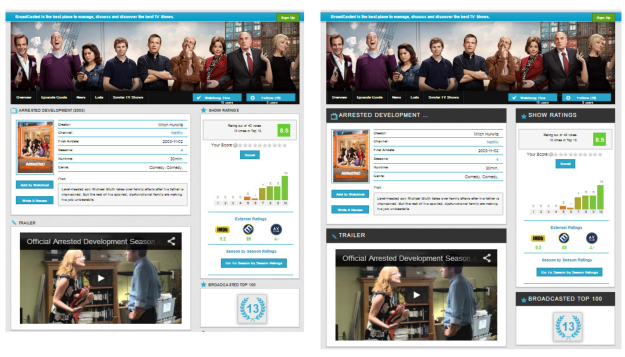
The new design can be seen with larger headings there (ignore minor bugs and css fixes needed):

http://broadcasted.tv/testdesign3.php and without there ( http://broadcasted.tv/testdesign4.php)

Any arguements for / against larger headings ? What do you think of how the new headings look ? Better/worse ?

Edit: Here are some sides by sides of different options: https://i.sstatic.net/sfQaC.jpg

4
  • 1
    Sounds like you've found a solution but haven't got a problem that is being solved with that solution. You should determine the site / user requirements and then build the site to fit those requirements. Maybe those requirements will necessitate the use of a large header, but who knows? Don't say 'I've seen some big headers, should I use one'. That's just shoehorning something in for the sake of it.
    – JonW
    Commented Aug 7, 2013 at 12:56
  • My original problem was that nothing really seem to stand out enough on the page. I get your point though.
    – Callombert
    Commented Aug 7, 2013 at 12:58
  • Bigger doesn't necessarily equate to 'standing out more' though. It could just be a bigger area that gets subconsciously ignored.
    – JonW
    Commented Aug 7, 2013 at 13:01
  • Btw, don't make your heading large and static at the same time. Some sites leave a very small space for actual content.
    – Inca
    Commented Aug 7, 2013 at 16:49

4 Answers 4

2

Headings should visibly separate (and encapsulate) sections. Bigger and stronger headings in your case do it better. In this situation I believe bigger headers with dark background do it better and thus are the direction to go.

2

Headings should be visually distinct, but that doesn't necessarily mean bigger. Visually distinct can be accomplished with color differences or separating elements (borders, drop shadows, etc).

The problem with bigger is that you are taking up more screen real estate for the same amount information.

I would try the size from testdesign4 with the coloring from testdesign3 and see how that looks.

Also, try doing the headers in mixed case rather than all upper case.

0
2

In short: large contrast headers attract user's eyes.

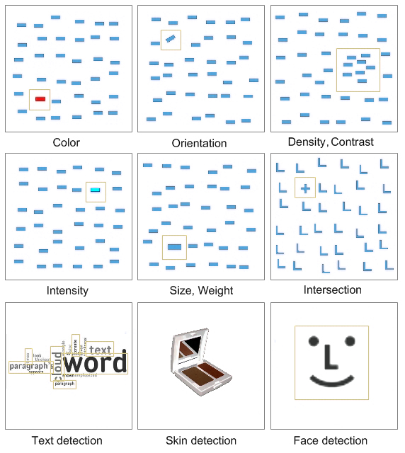
There is Feng GUI tool which allowed to analyse picture and find points of interest, i.e. user's attention attracting points. Now it isn't free, but they show features which catch attention:
enter image description here

Even primitive visual analysis allows to claim that big contrast headers are more prominent:
enter image description here

But having said this all, @JonW is right: first define a problem then search for solution.

0

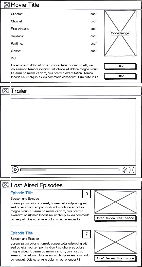
I think a better way to approach this is have the headings in line with your main content. The user's eyes will look mostly at the content so if your heading are closer to the content, they will notice it more. When I first glanced at your site, I barely noticed the headings since my eyes just focused on the content even with the change.

So a combination of this and your larger headings should look nice.

mockup

download bmml source – Wireframes created with Balsamiq Mockups

Your Answer

By clicking “Post Your Answer”, you agree to our terms of service and acknowledge you have read our privacy policy.

Not the answer you're looking for? Browse other questions tagged or ask your own question.