5

I'm designing a long form for insurance provider (est. 40 fields we need to ask)

My questions are:

  1. Should I try and fit all this on one page (so people can view all questions on the form and decide whether to complete or not)?
  2. Should I try and make it more 'fun' and design it like an app rather than a traditional form of radio buttons/dropdowns?

What I mean is the design is primarily for use on tablets. Within each section, the view slides onto the next question (question 1 of 20 and then slide onto the next question).

0

4 Answers 4

8

Should i try and fit all this on one page (so people can view all questions on the form and decide whether to complete or not)?

Sequencing

The key UX principle behind this is often called Sequencing. It stands for the simple concept that:

People are likely to be more motivated performing small tasks (rather than big).

So you can increase motivation by breaking a big task into smaller tasks. Also, by breaking your form into smaller sections, you reduce cognitive load - who can grasp 40 fields?

Sequencing an intern

A good example for sequencing is telling an intern what to do. Consider you're an intern showing up in the morning, and your manager asks you to perform the following tasks:

  • Make some coffee.
  • Go to the shop and buy some papers.
  • Stock up the fridge.
  • Take empty glasses from all rooms.
  • Go through all CV applications.
  • Read 7 articles and pick the best one.

Compare this with you coming and your manager only asks you to:

  • Make some coffee.

Then when done, you'll be asked for the next task (and so on).

Feedback Loop

Another thing that can enhance the user experience is showing some 'rewarding' feedback whenever they complete a part of a wizard - people are more likely to continue filling the form if they something is visualising their progress. A progress bar comes to mind here.

Progress Bar vs Steps

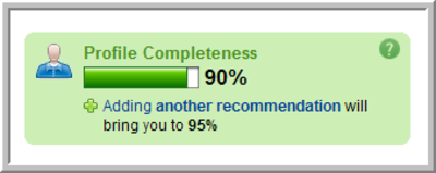
While Revolt's proposal is good (to show all different steps and those completed), you can further enhance sequencing by not showing all steps in advance. Instead, use a progress bar to show progress and each wizard tab will have a button linking to the next step. Something along these lines (taken from LinkedIn):
enter image description here

This way, you conceal from the users the scale of the form (people may be put off having to fill 7 steps). This also adds some mystery as to how many steps there are.

If such is the strategy taken a few recommendations:

  • Keep early steps extremely short.
  • Event if some steps will take longer to complete than others, you may not wish to give the percentages pro-rata, ie, for 5 steps each will be 20% - given that early steps take less time to complete, this will give the user the illusion that overall it will take less time to complete the form.

Should i try and make it more 'fun' and design it in an app like way rather than a traditional form of radio buttons/dropdowns?

By all means make it fun. Fun is good.

5
  • Do you have a source for the quote on sequencing?
    – Kit Grose
    Commented Jul 24, 2013 at 23:46
  • 1
    Seductive Interaction Design by Stephen Anderson. Mentioned in the same breath as Endowed Progress Effect (Nunes & Dreze).
    – Izhaki
    Commented Jul 24, 2013 at 23:58
  • I agree with your assessment except "not following pro-rata" approach. In profile completion example, you can always start first step and reward higher percentage to progress bar so the user may have a sense of achievement and an impression that completion is near - but - in this case where every field of the form must be filled and in one go, a disproportionate progress bar would prove rather dis-satisfying. Commented Jul 25, 2013 at 5:10
  • 1
    +1 The main difference between your manager/intern example and filling out a form to keep in mind is that the intern expects to be given new tasks, while someone filling out a form expects to be done. Unless you inform them how many steps are left, they will/may get annoyed at new questions cropping up every time they think they are finished. Commented Jul 25, 2013 at 7:23
  • I agree. There are pros and cons in each approach.
    – Izhaki
    Commented Jul 25, 2013 at 8:52
2

I recommend reading this: An Extensive Guide to Web Form Usability

1) I would highly advise not to have one large form. It's very intimidating for users to see a long form and would most likely discourage users from filling it out. As Revolt suggested, you should separate your forms into multiple steps (with a progress meter) so that it softens the blow.

2) This is more of a personal choice than a UX question. If anything, you should design it with a similar aesthetics of your brand and how you want your brand to be viewed.

On the side note, I don't recommend having the form automatically going to the next set of questions once the user is finished. Most of the time, I go re-check the entries I filled out before submitting it. This is also an unexpected behavior which the article advises against.

Sudden changes in behavior or appearance will make users edgy. Likewise, never introduce sudden changes between forms or between steps in a form.

0

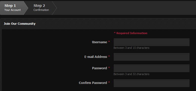
One great way to organize a long form is to divide it into sections, and then have another page for the next section, with a progress bar on the top ("you've completed 1 out of 3 sections"). Similar to how many forums do registration, it seems to work great.

enter image description here

1
  • I agree with @Revolt, this is the cleanest way to seperate questions, plus it does not overwhelm the user. Just be sure to use cross-page posting so that hitting the back button or refreshing do not clear the users work. Adding a simple 'Save and Continue ' button on each page is another clean way to do this. Commented Jul 24, 2013 at 16:08
0

I recently learned from a study mentioned in a TED talk that you can help keep users from experiencing decision fatigue by presenting questions in a certain sequence. The key is ask the questions with the simplest answers or least options first. For example, if you let users pick one of 4 engine types, and one of 30 paint colors, ask them to pick the engine type first. Scale up the number of options or the open ended-ness of the questions and people will stick with you longer.

Also, you may want to reevaluate the questions you are asking. I'm sure many of them are critical to ask at the time you are presenting this form, but can any be delayed until later? A strategy that I've seen from web marketing is to ask only very basic questions on registration, then ask one or two additional, non-essential questions at subsequent logins.

Otherwise, I agree with the other answers, particularly @Izkahi.

Your Answer

By clicking “Post Your Answer”, you agree to our terms of service and acknowledge you have read our privacy policy.

Not the answer you're looking for? Browse other questions tagged or ask your own question.