23

I am building a form for Mobile Web that requires users to enter in their DOB.

What is the best way to present the date input field(s)?

Some of the following options were identified in this question and its answers (thanks Oliver and those who answered it!) and I am interested if there's a different answer for Mobile Web:

  1. Single Text Field - A single simple free text field with an example (seems to be generally recommended approach for Desktop)

  2. Three Separate Text Fields - Users are able to enter day, month and year in three separate free text fields. With separate fields, this can cause some minor issues with users who look at the keyboard when entering data and not the screen so tended to enter in all fields then look up and notice that only the day field has been entered.

  3. Dropdown - Users can select the day, month and year from a series of drop down menus. So dropdown one is a list of 1 to 31, dropdown two is January through to December. This seems easier although the number of years in the final drop down is very long - 1920 to 2012 (?)

  4. Native Date Input - using to present a native-like compound menu control (see example about half way down this Smashing article on mobile form design or answers to this question (not specifically about DOB)) - I don't think this is universally supported on different mobile browsers though.

  5. Combination - Dropdowns for Day and Month (to ensure accuracy) and a free text field for Year (for faster data entry).

  6. Date Picker - Terrible option for DOB but I could present a date picker with a calendar icon where users can scroll through the months and years to select their date of birth.

In my case, it is for a CRM, so speed and ease of entry are more important than 100% accuracy.

I know that a simple single text field is fastest input method for most people. I am interested if the best approach for Mobile is different, as dropdown selection can be easier than text entry on Mobile.

Has anyone user tested any of the above options for Date of Birth entry on Mobile Web?

Bonus question: If it had to also work on Tablet and Desktop, what would you recommend?

2
  • 1
    Here's some user testing that suggests three dropdowns may be best on mobile... seren.com/blog/so-thats-why-dob-fields-are-dropdowns
    – Dan
    Commented Jun 18, 2013 at 19:00
  • 1
    "it is for a CRM, so speed and ease of entry are more important than 100% accuracy" :) every year I get an automated birthday greeting on the wrong day. It's quite annoying but more importantly reduces trust in that service.
    – Jason A.
    Commented May 20, 2015 at 8:27

5 Answers 5

22

The UK site GOV.UK published some initial test findings about how users on mobile devices use a DOB field they were testing against.

Initial reports suggested that having two dropdowns (one for day and one for month) followed by a text field for year was well received by users, although not exclusively. (emphasis mine).

enter image description here

...This tested much better, and people were able to complete this question more quickly. We also had unprompted comments from people who were pleasantly surprised to not have to deal with a long drop-down for year.

However, we test with a wide range of people, and we did find some problems with people who were less experienced with computer interfaces.

Some people click a drop-down and then try to type. This does work, but it doesn’t act the same as a text input field, and is therefore confusing. For example if you type 1, then pause and type 2, you will select 2 in the list, not 12 as you would get in a text input field. The backspace key does not work.

Some people had trouble interacting with even with the shorter drop-downs. Day and month both require scrolling, and we saw some people having issues with scrolling in general: knowing whether they could, and how to do that. People who struggle here often say that the value they’re looking for is not in the list.

Once they figure the first two drop-downs out, we saw people then get confused when they click into the year field, and get no drop-down.

People having these problems were in the minority, but we felt it was worth trying another approach to see if we could find something that worked for everyone.

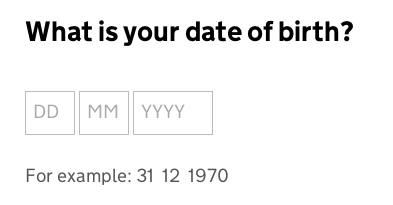
Their follow up test was to use plain text fields:

enter image description here

So far this has tested well, with the main issue being that some people pause and wonder whether to include a leading zero (for example ’01′ ).
...
On touch-screen devices such as phones and tablets, we can show a numeric keyboard by using the ‘type=”number”‘ attribute. This makes the expected input clearer (a number, not a word) and makes it quick and easy to enter a number.

Personally, I have recently opted to go with the plain text field option. The ability to set the fields to open the numeric keypad by default negates issue of "do I type 'Feb' in here?" variety, and also allow quick entry of dates (my application is for a multi-use calculator so isn't a single use variety - meaning that if someone is going to repeatedly use this app then the dropdowns could get annoying - something that you allude to may be your situation:

'In my case, it is for a CRM, so speed and ease of entry are more important than 100% accuracy'.

Having three separate fields means I can allow people to type 1 or 01 into the field and treat them both as the same thing so the issue of "do I type two digits or one" is also negated to an extent.

2
  • Thanks @JonW this is useful. Good to know that using the numeric keyboard helps!
    – Dan
    Commented Mar 19, 2014 at 18:25
  • "Having three separate fields means I can allow people to type 1 or 01 into the field and treat them both as the same thing" Why would this be dependent on having 3 separate fields, rather than just more flexible data input?
    – Peter
    Commented May 20, 2015 at 8:02
5

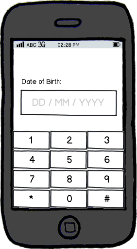
mockup

download bmml source – Wireframes created with Balsamiq Mockups

I believe that single field (with guidance) paired with the number keypad is the fastest way to input birth dates. The amount of time a user will have to scroll through or tap through things can be reduced if you just give them full control to enter it manually. They'll spend the taps they otherwise would have used on a dropdown for example, tapping the exact numbers.

7
  • Thanks ruby! The above wireframe looks good. It would need the "/" key too, right? I think an HTML5 input type of "number" would do the trick, bringing up this kind of keypad
    – Dan
    Commented Jun 18, 2013 at 18:47
  • 1
    This would also need to support both mm/dd/yyyy and dd/mm/yyyy based on user preference. yyyy-mm-dd may be a better, neutral format. Commented Jun 18, 2013 at 18:57
  • Hey Dan, You could hav the "/" be included in the field formatting so it automatically adds it between the numbers.. :) Auto-format!
    – rubysoho
    Commented Jun 18, 2013 at 19:03
  • @RoddyoftheFrozenPeas good point - but if you have a format previously displayed, they can follow that convention.
    – rubysoho
    Commented Jun 18, 2013 at 19:04
  • 2
    As an American user, when I see a prompt for DD/MM/YYYY I have a mental hiccup and have to stop and think. It's an extra (minor) cognitive load. Commented Jun 18, 2013 at 19:30
1

I feel that either single text field or three separate text field would work the best in your case of having speed over accuracy.

Single text fields have their advantages because as a user I do not want have to stare at three different input fields and worry about tabbing through the inputs, however something that needs to be considered is where is the label going to be placed. In @rubysoho's example by having a placeholder the user has to remember which numbers go where, forcing the user to remember the placement of text is never good form facture. Also when using a single field I would have it so the "/" are added in after each letter combination is typed.

Advantages to having three input fields is that it is very standard for most users. They expect there to always be three input fields when typing in a date or phone number. This means that no speed is sacrificed. Tabbing through input fields can be resolved by having the focus changed after the required characters are typed in.

2
  • I like the idea of having the "/" added in after each letter combination is typed. It would have to be implemented so that if the user does type the "/" it doesn't result in a double //
    – Dan
    Commented Jun 19, 2013 at 10:18
  • 2
    I sometimes find auto-tabbing can be an unexpected surprise (usually not a good thing). In this case, it could throw users off in cases where they just use a single digit. For example, if they enter "2" for Day, then (manually) tab to the next field and enter "12" for Month, then it auto-tabs to Year. They might not have been expecting that auto-tab as they had to manually tab to get from Day to Month. Same problem applies to automatically adding the "/".
    – Dan
    Commented Jun 19, 2013 at 10:25
1

The reason we use all sorts of various forms for text fields is typically to validate the data. But these, IMHO, are all workarounds that are best handled programmatically. Assuming the app has a sense of regional differences, there's no reason that the date field can't be text and that some logic be applied to properly parse it.

  • June 8, 1972
  • 6/8/72
  • 06/08/72
  • 6-8-1972

etc.

There's no reason that client or server side code couldn't parse those out a majority of the time.

Beyond that, specifically for mobile, ideally you'd use the native date field option, as that's arguably what a user would be used to. If you can't use that, then I think it comes down to usability--which mode would be easier for a user to enter data into.

1
  • So for mobile you are recommending "native date field option" - that makes sense. Is there a way to do that reliably with Mobile Web (i.e. HTML5) rather than an App?
    – Dan
    Commented Jun 19, 2013 at 10:16
-2

The built-in date input works well on mobile and is easy to implement.

It takes into account the user's locale and date preferences (e.g. using mm/dd/yyyy format for US and dd/mm/yyyy for other regions). The interface is also familiar to the user. For example on iOS it's almost exactly the same as a native app date picker. (I suspect this is also the case on Android but cannot confirm this).

Implementation is simple, for example to set the date to Halloween:

<input type="date" value="2013-10-31" />

2
  • 3
    Hi evilcelery. Your answer is very short, deals with an implementation and does not tackle the OP question directly. I would recommend you either expand it or remove it.
    – Izhaki
    Commented Dec 9, 2013 at 16:02
  • Yes as a User Experience Q&A site we're not so concerned with how to implement something, but more about what should be implemented and why. This is very much a 'how' answer but you need to explain from a user perspective why your suggestion is appropriate, why it is preferable over other suggestions and what the benefit is overall.
    – JonW
    Commented Dec 9, 2013 at 17:05

Not the answer you're looking for? Browse other questions tagged or ask your own question.