11

I am working on a form design that has two mutually exclusive forms accessible via tabs (Option 1). During usability testing my team observed users missing the tabs and only noticing them when we asked a follow-up question. As a result, we want to combine the two forms and let the user choose if they would like to perform a reservation or promotional search.

We developed two options: checkbox next to the submit button (Option 2) or two submit buttons (Option 3). Which option would make the most sense? I think that giving the user two submit buttons/actions will introduce confusion.
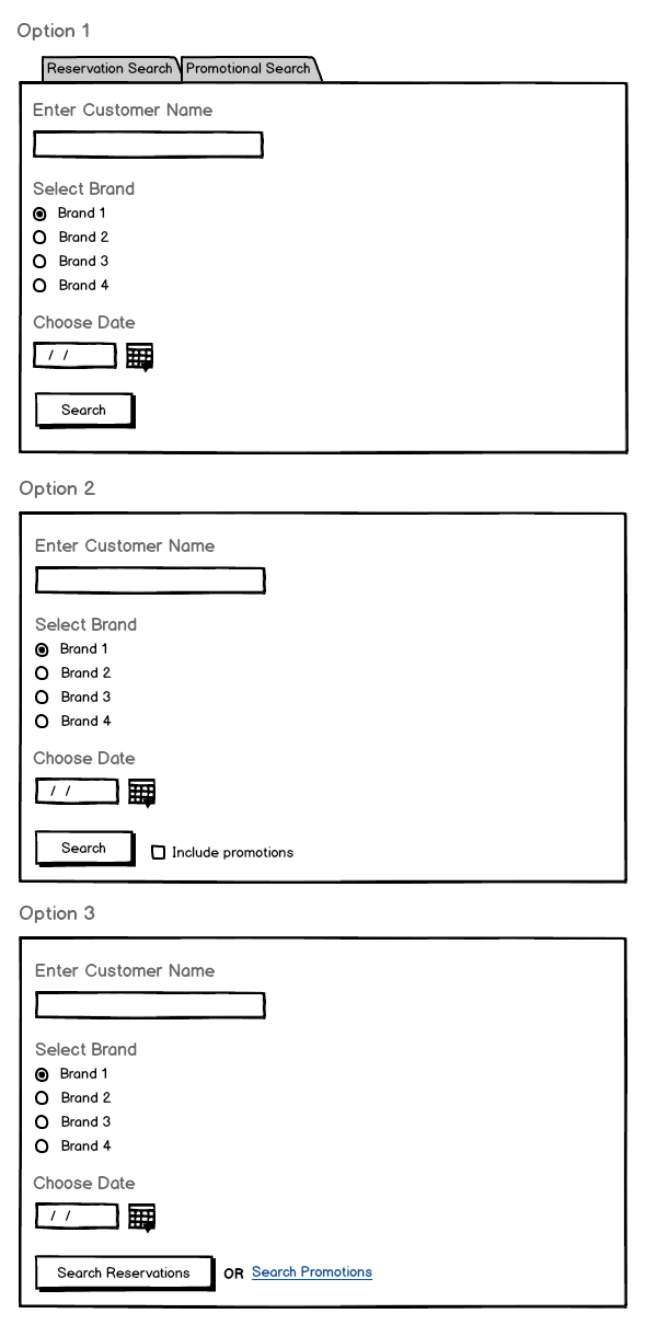
Three mockups showing the described options

Thanks for the help!

6
  • 2
    If the reservations/promotions are mutually exclusive, wouldn't two radio buttons be an obvious choice (in a section of their own similar to "Select Brand", either on top or bottom)?
    – dbkk
    Commented May 3, 2013 at 21:00
  • 1
    I should clarify: while reservations and promotions are mutually exclusive, each tab displays the SAME exact form fields. The only difference is what type of results they would see after submitting the form (reservations or promotions).
    – erik_lev
    Commented May 3, 2013 at 21:13
  • 1
    Well, you just answered it yourself — "the only difference is what type of results they would see after submitting the form". So the best choice, IMHO would be a set of radio buttons or similar control which will let user to chose for the desired result.
    – Ruslan
    Commented May 3, 2013 at 21:42
  • This is a modal issue (reservations mode vs promotions mode) so presenting a clear indication to the user what mode they are in at all times is vital. Also anticipating mode errors (e.g. user not knowing what mode they are in) should be part of the design process.
    – uxzapper
    Commented May 4, 2013 at 0:45
  • Curious to know why option 3 has search as both a button and a link - is "Search reservations" much more likely?
    – Peter
    Commented May 5, 2013 at 4:23

4 Answers 4

4

Why should users make this choice when searching? As the form fields are the same, use Option 1 but without the tabs. That way you remove an unnecessary choice for the first step.

Instead, you can offer the option to filter the results on the result page.

You could use the two tabs there, selecting the more common one by default. Or you could provide a form widget above/next to the search results where users can filter the results dynamically ("show both", "only show …"). Or display both result sets in two columns next to each other. Or similar (depends on the actual result content).

If you want to provide a "shortcut" so that savvy users don’t have to filter in the second step, you could use a split button, similar to the one from DuckDuckGo:

search button from DuckDuckGo

When clicking the search icon (or, in your case, the label "Search"), the default search will be done (search in both sets). When clicking the little arrow to the right, users can select between "Reservation Search" and "Promotional Search".

1
  • This is a very good idea! I'll need to work with our engineers to see if this will affect performance on our results page.
    – erik_lev
    Commented May 6, 2013 at 16:43
9

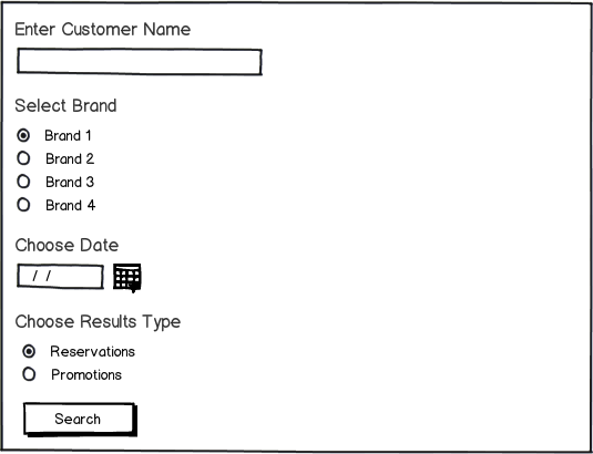
Radio buttons will be the most clear, as far as indicating that the options are mutually exclusive. Your Option 2 check box is very unclear. It looks like you can do a search with or without promotions, but from your description you're either searching for reservations or promotions.

I suggest something more like this:

mockup showing section with 'Choose Results Type' radio buttons before search button

download bmml source – Wireframes created with Balsamiq Mockups

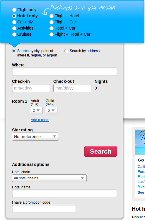
Using radio buttons to determine the scope of your search is already something that is used on the web. Here's an example: the Orbitz search form, which uses radio buttons to determine what type of results you get (Air, Car, Hotel, Air+Car, etc).

Search form from Orbitz.com which has radio buttons to determine the scope of the user's search

Using two different "buttons" that don't look the same is also inconsistent UI. Option 3 could work with two buttons, but as @usingtheinternet says, having multiple submit buttons can be confusing.

3
  • Interesting suggestion. You're right about the problem with the check box in Option 2, but can you justify what makes your new option superior to the OP's Option 3? "Choose Results Type" isn't very user-friendly language, and the presentation makes the form appear to be longer, which could reduce conversions. Commented May 3, 2013 at 23:35
  • 1
    @3nafish updated my answer to respond to your question.
    – elemjay19
    Commented May 3, 2013 at 23:42
  • 1
    I would use something like "Search for" over "Chose results type" because it describes the action better.
    – uxzapper
    Commented May 4, 2013 at 0:35
1

If the user doesn't need to worry about it until it's time to click search, why not just end the single form with search reservations and search promos buttons. If it's somehow relevant, you could even use a representative icon in each button to reinforce the distinction at a glance.

2
  • My option 3 does address this, but I don't like that the user has to choose between two submit buttons at the end of the form.
    – erik_lev
    Commented May 6, 2013 at 16:47
  • 1
    I think the two options become more difficult in your example because they take different forms: button and text link. Having two clearly marked choices at the end (reinforced by icons) makes for a fairly simple form. Commented May 6, 2013 at 17:36
0

Agree with unor that letting users filter by results would be a useful approach. However I'd also consider using a dropdown for "Select Brand" rather than radio buttons - the form is getting pretty long, and if you decide to filter using radio buttons in the search field, it will get even longer. Obviously it'll depend on your specific application, but "Choose date" - is this a start date, end date - would a range make sense?

1
  • Drop-downs are useful for longer lists, but why hide only 4 options in a drop-down?
    – erik_lev
    Commented May 8, 2013 at 0:33

Your Answer

By clicking “Post Your Answer”, you agree to our terms of service and acknowledge you have read our privacy policy.

Not the answer you're looking for? Browse other questions tagged or ask your own question.