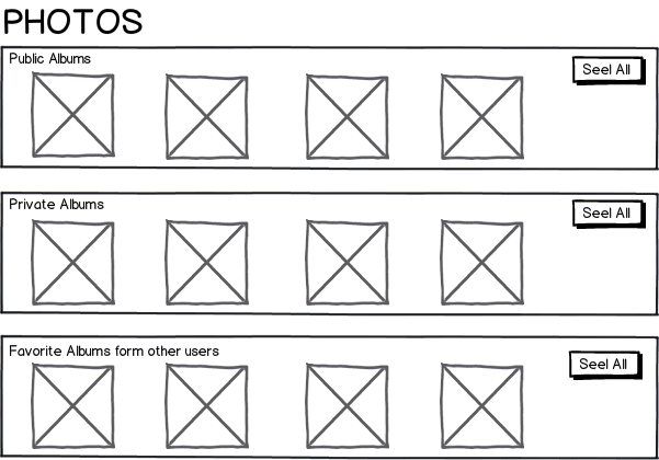
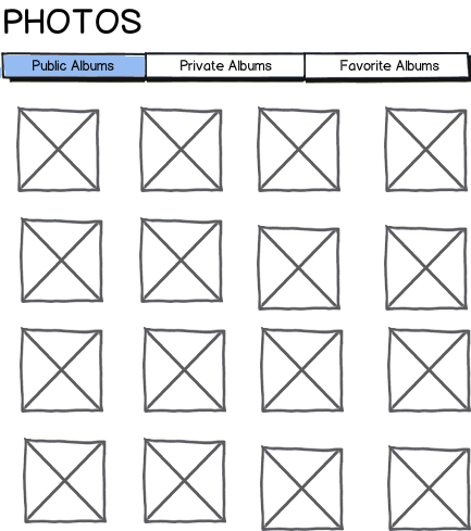
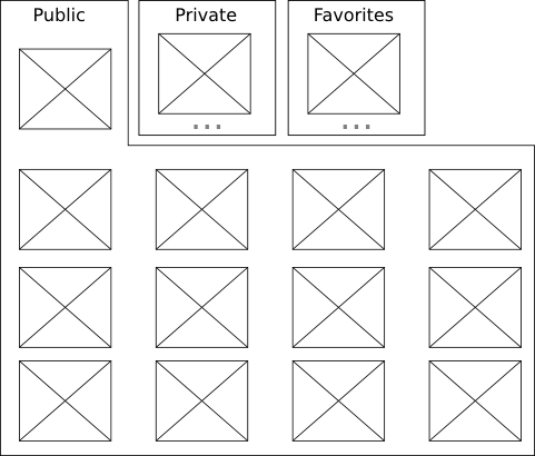
Both models have some pros and cons.
The First Model is used by Apple's App Store and works well but this model actually takes you to a new page where you get to see all images, and if you wanted to see the other gallery, you would need to hit back button to access other two categories. Second Model is better in the sense that it makes you feel as if you were on the same page while switching between the tabs.
On the other hand, First model seems to be better considering that you are teasing your user with a small bit of interesting information from each section, and the user is able to see bit of every section, and he/she would go for the one which interests him/her the most. Sounds good too.
Providing choices in the beginning is good as well as bad in a way. Good because you were able to pick a path that seemed right the first place — but at the same time, when you picked one out of three gallerias, you left 66% and went for 33% of available choices. What is the likelihood that you would want to revisit your decision and go back to the other two sections before finishing your picked section? For the first model, there will be an urge to check other sections out. Considering the Second Model, such urge wouldn't be there. Also one gallery was pre-selected for you so so if you have to make a choice, you have to pick one out of the two options instead of the three options of the first model — and at the same time, you have seen first default gallery considerably more.
Concluding: I would recommend to use the Second Model as it has the following good aspects:
- The user doesn't move between pages.
- The user is able to browse a section without having to make a choice.
- The user has fewer options to choose from, and decision making would be rather easy.
- Considering the bandwidth and download performance, Option Two is slightly more expensive but payoff is considerably more.


