2

I have a music portal where I need to make the users rank pages. Type of pages:

  • Playlist
  • Artist

I need the user to:

  • View rank.
  • Vote up or down.
  • The ranking must be a up / down vote system.

I have tried a similar model to stack exchange:

enter image description here

The feedback from the users (who are not familiar with stack exchange) wasn't good. They thought the buttons were to add to favorite or add songs to playlist.

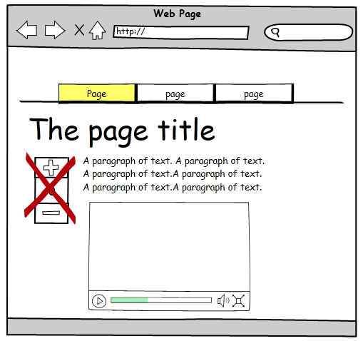
The layout of the page and the place of the rank is like this:

enter image description here

Any idea for best user experience that would make the rank action clear?

6
  • You first need to decide on what form of ranking you will use. Only then should you focus on how to make that form clear.
    – JohnGB
    Commented Mar 16, 2013 at 21:25
  • @JohnGB The form is a number that the user can increase or decrease.
    – user80042
    Commented Mar 16, 2013 at 21:28
  • You seem to be assuming that the ranking must be a up / down vote system, but your question doesn't specify that. Please clarify the question.
    – JohnGB
    Commented Mar 16, 2013 at 23:59
  • @JohnGB I updated my question.
    – user80042
    Commented Mar 17, 2013 at 13:10
  • 1
    From a UX point of view I'm uncomfortable with the phrase "I need to make the users to rank pages". Why not "I would like to encourage the users to rank pages"?
    – JonW
    Commented Mar 18, 2013 at 10:26

3 Answers 3

1

Stackexchange voting systems is not about rank, it's about wheather you approve/like/agree with an answer or question or not. It's not putting three stars of five in a ranking system per see.

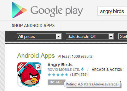
If you want a ranking system, try Google Play or AppStores way of ranking.

enter image description here

Edit

If ratings with stars doesn't do the trick, you could always try with a variant of this very familiar sign:

enter image description here

5
  • rank by percentage is not what I seek for. The #1 will be the page with most of the votes.
    – user80042
    Commented Mar 16, 2013 at 21:34
  • @user80042 And what does your users want? Commented Mar 16, 2013 at 21:36
  • To see how many users like the playlist.
    – user80042
    Commented Mar 16, 2013 at 21:38
  • @user80042 I've updated my answer Commented Mar 17, 2013 at 6:27
  • The problem is that "like button" makes an association to Facebook Like which move behavior like show your friend what you likes (it's not private).
    – user80042
    Commented Mar 17, 2013 at 13:10
1

What about this:

enter image description here

Explanation:

  • Using the words vote up and vote down to make clear is about rating.

Is that clear?

2
  • Can you add some explanation / reasoning for this suggestion, or say why you've suggested this?
    – JonW
    Commented Mar 17, 2013 at 17:59
  • @JonW I updated the answer.
    – user80042
    Commented Mar 18, 2013 at 9:52
0

There are a lot of examples of how to accomplish this out there. The difference between the plus/minus used in the wireframe and Stack Exchange is the use of the plus and minus in the first place, which, in your context may carry duel meaning (and may not fully demonstrate what the test users saw). Stack, of course, using up and down arrows to agree/disagree. So, it may not be the mechanism, it may be the visual representation related to the mechanism.

The like button, if styled to not look like the Facebook "like" button can be pretty effective - see YouTube for an example of this - and the Facebook "thumbs up" has become a kind of standard visual for saying, "I like this" - similar to male/female icons on lavatories. Further, Facebook requires the Facebook like button be styled (and interact with users) the way they say it should (since the sharer API is deprecated).

Also, the wireframe you are using does not indicate how one does add a song to a playlist or favorites; so, it may be possible that functionality is not explicit enough in comparison to the voting mechanism.

It also depends on your specific users. If you are testing with 10 users internal to the organization, I would probably say the test is not valid if the site is customer facing. Another option would be to make multiple (three, for example) clickable comps with completely different executions. Grab 150 people (50 for each comp), and see how each group responds to the variation. Take the best/easiest parts from each - create three more - do it again with 150 new people. And keep evolutionarily developing a solution until you find the "best" solution for the type of users you are targeting...which is pretty important - for example, if your target users are not familiar with Facebook - having a blue like button is not that big of a deal. Another, and my final option/example, would be to have faith in your users to eventually figure it out...just because it wasn't immediately apparent the first time they used the site is not an indication that the execution is not the best for your situation.


http://www.youtube.com/watch?v=v-l2zl85PHs https://developers.facebook.com/docs/reference/plugins/like/

Your Answer

By clicking “Post Your Answer”, you agree to our terms of service and acknowledge you have read our privacy policy.

Not the answer you're looking for? Browse other questions tagged or ask your own question.