8

What kind of data visualizations do you use to show a binary state of a month?

By "binary" i mean just two options for a month. Either "available" or "not available". The last vis on the example image would display that. But is this really the best solution available?

Examples could be:

  • Best Travel Season
  • Hunting Season

See image for examples on (non-binary) visualization. What do you think about a "classical" visualization like this: http://www.weather2travel.com/whentotravel/spain/costa-blanca/
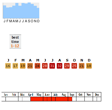
enter image description here

What are your experiences with the usability of those kind of images? Thanks

2
  • 1
    Could you clarify what kind of binary data you mean, as any given month could feasibly have more than two 'best time' for X activity. Is the bottom visualisation not already binary? in that it only shows two states per section of the month.
    – Kayo
    Commented Feb 5, 2013 at 17:11
  • thx for the hint, updated a bit clarification. Yes the last visualization would realize "binary as on OR off" but is this the best solution? (not very pretty also)
    – patrics
    Commented Feb 5, 2013 at 18:15

2 Answers 2

2

If this is just a list of months representing different state (true|false or on|off) I would use a valid icon for the different modes like the ones below. I'd also make the off|false modes looking disabled (a less intense color, as in greyed out which is something you see often in applications). Disabled because it's there but inaccessible.

mockup

download bmml source – Wireframes created with Balsamiq Mockups

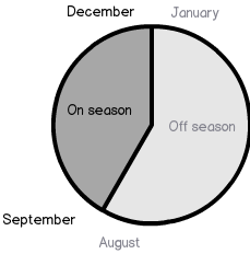
... but if this was a continous process, such as months with nice traveling weather, I'd try something looking more like a period of time rather than distinct months. Such as this:

mockup

download bmml source

The point here is that you don't have to write out all months of the year since they are continous. You get from the picture that January - August have the same state and that September - December also have the same state. Again I use the disabled grey style for Off season.

If users get confused by this, shown in a usability test, you could always add the in-between-months later on.

0

An idea is colour schemes. They have been proven to get their message across better because they stand out (and look pretty). If you are using binary values then I would say do something similar to what Benny Skogberg has proposed but with colour. Then comes the decision, Red for no and Green for yes? Red for hot and Light blue for cold? Just find a combination that fits with what you're trying to portray. Also bare in mind that even though some colour schemes are known by everyone as standards it's always handy to have a legend to reinforce what they mean.

1
  • Colour is not enough. Think of colour-blind people. Put different patterns too. Commented Feb 10, 2013 at 14:55

Your Answer

By clicking “Post Your Answer”, you agree to our terms of service and acknowledge you have read our privacy policy.

Not the answer you're looking for? Browse other questions tagged or ask your own question.