2

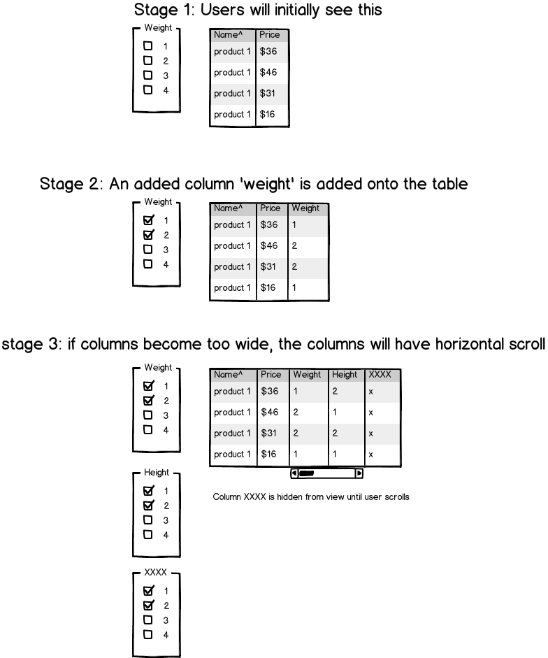
The initial table display shows the required information like name and price.

name | price

If the user wants to filter the product on a specification like weight, the table adds a weight column

name | price | weight

If the columns reach a max width, a horizontal scroll is added with the required information columns fixed.

Here is a clearer mockup - enter image description here

What are the negative impacts to this approach? Any way to improve it?

Thank you to everyone for taking the time to provide valuable input. It has made me rethink how I should organize my information.

4
  • Can you provide a wireframe/screenshot to show us what you mean? I could visualize what you described in more than one way, so I don't know which represents your specific example. Commented Jan 31, 2013 at 16:49
  • Sorry about that... imageshack.us/a/img842/1185/mockuph.png
    – dai
    Commented Jan 31, 2013 at 17:09
  • What is the upper and lower bound for number of columns and what is the average? Is this for a business app (inventory mgmt) or a e-commerce sales site? Commented Jan 31, 2013 at 17:32
  • It can reach up to 8 columns until there are no results. This is an e-commerce site.
    – dai
    Commented Jan 31, 2013 at 18:12

3 Answers 3

2

This feels like an awkward and unnecessary solution.

Firstly, it's possible that your domain is such that users don't need to differentiate between criteria matches, just see the matches themselves. Most listings sites that use faceted search provide search criteria that aren't reflected in the text of the listing summaries themselves, and that doesn't cause them any problems. You didn't tell us your domain or the sorts of items you sell, so I can't say if this will be the case for you, but it's certainly worth thinking about.

Secondly, I worry about the layout. I can't see an expanding table working well - either you're going to have to widen the table body itself (meaning it starts very narrow), or you're going to initialize the table body at full width and widen the records on demand, which will make things start quite unbalanced.

Thirdly, I don't like the notion of horizontal scrolling. It creates a rather small target to traverse the columns, and one that can't be used on touch devices. It also means the user can't compare columns that aren't contiguous, except by constantly shifting left and right. Drag and drop reordering could be fiddly and tends to be difficult to communicate.

Fourthly, the flow seems counter-intuitive. By adding filters, I'm creating a small set of close matches. It's going to be better to simply open and preview the two or three most attractive items and read about them in detail than to try and compare seven or eight attribute columns in a table. This is especially the case if a lot of the data will be numeric, in which case, it will be very difficult for a user to keep track of the meanings of several columns simultaneously.

Finally, it prevents sorting before filtering. If I want to find the item that meets criteria X and Y, but has the smallest Z (but with no bounds on max Z and min Z), I have to check every category in the Z filter, then use the table sort. That's not great.

Instead of this solution, I'd just show the columns that are most likely to influence a sale, provide the typical faceted search then perform post-release research to see if further controls are actually warranted.
1
  • This is dead on Jimmy. It definitely opened my eyes with new approaches. Thank you.
    – dai
    Commented Jan 31, 2013 at 23:45
0

You wrote - 'If the columns reach a max width...' Max width of what? Table, div for table, browser window, mobile browser width? So, sooner or later you obtain horizontal scroll bar. And what is a real problem of it? If user need to view Height column which requires scrolling, so give him a possibility to reorder column to fit in unscrollable area those columns which he need to view in that particular moment but don't want to widen the table instead.

If implementing reordering is too complex you can implement the following logic - add the latests added parameter column next to your basic columns layout - Name and Price - instead of adding it to the end of a table.

0

The biggest problem I see with this layout is the horizontal scrolling.

For example, if I was only interested in comparing XXXX with the product names, I would have to block out one or the other. If there were 50 Products, I would need to scroll back and forth over and over again to see the information I want. Not good UX.

I'm not sure how many filters you have, but I would reconsider re-laying out the information and utilizing your vertical space instead of using a table.

The point of having a table is to compare things quickly with a glance. Forcing the users to scroll horizontally is an indicator that this may not be the correct format.


If having a table is a requirement, you could possibly merge some columns together with information that are related. (height/weight) Though not the best case scenario, I'd rather see merged information than hidden information.

1
  • Thanks for the idea Chris. I'll add this with common abbreviations.
    – dai
    Commented Jan 31, 2013 at 23:50

Your Answer

By clicking “Post Your Answer”, you agree to our terms of service and acknowledge you have read our privacy policy.

Not the answer you're looking for? Browse other questions tagged or ask your own question.