I'd mix it: group what belongs together.
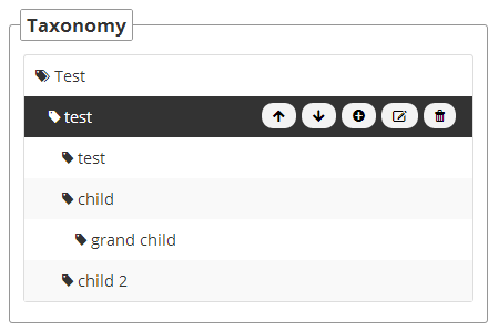
In your first example, it is harder to get an overview of the provided actions (harder to distinguish).
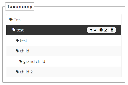
Your second example might be harder to use, because the buttons are nearer to each other, so the click-area is smaller. But it's straightaway clear what actions are possible.
I assume the following actions:
- Move item up
- Move item down
- Add new item (as a child of the current one?)
- Edit item
- Delete item
I'd display the edit and delete button inline right next to the item name (without the eye-catching button background color, if these actions are rarer used than move/add).
Then I'd group the two move buttons as you did in the second example, but with a higher whitespace inbetween. And then display the add button separately next to the move buttons (with more whitespace than what is used inbetween the move buttons).
So it would look like:
Test
  test ✍ ✖                             [↑ ↓]   [+]
    test
    child


