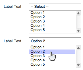
Consider the two inputs below:

Ignoring the poor label placement for a moment...
It seems to me that in many cases, either of these inputs could perform the same function.
Do either of these inputs have a big advantage over the other in terms of form usability?
I have read (e.g. Label Placement in Forms :: UXmatters) that drop down menus have a significant impact on saccade times.
Is it possible that a multiselect (even constrained to a single selection) might be a better option?
Each has its own prima facie advantages:
- The multiselect allows the user to immediately see a sample of the options available, which may aid in quickly understanding the intent of the input (and clarify an ambiguous label)
- The drop down menu allows shows the selected option as its current state, and so allows a user to quickly verify their selection, in a way that the multiselect does not
Finally, has there been any discussion of a combination of the two?
The wireframe combo I've mocked up below shares the visibility of the multiselect options with the statefulness of the drop down menu.

Are there any obvious problems with this alternative?
Note: I realise this alternative is very close to a combo-box, with one significant difference. Here, the user does not need to start typing to reveal available options. It seems to me the combo-box is great for allowing the user to actively narrow a long list in an efficient way. But combo-boxes do not generally create the visibility of options that a multiselect does.
Note: I'd use "multiselect" and "list-box" as synonyms.
