4

I like to record my Max Weights for exercises (e.g. Bench Press) on my phone.

I have a web app I created for doing this.

One of the tools I created is a "Barbell Calculator".

I plug in my weights and it reports the value. I like it, but I'm unhappy with the layout:
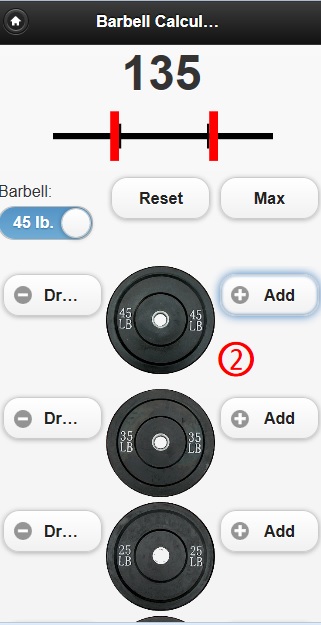
Barbell Calculator

Mainly, I hate scrolling up and down and there are too many add/drop buttons on the screen.

I put a working demo on jsFiddle.

Instead of those images of weights, I think a layout that looks more like a standard calculator would work better.

The barbell at the top would look the same but under it would be something like this:
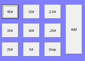
New layout

The pound buttons would act like an option button and, whatever weight is selected will either be added or removed (depending on what action the user takes).

I'm curious to know if there is an even better layout than the ones listed above.

The goal is to reduce (and preferably remove) any scrolling required to calculate the weight.


Update

Adding additional details outlining my concerns based on the drag-and-drop answer given:

  1. This a faux-app using a web browser with jQuery Mobile. By default, swiping the screen moves the web page up and down. I am sure there is a way to move objects around on a mobile phone browser, but, at this point, I do not trust the technology or my ability to maintain it.
  2. When maxing weight, plates are removed as well as added. Proposed answer doesn't offer a good way to drop weights. Sure, you can "drag" the weight off, but the weight representing .25 pounds will be much smaller than the weight representing 45#. My android display is 4 inches long and the screen on my wife's iPhone is even smaller. Removing tiny weights by pulling them off the bar could get very frustrating.
  3. Not intuitive to non-techy users. I'm not even sure I would understand drag-and-drop unless I wrote it. I think the add/drop buttons in my images effectively communicate to the user what they can/should do. Please correct me if I am wrong.
  4. Screen Real estate is key. In proposed answer, 65# is bigger than 25#. An ideal design means dragging the 25# weight to the bar is just as easy as dragging the 65#. I believe you would do this by making the selectable size standard among the images (e.g. 25# takes up just as much space as 65#, but has a transparent background). Here's the problem with that: The selectable area will have to be the same size for each weight. So I'm faced with making the smaller weights so small the user can't understand what they mean OR I'm back to creating a bigger web page with images that scroll.

I’m not against the answer, but I think I’m missing some things on how this would be implemented on a mobile phone browser.

4
  • Excellent idea. Make sure you have an option to configure unit system. Maybe also make the weight discs configurable. I'd pay for such an app. Commented Nov 15, 2012 at 12:49
  • Does your app also allow you to store the values? You should also think of the opposite way. Use case: I want to bench press 75 kg, give me the different options for weights. Commented Nov 15, 2012 at 12:52
  • BTW, a number of exercise trackers do exist :) Android - Barbell, Android - JEFIT, probably some others. Commented Nov 15, 2012 at 17:06
  • @VitalyMijiritsky Duly noted; but where's the fun in paying $4.99 for something when you can spend 200+ hours development time creating your own thing?
    – ray023
    Commented Nov 15, 2012 at 18:15

2 Answers 2

12

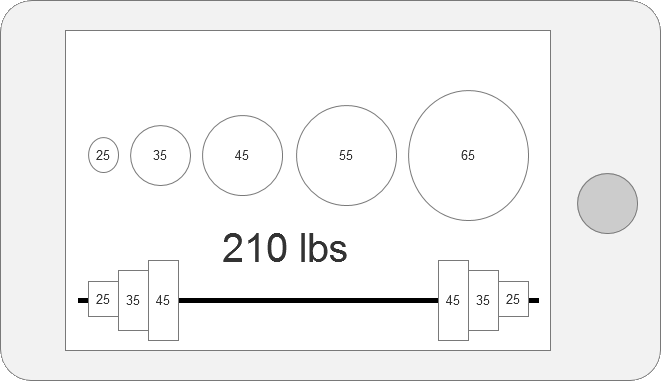
You are trying to imitate adding and removing weights to a bar. On a touch device, you can do precisely that. Just drag them on and off the bar:

enter image description here

You can enhance this in many ways, but I think that as the main concept, it doesn't get simpler than this.

UPDATE following OP update

1 - Not much that can be done about that... If it's a web app, it needs a different approach.

2 - You can make all the plates the same size. Also, their size differences don't need to be in scale with the weight differences (0.5 doesn't have to be twice as large as 0.25).. If their size differences are small, it's enough to arrange them in an increasing order to make it work well. If you're looking for another way to remove a plate from the bar, it's enough to just tap it - there's not much else that you can do with it but remove it. A 4" screen and an iPhone screen can display apps with much muchmore detail than is needed here. A good designer will be able to handle this easily. And if you do find yourself pressed for space, you can display just one side of the bar (it will be symmetrical in terms of weight, even if not in terms of specific plates making up that weight).

3 - Touch devices users expect drag and drop. To be more exact, they expect the direct manipulation of objects. That's what the touch screen is all about. If you show them a bar and a bunch of plates, the most intuitive thing for them is to drag the plates onto the bar. The beauty of this case is that the mental model of the users is very clear and it's fully translatable to the digital world. It actually may be more intuitive to non-techy users than to the techies, who might find it more natural to have a calculator.

4 - see 2.

6
  • 2
    Me like this!.. Commented Nov 15, 2012 at 7:28
  • Note that you also must take into account the weight of the bar. When you start working out, you bench press with just the bar, that's enough to start with ;) Commented Nov 15, 2012 at 12:51
  • @BartGijssens Nah, it's digital here, it doesn't actually weigh anything ;). Commented Nov 15, 2012 at 13:33
  • @VitalyMijiritsky I like this idea, but I do have some concerns which I added to my OP.
    – ray023
    Commented Nov 15, 2012 at 15:10
  • 2
    Of course the really good UX solution would be that the gym would offer a solution for this problem. Have some kind of scale in the bracket that holds the barbell, and as you add weights onto it, a LED display shows the weight. Since no gym does this, the app that Ray is making is outstanding. Why did I not think of this... Commented Nov 15, 2012 at 16:00
1

Since what I built must work in a Mobile Web Browser (for now at least), I could not use the the most popular answer.

Instead, I created a standard calculator interface:

enter image description here

It's quick and removes vertical scrolling.

1
  • 1
    Thanks for sharing the route you actually went with. It's always good to know, even if you didn't go with an option suggested that you took the suggestions on board and constructed your own solution to the situation.
    – JonW
    Commented Nov 19, 2012 at 23:01

Your Answer

By clicking “Post Your Answer”, you agree to our terms of service and acknowledge you have read our privacy policy.

Not the answer you're looking for? Browse other questions tagged or ask your own question.