5

Some context here: I work for a company as a front-end web designer. I'm dealing with a new "team" who put themselves together to make updates to the company website (sales & marketing types) ... that's great, but they want to make changes that just aren't good UX decisions. I'm running into a brick wall, and losing, to a lot of the things they want. Now they want to remove the search button from the site search and use an arrow. I am arguing against it. It's too small. it's not descriptive. It doesn't fit the mental model for a search button on a web site (at least not to me).

I think they're approaching everything from a self-design stance and it's beyond frustrating. At this point, I'm so frustrated, I am afraid I'm being too obtuse. Is an arrow an acceptable choice for a search button?

3

3 Answers 3

5

It's not a convention, and conventions are important, because, as Jakob's law tells us, users spend most of their time on other people's sites (that might be a helpful link for your colleagues).

But even if you don't want to stick to convention, I still wouldn't use an arrow, because it implies the user is directly taken to the content rather than going through a search process. That means that

a) users who know the keyword of the content will be frustrated when they go through the unexpected search stage, and;

b) users who aren't sure of the keyword don't search because they think they need the exact search phrase before they can advance.

Another question to ask is why your colleagues want to remove the search button in the first place. There might still be a legitimate reason to this impulse - perhaps the current search button doesn't fit the gridlines, or the proportions of search text field to button are odd. If you can find this reason, you might be on your way to a compromise that doesn't violate usability.

1
  • Thanks for the response. You put my thoughts about the arrow into words. As far as if there is a legitimate reason? They're reorganizing the top header and site navigation to make room for social media links. They may think they don't have room for the new icons as well as a Search button, but there is room.
    – user20884
    Commented Oct 23, 2012 at 13:54
2

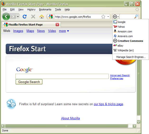
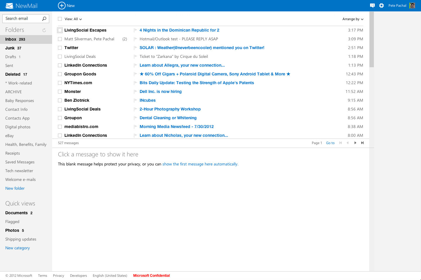
Another, more acceptable icon is the magnifying glass. It is used heavily at Microsoft, in Firefox, etc. Change is bad unless is great! As in you should not come up with your own thing unless it's siugnificantly better than what's accepted as the norm.

Outlook search box uses the magnifying glass

Firefox search box uses the magnifying glass

1

My take on all things design wise is this: "If in doubt, copy the big players" This works in this instance as almost everyone will have used the big players and so will be familiar with the way they work. A magnifying glass is fine if you want to keep things small and simple. The arrow idea will take off more and more because it is used as the submit button on mobile devices. My feeling on this is that an arrow isn't familiar enough... yet.

Your Answer

By clicking “Post Your Answer”, you agree to our terms of service and acknowledge you have read our privacy policy.

Not the answer you're looking for? Browse other questions tagged or ask your own question.