5

On one of my sites I have a contact form. And on that form the user is first asked to select from a short list of common reasons for why they wish to contact me.

The actual form itself will either be hidden or visible depending on which reason they select. In 90% of cases users do not need to contact me as their request can be dealt with by an automated system.

The most common reason is that users are trying to recover their licence key for a piece of software that I sell (which is handled by an automated system) - since it's the most common it's the first thing in the list of reasons. When the user selects this reason, they are shown a link to take them to the page that performs this for them.

Yet despite it being the first and clearest option, users still reasonably often jump straight to the "None of the above" option (which makes the contact form visible) and send a message asking how to recover their licence key.

I picked a handful of users who did this and asked them why they picked that option instead of the one that actually answered their question. And what most of them said was they didn't bother to read any of the reasons, and just went down them until they found the one that showed an actual message box (and that they felt daft for not spotting that the first option would have answered their query)

What steps can I take to discourage this kind of behavior and get people to pick the answer most relevant to their question?

2 Answers 2

7

I'm not sure your users have been particularly honest with you there. In the vast majority of instances, the user will simply be looking to speak with a human, rather than be taken through a number of additional options which may or may not present the answer they are looking for.

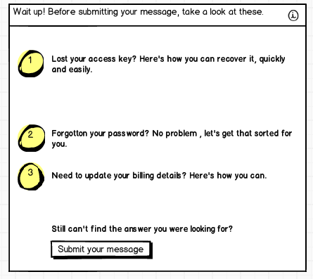
One thing you could do to combat this, may actually fall after the form has been submitted. That is, after a user has completed writing their message the next action is to submit the form. Upon selection of this action, present to the user a list of options that might be relevant to their query.

modal mock up

Here's a very quick and rough mock up, but it should help give you an idea.

3
  • 1
    This is a good solution. There is one particular helpdesk app that springs to mind (I can't remember the name) which displays suggested answers while the user types their message. That avoids the user having to write the whole message before seeing the suggestions on a separate page.
    – Matt Obee
    Commented Oct 11, 2012 at 12:22
  • You might be thinking of Desk.com Matt (previously Assistly), I swear by it. Commented Oct 11, 2012 at 12:29
  • Quite possibly Daniel. I think Kayako might be another.
    – Matt Obee
    Commented Oct 11, 2012 at 12:32
0

The list of options to choose from might be too long. You can prevent this by giving better information on your website.

The formulation of the options might not be 'catchy' enough. This way people won't recognize fast enough what it is about. First mention the problem (it will give recognition by the viewer), then mention what needs to be done to finish quickest (mention the advantages of this solution over calling).

It is all about recognition and that you provide the best help, even with an automated procedure.

Your Answer

By clicking “Post Your Answer”, you agree to our terms of service and acknowledge you have read our privacy policy.

Not the answer you're looking for? Browse other questions tagged or ask your own question.