39

Apple and Google are going head-to-head to define meaning of the three-horizontal-bars icon: enter image description here

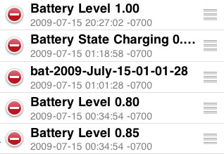
In iOS this icon means "drag me to rearrange items in a list" while Google Chrome's version means "click me to bring up a menu".

Is one of these two meanings already widely established in mobile, web, or desktop software? Also, which popular apps (on any platform) use this icon and what does it mean in those apps?

I'm asking because we're building an app that has a "list re-order" feature (using the standard iOS icon of course!), but several iOS-familiar folks I talked with didn't recognize the re-order icon. This led me to wonder how popular either variant is. Even if an icon is iOS standard, if it's not used much and the other variant is very popular, then we'll have some user education challenges we want to prepare for.

Here's pictures from the newest Google Chrome:

enter image description here

From iOS design guidelines:

enter image description here

From a sample iOS app:

enter image description here

5
  • It's great to ask how the item is used in the majority of cases, but don't forget to test test test :) Commented Aug 25, 2012 at 1:43
  • You may want to rephrase the question to ask something closer to "how to best indicate re-orderability". A popularity phrased question does not really indicate the challenge you are confronting and may cause downvotes or closing. Commented Aug 25, 2012 at 1:58
  • Different icons can mean different things in different contexts. If you're not using iOS there's not much reason to assume the three lines will be read as "drag here" unless they actually look grippable (IMO they don't really, the dots are a more standard drag and drop queue)
    – Zelda
    Commented Aug 27, 2012 at 15:46
  • 2
  • A coworker said it was a "tri" (try me)button, which I thought was pretty clever.
    – user57551
    Commented Nov 20, 2014 at 23:42

4 Answers 4

21

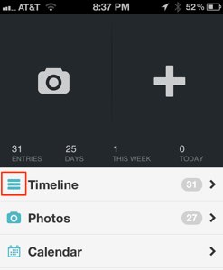
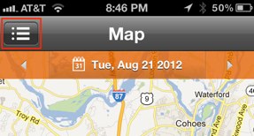
Three bar icons are now being used widely to indicate a "show list/menu" function - it's not just Chrome. Below are screenshots from Day One and PlaceMe (I only had to open a couple of apps to find examples of this usage).

Day One Screenshot PlaceMe Screenshot

I believe the icon was a poor choice by Apple (in hindsight) - it does not give a clear interaction cue, it's more of a reorderable state indicator. But, let's remember that Apple made this choice before all this app-madness happened.

On iOS, both uses may be able to co-exist without confusion - since use as a menu/list indicator would have a single icon and "reorderable state" would have an icon beside each list item.

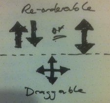
A better choice may be to move toward something similar to the "draggable" icon to indicate reorder-ability and let the three bars be a "show list/menu" function cue - as it is gaining traction.

icon sketch

1
  • I am working on an app.. i need this three horizontal bar icon.. png file..whether this icon png will be available for free download ?
    – goofyui
    Commented Nov 19, 2016 at 20:04
39

drag'n'drop nearly always has bad affordance.

The current model in gmail is the following:

gmail's new dd affordance

Albeit I'm not sure if they're really serious about it, esp. as it only appears to the hovered element.

The previous one was this:

gmail's old dd affordance

More dragg-ish, but still bad.

I think in order to reach good affordance with a drag-n-drop control, it either has to be explicit action (up and down arrows, that's pretty explicit), or it has to be "bumpy" (in case of a touchscreen): I guess the apple version looks more like a kind of air venting holes than something to get a hold on.

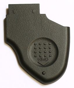
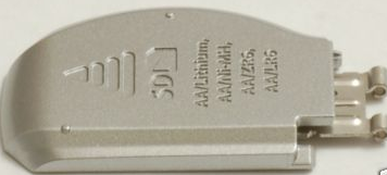
The drag-n-drop affordances usually come from hardware switches and battery cover lids, and this is what those three "lines" mean (they're the "receded" type). But even if you do miss them for 3 lines (compared to Chrome, which are three lines), then we shouldn't expect the users to understand...

Here are a few examples from 'real life':

A kodak battery lid

A bumping-out battery lid (from here)

A fuji (dotted) battery lid

A dotted battery lid (from here)

A kodak receding battery lid

A receding battery lid (from here)

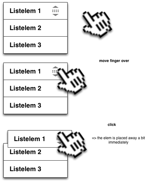
You can also create the following interaction if you don't fear of breaking out of native:

iOS affordance mockup

Because of the arrows, the users will immediately understand what is it for (I hope so, this is just a mockup, no user tests yet), and they'll try to tap on it as part of exploring the interface. If you do it well enough, they'll notice the displacement (likely if it happens somewhere between 150-250msec after touchstart), and will understand that it's a tap movemenent.

This is just a tip. Norman's classic "The Design Of Everyday Things" might help you out on this.

7
  • The 3 little lines go back at least as far as Windows 2000 as the 'rough' (ie draggable) area in the bottom right corner of a Window. Xp switched to using the dots
    – PhillipW
    Commented Aug 25, 2012 at 12:28
  • @PhillipW: I bet there were battery-powered remote controls even before windows 95... and Design Of Everyday Things appeared in 1990. Gnome/Gtk had dotted design at the end of the 90s (before win2000 as I remember). BTW, in OS X Snow leopard it's still 3 diagonal stripes. My point was about resemblance to physical devices.
    – Aadaam
    Commented Aug 25, 2012 at 14:55
  • 3
    @Aadaam +1 for bringing in the physical device history - very interesting. Seems like the lines/dots may have been more for grip/traction at first - developing into an affordance over time. Commented Aug 25, 2012 at 15:43
  • 1
    @LukeCharde grip/traction is an affordance!
    – Kit Grose
    Commented Oct 9, 2012 at 9:33
  • 1
    @Aadaam do you happen to know the name of the designers who had impact on setting loose the current wide-spread virtual usages? would be a nice touch to honor them. / cheers :)
    – n611x007
    Commented May 29, 2014 at 11:22
3

Over the years, things have changed somewhat.

Chrome has changed its menu icon to three vertical dots to comply with the Material Design HIG:

enter image description here

Apple has changed its drag-and-drop icon to be visually distinct from the hamburger:

enter image description here

Though the hamburger icon still isn't used consistently (e.g. Firefox and Gnome use it as a generic menu icon), both Microsoft and Google use it for navigation menus. (Apple doesn't seem to use this icon anywhere.)

You can see the icons being used in the navigation drawer recommendations in both the Material and Fluent HIGs.

2

I agree that the three-lines icon is being established as a place to pull something. (See in particular the lined tab that appears if you drag down from the top of an iOS screen to show notifications, or on the lock screen when multiple notifications are waiting, or on the camera icon on the lock screen.)

Matching that icon to the real world examples of the battery door / sliding plastic widget makes sense to me. The Google Chrome icon confuses me for that reason, and I always thought a "gear" or similar "settings" related icon would have worked better there.

1
  • 1
    The meaning of a gear-icon is more like having a look into the "guts of the machine", so it fits for a settings menu, where one will manipulate stuff. The Chrome button on the other hand leads to a variety of functions, not just settings (new tab, bookmarks, printing, etc.) so a more general "list" or "menu"-icon makes more sense.
    – J_rgen
    Commented Feb 14, 2013 at 9:44

Your Answer

By clicking “Post Your Answer”, you agree to our terms of service and acknowledge you have read our privacy policy.

Not the answer you're looking for? Browse other questions tagged or ask your own question.