0

I'm helping to pull together UI/UX best practices document for my company, and we have discussion on the "save" function for applications and multi-page webs forms from which a user could leave and return to later.

Currently, we've already determined that the application/form should be saving the input automatically as the user progresses through each stage or page. The discussion is whether it's a better practice to offer a visual "save" option for the user to interact with, or do we feel it's generally expected that the auto-save is happening?

Additionally, we couldn't find consensus on whether a visual save option should be very familiar and traditional, such as the 3.5 floppy disc icon located near the top of the app, or should appearance be left up to the creative requirements (different icon, text and icon, etc). Any thoughts?

2
  • "save and continue" or "save and finish later" are common ways I've seen it labeled.
    – DA01
    Commented Aug 15, 2012 at 18:57
  • There are different best practices depending on your context and application, which makes it hard to answer this. Commented Aug 16, 2012 at 16:52

2 Answers 2

0

Look at Google Docs or iOS or iWorks on OS X Lion: they implemented autosave. I guess, there's a save button in Google Docs, which does nothing. It's really just there to keep the user calm. You don't need an icon for it: "Save" is just enough.

Also, this edit form is also auto-saving, I just refreshed the page, and most of what I wrote stayed there (I did a quick select all, copy though, as it only saves every half a minute or so)

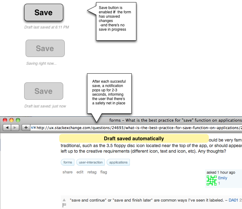
Blogger did a wonderful thing: they had a save button, but it was mostly in disabled state, and underneath it was written: "Draft autosaved at 2012/08/14 19:14 GMT" (or similar). Whenever the user changed something (this is called the "dirty" state by programmers, the save button would get enabled, so they can press it.

So, put a save button there, and trigger the function which runs at autosave with it, and put the date of last succesful save underneath.

Perhaps do an unobstrusive "flash notification" at the top of the screen whenever the form was autosaved succesfully.

Also, make sure you have a "reset" option and/or users could go back to any page, as normally, if you messed up a form, a simple refresh would do, but given up that you do autosave, and offer the same state afterward it's impossible.

Also have unfinisihed forms listed somewhere.

We also implemented something similar, although we had a long one-pager.

Look at the way blogger works (blogspot.com), look at the way Google Docs works, look at the way iOS apps (Pages for iOS, OmniOutliner for iOS) work, look at how Pages on OS X Lion works (I guess that does this too).

Save must be gone. Long live permanent computing.

Edit: mockups: Autosave mockup

0

As a user until I haven't interacted with the application/form before, I have no way of knowing that the auto-save will occur. I will only notice it if I read the documentation or, I accidentally close the app and find the form data present when I log in.

Also, from a developer's point of view it will be difficult to find the "right" time for auto-save. I am not sure when do you want the auto-save to work.

Scenario 1 : In a multi-stage form, when user goes from page x to page x+1

Scenario 2 : After every t minutes

Problems with Scenario 1 : User filled everything on page x+1 and the application crashes (or, machine accidentally shuts-down). He/She will have to fill the page x+1 again.

Problems with Scenario 2 : User filled everything on page x+1 and the application crashes (or, machine accidentally shuts-down) in 5.9 min. The stuff that he/she has written in those 2.9 minutes will be lost. (assuming t=3min)

Solution: Give the option to save the work. I always try to save the form when I have filled something important or long enough and I do not want to type all that again. Suppose, u r a customer support and you have got some long and important feedback from the customer and the app crashes. It will be difficult to get that feedback again. Visual "save" option will be handy in that scenario.

As far as the icon goes, floppy disc is the generic save option in most apps. I will suggest going with that as it is intuitive for the new user. I also suggest going for a layer (that will contain the visual "save" option) on top-of-the-form layer. The visual save option layer will stay on the right of the form field which is active. (Basically a floating layer)

1
  • Usually autosave is time-triggered for a few seconds (10, 30 are typical), and dirty state is maintained. Therefore you usually loose only about 5-10 seconds of work: hopefully not that much. As for the user not knowing that autosave will occur, there are multiple solutions for this.
    – Aadaam
    Commented Aug 15, 2012 at 19:22

Your Answer

By clicking “Post Your Answer”, you agree to our terms of service and acknowledge you have read our privacy policy.

Not the answer you're looking for? Browse other questions tagged or ask your own question.