2

What are your thoughts about changing the button label based on what the user has done to the input.

For example, for updating an item's price-- once the user enters the 'update page' the button label would be labeled [go back] by default -- and would then change to [update] once the value has been changed.
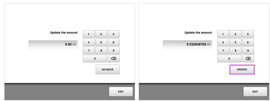
enter image description here

in particular, do you feel it would be at all confusing to the user on the default state?

1
  • What if I update it, then realize I need to change it again, I then hit what I thought was the UPDATE button and it takes me back. Now I may be thinking the price was updated, but in reality it hasn't. (In other words, I think this is a bad idea and will confuse people)
    – DA01
    Commented Aug 15, 2012 at 17:32

3 Answers 3

2

I think it can be confusing. Users come to a page with a goal to update the amount and might look for the Update button right away. User will look look for it, it is not present and the users might go back to see if they picked the wrong option. Also the user might want to go back even after they typed the account, if you change "back" to "update" there is not way out. If you have more pages like this in UI I think it is good to have a consistent back control location that is always present. Users will know what to expect and it will be easier to navigate around.

2

I'm not sure what benefit you're providing by doing this. You're simply making it hard to go back/cancel the operation if I didn't mean to be there.

One of the biggest usability improvements we ever made to our kiosk software was putting the "Go Back" button in a consistent location on the screen (in our case on the bottom left, just above the footer). By putting the back function on the left side of the screen (in a left-to-right culture like English language countries) it's also a more predictable location to look for a "Go Back" button.

My recommendation is to move the "Go Back" button to the empty space on the left of your screen and to leave the "Update Amount" button on-screen for both states (ideally disabled if the user hasn't changed the value).

1
  • 1
    Some designers tend to get rid of the inactive state, like in this blog entry at UXbooth. While I'm not sure if it's really necessary, I would advice to give the user a hint, why a button is deactivated. In this case "Nothing to update right now" or "Change the amount first". Commented Aug 17, 2012 at 7:48
1

The biggiest drawback of your design is that a user might want to "go back" even though some numbers have been typed in. And as others has mentioned - users often handle on instinct - " This button ment this the last time so when I press it again I expect the same function".

If you want a button to do dual things you should consider using it when the button does "pretty much the same". For example - The first time the button says "store number". The next time the button says "update number".

1
  • 1
    For example - take a look at Youtube. The first time you play a clip, the leftmost button on the footer of the clip is a play button with a triangle play icon. When the clip ends the icon changes to a repeat icon but the functionality doesn't change. Commented Aug 17, 2012 at 8:55

Your Answer

By clicking “Post Your Answer”, you agree to our terms of service and acknowledge you have read our privacy policy.

Not the answer you're looking for? Browse other questions tagged or ask your own question.