2

I am familiar with common form error validation techniques. However I would like to find a nice way to handle error messages in an interface with little room to spare.

I'd like to show:

  • Flag the offending field
  • Show a small piece of text to describe the error. This if feel is the key. Although we will have expert users, it can still be frustrating to have to figure out the error.

The context:

  • The application is complex with multiple panels on screen.
  • Each panel has a limited space it can occupy.
  • One of the panels has a form
  • Within the design there is little room below or to the side of each field.

Though I can't show the actual app, the best analogy is a capture from an Axure panel below:
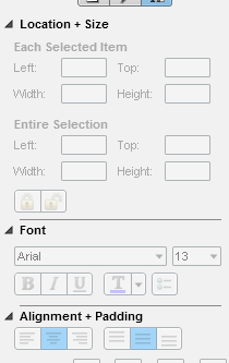
Panel example

One suggestion I had was to flag a field as an 'error'. When the user hovers or clicks on the field a message can pop up describing the nature of the error (a little like a tooltip). However I have some reservations about this approach.

9
  • What are your reservations about the approach you mention? Commented Jul 2, 2012 at 15:00
  • 1
    @AlexFeinman Mainly; Whether needing to click / hover on each one will be overly frustrating. Whether we can make this work in a satisfying way.
    – Jay
    Commented Jul 2, 2012 at 15:06
  • Some other questions: how much of this validation can you do for the user, so there is less of a chance of them making an error in the first place? Can you simplify the process or break it up? Would a wizard be more appropriate? Commented Jul 2, 2012 at 15:26
  • @AlexFeinman As a rule, we'll do as much as possible. However some can't be avoided. One example of validation. If a date chosen falls on a holiday the user will need to select an alternative day. The error message will say this and hopefully suggest the next valid day for the user to confirm. A wizard would not work in this context unfortunately (a bit like the example I gave, the user will need quick, frequent entry while viewing other panels).
    – Jay
    Commented Jul 2, 2012 at 15:35
  • 1
    You wont actually be able to hover over them if it's on a mobile (which judging by the dimensions above it appears to be). I'd go with that approach - have the alert icon that activates on a click, and take the user to a new screen displaying the full error text with a <back button.
    – JonW
    Commented Jul 2, 2012 at 15:35

2 Answers 2

4

What were your reservations about your proposed approach? It was the solution I immediately thought of - putting a yellow-and black 'caution' triangle on the bottom-right corner of offending fields (maybe overlapping the border of the field), and offering an explanatory tooltip on hover. This solution allows you to write help text that needn't obey dimensional constraints, and should be easily discovered so long as the iconography is implemented well.

The only cost is that the user must hover to read the text, but for an interface as cluttered as your mockups suggest, you're going to have to withhold text until activated or put it somewhere undiscoverable. Hovering isn't an expensive action for a user to take, though it can be badly implemented. The biggest thing to be wary of is that a small icon might require excessive mouse precision.

5
  • It is about the process. They locate the field, they figure out if they hover they get the tip about the error. They click into the field (does the error stay?). They update the information (do they have to click out before the message disappears?). Also concerned that having to hover over each might be frustrating (as you mentioned).
    – Jay
    Commented Jul 2, 2012 at 15:20
  • Offering it on focus as well as hover might help. Then you can tab through and clear problems. Commented Jul 2, 2012 at 15:25
  • @AlexFeinman Thanks. If you took the example above, where would you place the message? To the right would go outside the pane. Above or below would overlap other fields which might have their own errors.
    – Jay
    Commented Jul 2, 2012 at 15:29
  • It's less important with tooltips. Do people need to see other fields to fix the error in one field? If so, that might itself be a concern, and you should take that into consideration when laying out the field. Commented Jul 2, 2012 at 17:19
  • So what if it overlaps? Just remove the focus or dismiss the tooltip when outside the hover state. Users will probably be fixing single fields after failed submission. These aren't expensive actions, and they're unavoidable when space is constrained anyway. Commented Jul 2, 2012 at 17:19
3

A couple of options:

  1. Validate on blur of the field. The moment the user leaves, validate the field and display a relevant message.
  2. If applicable, when the form is submitted, just display a message about the "first" invalid field and set the focus to that field.
  3. The suggestion that has already been mentioned a few times, style the fields that have errors appropriately (red border, or warning icon, etc) and allow mouse over to display the error message.

Options that are valid for all these choices:

  • Display a summary of error information in some other section of the pane, clicking on an error changes focus to the field with the error.
3
  • Thanks. I'd imagine #2 might be quite frustrating though. Also your last suggestion breaks a rule of validation -proximity. That would be something to deal with.
    – Jay
    Commented Jul 2, 2012 at 15:41
  • @Jay - proximity isn't a 'rule' of validation patterns. It's just a (strong) guideline. Granted, the 'click to be taken to problem field' function is going to be hard to communicate, but if it were understood, the interaction would be valid. Think in terms of user interactions rather than stern pattern matching. Commented Jul 2, 2012 at 19:22
  • @JimmyBreck-McKye Certainly not advocating rigid rules.
    – Jay
    Commented Jul 3, 2012 at 7:53

Your Answer

By clicking “Post Your Answer”, you agree to our terms of service and acknowledge you have read our privacy policy.

Not the answer you're looking for? Browse other questions tagged or ask your own question.