6

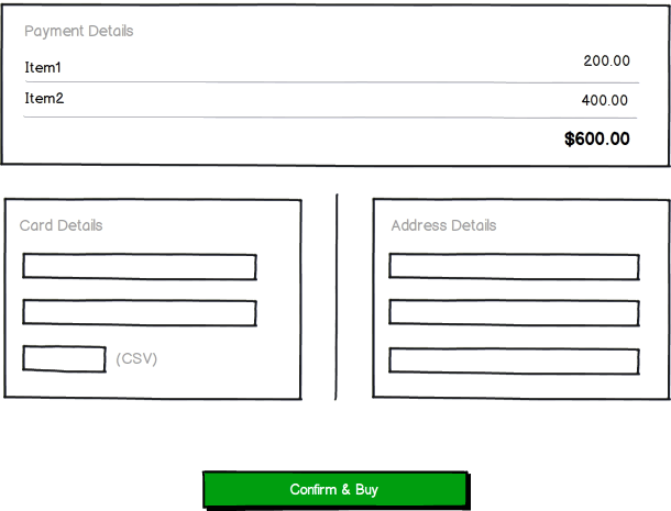
I am designing a checkout workflow where the old IA has mocked up different screens for billing/shipping and payment.

I want to combine into one page like this (which I've abbreviated):
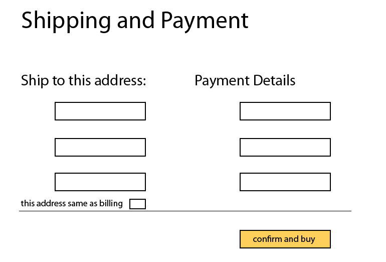
enter image description here

I've said there is an evidence base behind it but can't find anything conclusive either for same or different pages. There are more back end implications for the combo approach though, but these dont affect the UX

Q: can you direct me to evidence that looks at this exact scenario vs different pages for checkout.

bounty will be offered

Update:

I've blogged my thoughts based on your comments http://colmcqux.wordpress.com/single-vs-multi-step-checkout/

tx for all your help!

1
  • The availability of payment details and/or shipping options might depend on data entered by the user, i.e. address/country. Having everything on one page would make this page very 'dynamic' and this might confuse users. Commented Jun 27, 2012 at 16:30

3 Answers 3

9

It's not even studies or evidence. It's one of the main principles of good UX: the fewer the screens a person needs to see to accomplish a task the better the experience is and the least frustration s/he feels.

Fewer screens mean fewer steps, fewer opportunities to make a mistake, less time spent getting familiar with the content of the screen (even if it's milliseconds), HTTP requests & data transfer (in web context), and no need to remember info from another step (in this case particularly).

Here's a study by Get Elastic that found single-page checkouts outperforming multi-page ones by 21.8% in 606 transactions. And here's their discussion of the technical cons of single-page checkouts.

At the same time, Baymard Institute found that the main problem with multi-page checkouts is with the actual tasks of the each of the screens rather than with their number.

7
  • cool. I've seen some nice examples online too but I'm wondering why some sites insist on splitting the pages. I suspect its a technical reason.
    – colmcq
    Commented Jun 27, 2012 at 16:22
  • the links deserve beer for that
    – colmcq
    Commented Jun 27, 2012 at 16:38
  • 2
    Not me. The people who created www.uxpond.com do.
    – dnbrv
    Commented Jun 27, 2012 at 16:43
  • Make it as simple as possible but not simpler. Sometimes concentrating on the number of pages masks the real issue. Whether it is performing the task in a way that is intuitive and effective for the user. If the best solution needs one more screen, then don't fight it.
    – Jay
    Commented Jul 2, 2012 at 14:06
  • Wow thanks for sharing uxpond. Hadn't heard of that before. Commented Jul 2, 2012 at 15:08
0

Here is my opinion which I have understand from question:

enter image description here

1
  • 1
    This isn't an answer to the OP question. The question was: "can you direct me to evidence that looks at this exact scenario {all forms on one single page} vs different pages for checkout". Do you have any information about studies in this area?
    – JonW
    Commented Jul 2, 2012 at 14:10
0

There are some other considerations which take precedence to UX studies. Besides backend technicalities there's an issue of security/privacy and how repeat customer purchases are structured during the checkout. On security and privacy I merely mention the concept of minimal exposure and leave it at that. Successful checkout interfaces combine registering a first time purchase (or not) with reusability for repeat customer (registered) in a way that still allows the delivery fields (more prone to adjustment) to be changed at will without editing credit card details. At all times still keeping in mind to minimize security risk to credit card details being stolen.

These are serious considerations that are at least as important as any UX studies. UX studies of e-commerce are particularly difficult to re-construct accurately. It's one thing to spend x dollars of virtual money not from you wallet, a real purchase where you're knowingly exposing your credit card to fraud is another.

So just because it's possible to combine checkout screens, it might still not be a good idea to do so. UX studies should not take over as the dominant factor in e-commerce.

3
  • 1
    Can you expand on your statement: "I merely mention the concept of minimal exposure and leave it at that". If this is the heart of your answer then you really shouldn't leave it at that, you should actually explain why this is important and how it impacts the OPs situation. Otherwise you've not provided an answer you've just left a long comment.
    – JonW
    Commented Aug 21, 2012 at 6:59
  • Hi JonW. Security in e-commerce is a large field of its own. Hence I leave it up to the reader to follow up. It is of primary but not only concern. The usual business analysis will bare these factors. You cannot start at the interface and decide everything from there. Not that UX advances should go unnoticed.
    – Chris
    Commented Aug 21, 2012 at 7:09
  • Well that just means your answer is really just 'it's about security, go and figure out what I mean by that yourself' which isn't helpful. If you're not able to detail your reasoning then that means you're not leaving a useful answer. This isn't the place for leaving forum-y comments, you need to specifically answer questions here.
    – JonW
    Commented Aug 21, 2012 at 7:15

Your Answer

By clicking “Post Your Answer”, you agree to our terms of service and acknowledge you have read our privacy policy.

Not the answer you're looking for? Browse other questions tagged or ask your own question.