6

Given the interface below, what would be the best way to contrast the labels from the data labels?

The only thing I could think of would be to shade the background of the labels, however, according to LukeW http://www.lukew.com/ff/entry.asp?1502 background shading is undesirable because it adds visual elements to your layout.

As you can see, if there is any data that is blank then the information looks spread and unorganized.
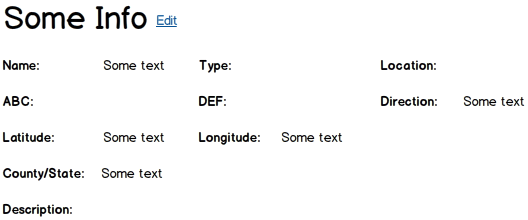
enter image description here

4
  • 1
    You already have all the labels in bold, that has a similar affect as increasing the contrast. Commented Jun 26, 2012 at 15:49
  • True. There is a lot of info out there on how to improve layouts with labels and inputs, but I haven't found anything on labels with readonly data. Any way to improve on this?
    – Rich
    Commented Jun 26, 2012 at 16:38
  • You could make the data italic or change its font. Commented Jun 26, 2012 at 16:47
  • This is a visual design question, one that is not easily answered in a wire mockup. Commented Jun 26, 2012 at 23:39

2 Answers 2

3

If the main reason for visiting the page had to be to know the information, then you should improve the contrast in favour of information. Your labels are bold and are dominating the information. You should do the opposite: make the labels less visible (grey, for example) and leave the info black (or make it even bold).

Next thing, in order to make information more readable and understandable you should consider placing the informations that are connected in the proximity of each other. Informations like "name", "address", "state", "zip code" form one group, while the "latitude", "longitude" and driving directions form the other.

I am not sure what is the meaning of informations like "type", "ABC" or "Description", but surely you need to place it and display it with the correspondence to it's importance (for the user).

0
1

The technique used at my work currently is to put user-editable data in text boxes in both read-only and in edit mode. In read-only mode, the text boxes are disabled and both the text boxes and their contents are slightly greyed out. If there isn't any data for a particular field, an empty text box is still shown.

In this case, I think adding some kind of visual elements to connect labels and data labels is necessary to give a good visual cue.

Your Answer

By clicking “Post Your Answer”, you agree to our terms of service and acknowledge you have read our privacy policy.

Not the answer you're looking for? Browse other questions tagged or ask your own question.