44

Submitting my online council tax payment last week, I made a mistake. Instead of specifying £X.00 in a freetext payment field, I missed the dot and accidentally entered by £X000!

I'm currently waiting for my refund request, but in the meanwhile, it has me thinking - is there a suitable solution for preventing this kind of thing happening to others?

1
  • 12
    Another issue here (and perhaps another question) is the fact that different countries use different decimal separator characters and different grouping symbols (thousand separator). In Norway, we use . as grouping symbol and , as decimal separator. "63.000" is not 63 but 63000. So, in a financial web form with an international user group, one need to take this issue into account as well. Commented Jun 9, 2012 at 22:54

8 Answers 8

62

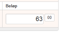
Put the pence (the decimals) in a separate field and only accept whole numbers in the two edit fields (pounds and pence). If the user hits the decimal separator key in the pounds field, then move focus to the pence field.

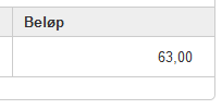
In addition to preventing errors during editing, one should also let the user confirm the values in a different screen/layout. If you just ask a user to confirm the input he just entered, the chance for detecting errors is lower than if you present the values back to the user in a slightly different way.

Enter value:
enter image description here

Confirm value:
enter image description here

3
  • 14
    I'm very keen on the concept of using a smaller textarea for numbers of lower magnitude. Commented Jun 10, 2012 at 16:09
  • 1
    I am absolutely against using multiple fields for input of a single value. It's like the bad old days of three separate fields for the area code, exchange, and station of phone numbers. I'd prefer one of the other solutions. Or flip it around and let them enter in a single field, but show them separate pounds and pence when asking them to confirm. Commented Jun 14, 2012 at 3:55
  • 2
    @DavidConrad, I was actually pretty skeptic to this solution myself, but I works very well. There are pros and cons to this solution, of course, but that's what the UX job is all about: Finding the optimal solution for the case you are working on. This is one of the alternatives to solve this question, and you have to test it properly and you must prioritize this aspect to other aspects regarding the payment process. It's a huge difference between an once-in-a-lifetime payment action (ie donation to FOSS project) and a ten-times-a-day payment routine (ie paying bills for your company). Commented Jun 14, 2012 at 8:25
32

mockup

download bmml source – Wireframes created with Balsamiq Mockups

12
  • 5
    This isn't an answer, it's just two completely un-annotated wireframes with no wording whatsoever. What are you suggesting. Why are you suggesting these options, how does this address the OP's problem?
    – JonW
    Commented Jun 10, 2012 at 0:29
  • 39
    As UX folks, we should be able to accept visual answers. It seems pretty clear what this is proposing.
    – DA01
    Commented Jun 10, 2012 at 0:56
  • 6
    With no argument as to how this solves the problem. I surely wouldnt promote these kind of answers
    – Ivo Flipse
    Commented Jun 10, 2012 at 8:19
  • 6
    @DA01 I would counter that argument with the following: As UX folks we should also be fully aware of basic accessibility guidelines: WCAG 2.0 guideline 1.1.1: Non-text Content: All non-text content that is presented to the user has a text alternative that serves the equivalent purpose
    – JonW
    Commented Jun 10, 2012 at 15:04
  • 4
    Not only is it good for accessibility, what about people searching via search engines? or what about foreign-language people who are using Google Translate? Images / Wireframes should be used to enhance and answer, not as the whole answer itself.
    – JonW
    Commented Jun 10, 2012 at 15:12
20

The simple solution is Radio buttons with a minimum/maximum payment. See this example from Chase.com's credit card payment form.

enter image description here

The only way I can over pay is if I intentionally choose other amount, I can just click one of the other payment options to either pay the minimum amount I can, my full statement balance, or my whole outstanding balance.

Another idea would be inline validation warning the user "You're payment is $X over what you currently owe!" This could be used in addition to the radio button scheme above.

Since this is dealing with money, and the common typos here (misplaced decimals, extra zeros or transposed numbers) can cost the user a lot of money, even if temporarily, I'd even say a modal dialog confirming "You are about to pay $X over the amount you owe, pay this amount?" wouldn't be excessive; alternately a red/error styled warning on the "confirm payment" screen (in addition to an inline warning) could be useful.

You should be very careful when letting a user enter payments, especially when it's likely they've made a mistake. The radio buttons are the simplest way, because the worst you can do is select the wrong bubble, and you can't accidentally select "Other Amount" unless you don't notice the other bubbles.

4
  • 1
    Although in this case it looks like it was an open amount payment system ... in other words the system didn't know what amount the user would be paying. How would you cover that? Commented Jun 9, 2012 at 16:04
  • @LisaTweedie it was a free text one, I would certainly assume if you're paying taxes online the site would offer you some indication of what you're paying. If this were something like Kickstarter where you have no "owed amount", you can at least provide bubbles for the "reasonable" abouts where applicable; in Kickstarter's case those would be the pledge amounts
    – Zelda
    Commented Jun 9, 2012 at 16:08
  • 1
    If it is council tax, the system must know how much you owe. I would also add some confirmation on the free text box if the amount is greater than the total outstanding amount, just to catch mistyped errors. Commented Jun 10, 2012 at 8:56
  • 1
    This doesn't really solve the problem though. It is still possible to easily make the same data entry mistake. Commented Jun 11, 2012 at 17:44
6

If you have any idea what the user should be putting into the box, then you could try to detect abnormal inputs. In your case, I suspect £6,300 is significantly more than the usual tax, so having a warning dialog informing them that their tax is 100x what you'd expect (although you'd have to factor in how it might annoy people who actually do pay 100x what everyone else does).

Another thing you could do is calculate the tax from other inputs. For example, if it's a property tax, you could have them enter the approximate value of their property (likely a number so large that keeping track of fractions of a pound is pointless), and then you calculate the tax for them.

Or, you could go the other direction -- if they put in £6,300 as their tax, then you could display on the confirmation screen that this is the appropriate tax for property value, and they could clearly see that they don't own tens of millions of pounds worth of property.

4

There are many options, the best is education. Let the participant know what they are doing, what they have done, and reduce assumption. Literal examples for this case: Append .00 and deal with whole amounts. Have a separate box for change. [00].[00](Adding a click or tab sucks... but safety when dealing with $$) Have the decimal point in the box so as they type the numbers move left leaving the . two from the end. More...

3

The solution is proper user experience design and testing. In my limited experience working in the .gov sector, there just isn't much money invested in that. In attempts to save money by outsourcing and/or investing in established existing solutions, UX is usually sacrificed, much to the frustration of many.

UPDATE:

So, yea, alas, the problem is more systematic than anything. But if I were to fix this one problem, in the least expensive/quickest way, I'd simply have some form of confirmation dialog.

You are about to pay $8723.00. Is this correct?

[ Yes, submit ]   [ No, return to edit ]
4
  • 2
    Yes, but what about it isn't proper UI? How would you fix it? This is a rant, not an answer. Commented Jun 9, 2012 at 21:27
  • 1
    I would fix it by investing in proper user experience design and testing. Admittedly, that's not a specific answer.
    – DA01
    Commented Jun 10, 2012 at 0:56
  • It isn't even an answer. What you've said is, you'd fix it by fixing it so that it was fixed. Your update improves it slightly. Update it again to remove everything before "UPDATE" and you'll be on the right track. Commented Jun 14, 2012 at 3:59
  • The first part addresses the endemic part of the problem. The second addresses the symptom. ;)
    – DA01
    Commented Jun 14, 2012 at 4:13
2

I use my internet banking exclusively to pay bills and the bank has no idea of the amount on the bill, so the amount is always entered by the user. I think the root of the problem is missing the decimal point (. and , or a space depending on the country).

@Ben Brocka's solution is very nice, provided that the system knows the amount before hand or can do some analysis to determine if the amount being paid is way too large.

My suggestion is to force the user to enter the decimal part in countries where decimal currencies are used (for example, to pay a bill of $63, you will need to enter $63.00). My bank uses this and it works rather well. If the application is internationalized, you will need to allow people to use space or commas for the decimal point, depending on their locale.

The down side is that this is not of much use of countries without decimal currencies, for example the Japanese Yen, but I think it should help prevent problems for people in countries using decimal currencies.

0

I would probably add a special case for this particular situation. If the input is exactly 100 times the expected amount and the decimal point was left out, just "autocorrect" the mistake.

A more generalized solution could involve statistics to determine the probability that the input value is an error and use that to determine how forcefully to verify.

  • 80-100%: Display a warning and force the user to acknowledge it (or autocorrect if you can do so with confidence).
  • 30-80%: Display a warning that's hard to miss.
  • 0-30%: Just echo the user's input.

It may help to look at how similar problems are treated in the analog world.

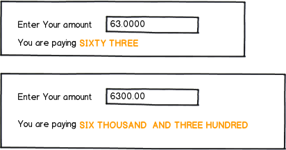
Cheques require the payer to write out the amount in two forms: as a number and spelled out ("SIXTY-THREE POUNDS AND 00/100"). Maybe it would make sense to echo the input in words. You likely wouldn't have missed "SIX THOUSAND THREE HUNDRED POUNDS" on the confirmation screen.

At a restaurant, when we pay with a credit card, we're required to do a little arithmetic, adding the tip to the subtotal to fill in the total. If the application knows the amount of your tax bill, the confirmation screen should show your balance after payment. If that balance is negative, it should be clearly highlighted.

Your Answer

By clicking “Post Your Answer”, you agree to our terms of service and acknowledge you have read our privacy policy.

Not the answer you're looking for? Browse other questions tagged or ask your own question.