190

Is it better to paginate a long article or show the entire article on one page?

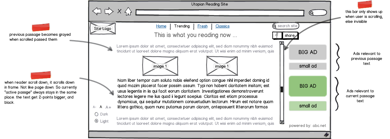
The following is a side-by-side of the same article. On the left is page one with navigation and on the right is the full article.

Long article paginated and shown in full

Is there data to support that one is better than the other? If so, what makes it better?

The following is an example of the article navigation for a long article.

Navigation for a long article

The user is given the option of just seeing the whole story, skipping to a particular page or going to the next page.

Wouldn't it be easier (read: better) to give the user access to the entire article right away? If the user reads the first page and then decides they want to see the full story, they'll go through a page refresh and be taken to the top of the page with the full story. That can't be a good UX right?

My hunch is this is some sort of ploy to get more clicks on a site, but perhaps I'm missing a real reason why paginating a long article or post might be better.

So, what's the deal?

9
  • 166
    It sadly wouldn't surprise me if the answer is something along the lines of 'the more new pages we can split an article into, the more adverts we can add in'.
    – JonW
    Commented May 15, 2012 at 14:09
  • 3
    That's what I'm afraid of. The problem, of course, is clients don't realize that, and they think it's normal or the "right way" to do long-article page design.
    – magzalez
    Commented May 15, 2012 at 14:11
  • 5
    There are certain arguments for/against infinite scrolling (ux.stackexchange.com/questions/5556/…) but I think when there's a clear end that's not extremely long there's nearly 0 reason to paginate beyond inflating page view statistics and ad impressions
    – Zelda
    Commented May 15, 2012 at 14:21
  • 7
    Having a long article all on one page is not infinite scrolling, so the arguments against infinite scrolling seem moot in this case.
    – user
    Commented May 16, 2012 at 7:26
  • 4
    I always saw pagination as the same tactic large shopping malls use - make winding hallways with big displays to obscure the other end of the mall. That way you're less likely to think "I have to walk all the way over there?" Likewise if I'm on a page where the scroll bar handle is incredibly small I'll think "Geeze, this article is long. I won't read it all." If it's paginated, I get to the bottom of a short page and if the article has caught my attention I'll be more enticed to click through to the rest of the article.
    – Phil
    Commented May 16, 2012 at 13:48

13 Answers 13

229

It's no longer necessary to paginate for users, but content providers love it for advertising.

Common knowledge among content strategists in my work is that you paginate in order to increase advertising impressions. A slideshow with ten slides gets ten times the impressions as an article with ten photos. And an article with three pages gets … well, you get the idea.

In the old days, pagination was about bandwidth. And in the old days, people didn't know or want to scroll. But those days are long gone.

From UX Myths (with many studies cited):

Although people weren’t used to scrolling in the mid-nineties, nowadays it’s absolutely natural to use the browser’s scrollbar. For a continuous and lengthy content, like an article or a tutorial, scrolling provides even better usability than slicing up the text to several pages.

And Google is pushing the full-page version in its search results, essentially saying "full pages are better than paginations." Content Strategy blog Eating Elephant writes about it here: Google JUST SAYS NO to Overpagination.

Interestingly, however, multiple pages can be used to track engagement: if users exit on an article page, you can't tell how long they were there, but if they click through each page, you can track their time on each page and how far through the tunnel they've gone. Magazine's Online summarizes this nicely, based on original comments in Twist Image's article on multiples page trickery.

What to do…
In order to balance business needs for more ad impressions with user needs for the most pleasant experience, consider the following:

  1. Put a "full article" link with pagination somewhere at the top as well as the bottom. (If you only include a "full article" link, you run the risk in some cases of the user believing they are only looking at an abstract, rather than the beginning of the article.

  2. If employing responsive web design principals, serve paginated articles when download speeds will degrade the experience of a full article.

  3. If and when you paginate, do clearly indicate at the top what page the user is on, in case they land there from search results or a link.

  4. [From an in-house developer] If you want the advantages of pagination with a full-page experience, use progressive loading as you see on Facebook and Twitter (also called "infinite scroll," although in this case it's finite).

Mashable does a good job of paginating when it improves the experience and defaulting to one page otherwise. Here's a nicely paginated slideshow on pregnancy time lapse videos, and here's a nice full-page article on self-driving cars. Note that the slideshow loads an ad with each slide (often the same ad).

New York Times appears to have designed some flexibility into their system by making pagination beyond the first page a request string in the URL. That way, if they decide to change to full pages, the URLs don't break (I surmise). Anyway, NYTimes breaks into pages without feeling egregious.
20
  • 7
    Though I think there's a flaw in the ten slides gets ten times the impressions assumption that site designers are making -- if I can tell that content is split across multiple pages, I don't even bother reading because multiple pages are annoying. Giving up after six seconds may not show up in analytics software, but I'd expect second-page views to be far less than first-page views.
    – sarnold
    Commented May 15, 2012 at 20:48
  • 4
    Slide shows really do increase "impressions," but they dilute the click-through rate. quora.com/Internet-Advertising/…
    – Taj Moore
    Commented May 15, 2012 at 21:15
  • 14
    with some clever javascript you can track where someone is in an article as they scroll, think about how the endless scrolling plugin in Wordpress works.
    – user8394
    Commented May 15, 2012 at 22:05
  • 3
    Google Analytics does track how much time you spent on a page - and this is an important metric, if you care about your users. Things like @sarnold mentions DO show in the statistics.
    – skolima
    Commented May 16, 2012 at 12:46
  • 1
    @skolima Google doesn't normally measure time on a page until you jump to another page: searchenginejournal.com/…
    – Taj Moore
    Commented May 16, 2012 at 14:08
103

I'm all against pagination on articles for two main reasons:

  1. If you paginate content like it was a book page just because it has a specific height, you end up with content that has to be clicked through in order to consume. That is several not very useful steps putting extra effort on the user - for no reason at all. If you need to hide content because of length - use a toggle function read more... and read less..
  2. Users who consume large content would like the ability to search within the page - which is not possible if you paginate long content. I've seen user hitting ctrl + F and then started typing to find exactly what they need - faster. Having pagination makes this process much harder.

Don't paginate long articles.

5
  • 22
    Your second point is excellent.
    – magzalez
    Commented May 15, 2012 at 14:28
  • 6
    I would rephrase the first line to be "...against pagination on articles...", pagination makes sense in some circumstances, such as large tables of data or search results, where the user doesn't need to be bombarded with all the information at once.
    – zzzzBov
    Commented May 15, 2012 at 17:21
  • 2
    @zzzzBov Your absolutely right. I've edited it now according to your suggestion. Thanks for the heads up! Commented May 15, 2012 at 17:35
  • If most of the content is hidden because "read more" hasn't been clicked, how can a search be sensibly performed on the hidden content? Commented Sep 27, 2012 at 4:06
  • 1
    +1 for the great second point, but it's more for advanced users
    – Baumr
    Commented Nov 28, 2012 at 12:13
35

Don't forget that some users want to print some articles. Pagination, of course, makes this a royal bother. To provide this feature, some sites put a link to an un-paged view on the article, but there will always be some poor users who don't find that link or don't even know to look for it.

4
  • 43
    Many users will actually go to a Print Preview page just to read the damn article on one page. My dad does this all the time and emails articles in "print view" on occasion...
    – Zelda
    Commented May 15, 2012 at 18:46
  • 2
    @BenBrocka, that was an awesome tip! Commented May 16, 2012 at 11:11
  • 5
    Interestingly enough, I've seen where some search that cache and rank the "print version" of a page higher than the split version.
    – magzalez
    Commented May 16, 2012 at 14:01
  • 1
    And these days I look for the one-page view when capturing an article for offline reading (using Evernote, etc.). Commented Feb 28, 2013 at 15:28
5

The obvious answer of ad impressions is probably paramount. Advertisers want to show advertisements to large audiences and tripling your page views is one way to fake it. However, I wouldn't be surprised if paginated articles hold users hostage at the website for a longer viewing period, and as such forcefully creating an extended viewing period.

Here's my rationale:

  1. By splitting up relevant information into chunks the user is forced to look around and conjure up a way to navigate to the next part of the article. In doing this they waste time skimming over other perhaps higher priority articles of interest that might choose to jump to. You are essentially training the user to learn your website, all without telling them directly. It's like the test drive at a car dealer: gives you the illusion it's yours, then they go in for the kill.

  2. If the user reads through a paragraph or two and finds the writing hopeless they can opt to quickly jump to another area of the website they are presently browsing. If the user wastes 3x the time reading hopeless material they may become discouraged and opt to exit to another website altogether where they reason they will waste less time. Stranding a user half way down a page with limited navigation and exit points leave the user with essentially 2 options: scroll up to find out what else they can do, or leave to a better website.

  3. A huge influx of traffic to these article websites may be generated via linking from other websites. When a user arrives for the very first time you don't want to overwhelm them with information. Just the bare necessities, and you want to encourage them to venture around on their own accord. Having a page with a seemingly infinite scroll bar will cause a user to think twice about what their time may be worth, and if they are willing to contribute an excessive amount of time to read this content vs the value they are getting. I know I've skipped over many articles despite them being interesting because I simply don't have the time to lend and I know it's false hope, because I'm not getting it back.

  4. Reading long text is hard! I recon the same reasoning newspaper columns are only but a few inches wide, and couple tall. Keeping information in small concise chunks may help garner their attention.

I could certainly be far off and think this is an interesting question. I'm keeping my eyes peeled on this one!

1
  • 1
    I relate to your reason #4. I'm often tricked (glancing at the browser's scrollbar size) into thinking an article is short enough to start reading now... Only to find out when I reach the page's bottom that I now need to go on reading. While this is pretty disturbing, sometimes it's the right amount of motivation to go on and read.
    – n0nick
    Commented May 22, 2012 at 8:13
3

Just read an article at Scientific American (The Reading Brain in the Digital Age: The Science of Paper versus Screens) that provides another view on pagination. Some studies showed that scrolling uses more cognitive resources than turning to the next page.

"Although people in both groups performed equally well on the READ test, those who had to scroll through the continuous text did not do as well on the attention and working-memory tests. Wästlund thinks that scrolling—which requires a reader to consciously focus on both the text and how they are moving it—drains more mental resources than turning or clicking a page, which are simpler and more automatic gestures. A 2004 study conducted at the University of Central Florida reached similar conclusions."

So I think saying "no pagination" is not such a simple answer as it might appear. Without pagination readers also have no trail of where they are and how much reading is left. Scrollbar gives you some idea but it is not as precise as the page number.

1
  • This seems to suppose that the user will be actually scrolling with the wheel. If the user hits the "page down" button, he has all the cognitive benefits of not scrolling, plus all the speed (no waiting time for the next page to load) of no server-side implemented pagination.
    – Rumi P.
    Commented Dec 30, 2013 at 11:36
2

Pagination while trying to avoid a scroll bar is mostly done for ad impressions, but there are a few good sites that do try to think of user convenience - as @Ken mentioned, providing a print version. This is usually in a single page, it also lacks some of the formatting & background images but that is a small price to pay.

I'd like to add that as a user, if the article is really long I would still prefer no pagination; but in combination with section links within the document and maybe a TOC & links to go there easily from within sections.

3
  • What convenience do you find in pagination?
    – magzalez
    Commented May 15, 2012 at 18:10
  • @magzalez: Ow that was a wrong place to forget a 'not'! Thanks for pointing it out ;) ... and for the record, I don't want pagination
    – Alok
    Commented May 15, 2012 at 18:36
  • 3
    +1 for section links. Long articles are best on one page, but that doesn't mean we should abandon the user without any tools to navigate within that long page.
    – Dave
    Commented May 16, 2012 at 13:45
2

I agree with most of the sentiments against pagination, though there is one use-case that is not addressed well with long, non-paginated articles: It is typically difficult to share a subsection of such an article.

However, this is not sufficient justification to use pagination: The Verge (sample) uses a very nice system to address this problem without resorting to multi-page content.

9
  • 5
    This problem can be fixed with an anchor on each <hx> stackoverflow.com/questions/484719/html-anchors-with-name-or-id
    – janw
    Commented May 16, 2012 at 14:07
  • Most articles don't have separate sharable sections anyway. Why would I share page 2 of a typical NYT article? Wikipedia is different, but they use the table of contents links for this purpose.
    – Zelda
    Commented May 16, 2012 at 16:40
  • @BenBrocka: if you are e.g. quoting a paragraph from a news article, you might want to hyperlink directly to the relevant paragraph. Commented May 19, 2012 at 9:18
  • @Mechanicalsnail That's getting sort of impractical though, isn't it? A link for every possible place online I might want to share? Your options at that point are invisible, undiscoverable anchor links or blue "link" headers all over the place, which don't make sense without a Table of Contents.
    – Zelda
    Commented May 19, 2012 at 17:43
  • 2
    @BenBrocka: A fair number of websites do this with paragraph signs that appear on hover. For example, the Python docs. Commented May 19, 2012 at 21:17
1

I don't think paginating a single piece of cohesive content is a good practice, but there is one other reason that occurred to me why some might do it. It can be useful to determining whether users are actually reading the article. While a user may land on a page, that doesn't mean he actually read it. Even if he started, he might decide its too lengthy and abandon the effort. With a paginated article, a site could possibly use stats to determine that the article was actually read.

It's one thing to earn money from advertisements. It's another thing for an author to actually have his works read and some might want to confirm that.

1
  • I just had that thought too. But paginating for this reason still inconveniences the user for the sake of the provider. Commented May 23, 2012 at 15:00
1

It was definitely advertising staff pressure that lead to my former employer -- a newspaper site -- paginating almost every article, regardless of length, from the mistaken belief that spreading content over double the pages would double the inventory and offset a steady decline in sitewide page views. In addition, the ad staff larded a series of ads, widgets and other experience "enhancers" onto each page, making other news sites far more attractive.

1

I'm a firm believer in NO pagination. Besides the reasons listed above, I frequently use tools like Evernote page clipper to save articles, but if the article is paginated, then I just don't bother.

Also, I would assume that Google looks at each page as an individual article, so trying to optimize each split page for relevant keywords could be difficult.

0

SURL did some research back in 2003 on this, in an article called "The Impact of Paging vs. Scrolling on Reading Online Text Passages"

The findings from this study show that participants using the paging condition took significantly longer to read the passages than either the full or scrolling conditions. Participants also showed no significant differences in their ability to answer comprehension questions correctly, nor in their perceptions or satisfaction of the reading conditions.

...

However, several users commented that they were more accustomed to scrolling when reading documents on the web. It may be that since participants had more exposure to scrolling they were able to read through the documents more quickly using that mode of navigation. Participants stated that they found the Paging condition to be "too broken up," and that they had to "go back and forth" quite a bit to search for information. It is possible then, that for searching as well, viewing more of the document on a single screen facilitated easier scanning.**

Source:http://usabilitynews.org/the-impact-of-paging-vs-scrolling-on-reading-online-text-passages/

1
  • it is a good read; but a little outdated for current context. "A Pentium II based personal computer, with a 60 Hz, 96dpi 17" monitor with a resolution setting of 1024 x 768 pixels was used"
    – kmonsoor
    Commented Dec 28, 2013 at 12:21
0

Note: My response may be a little late; but the problem is still there, so answering this on this thread.

IMAO, most of the high-traffic sites still miss some very important points from user perspective.

  • Over the time since the online era, our subconscious as well as conscious mind are well-trained to ignore ads altogether and focus on the content, mostly on relevant picture. e.g. when i entered a NYTimes for news on Iraq, the new shiny Ford(ad) is totally irrelevant (hence, irritating). In return, my subconscious mind take a silent note on this irritation (entirely due to the ad).

  • As a try to address the fact, ad engines (syndicates) tried to deliver contextual ads and collect and relate search data. What is the result? once i just needed to know(so, searched) a fact about Nikon D800. Now, everywhere i just see ads of DSLRs. As i already have one, i am not even remotely interested to buy another one. Now, what? My irritation just got a polynomial factor.

  • Our monitors, even on laptops, are mostly now widescreen(16:9) rather than archaic 4:3. But, the sites mostly are failing to adopt the new display real-estate. Instead the ad's column (on the right) just multiplied.

  • Yet still, pagination is the worst factor to "dishonor" the visitor's "mission statement".

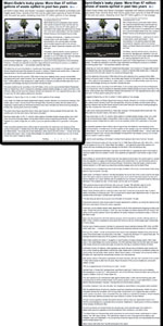
In my utopian world of internet, a friendly and readable (yet, revenue generating) site should be like this.

mockup

download bmml source – Wireframes created with Balsamiq Mockups

Edit: I have to put something more. So, posted on: http://kmonsoor.wordpress.com/2013/12/28/ad-vs-content-profitability-vs-readability/

0

Pagination is sometimes necessary, for example, in a tutorial to create an app, which is a long process, and tedious too, It wouldn't be logical to keep the entire content in one article.

Also, for SEO purpose, if different sections have different headings and someone wants to search for a specific section, it would be awesome.

And, now the most important, a long article means huge size, means more loading time, it may not be appealing to a user to have a slow page,

Thus, the choice depends completely on the article, If the parts are in itself an article, paginations are recommended, but if the goal is to increase ad revenue, I wouldn't suggest that.

Your Answer

By clicking “Post Your Answer”, you agree to our terms of service and acknowledge you have read our privacy policy.

Not the answer you're looking for? Browse other questions tagged or ask your own question.