14

I am working on a new web application that will have a user dashboard displaying lots of great information with charts, notifications, alerts, etc. The actual data populating the charts will not be entered by the user, but will reflect activity over time (days, weeks, months) based on user activity.

I am aware of a lot of best practices for dashboard creation, but one area I am not sure about is how to show a new user that has just signed up an example of what they could see down the line (i.e. a 'full state'). It is fairly anticlimactic to go through a long sign-up process and then stare at an empty dashboard.

Are there any suggestions or techniques?

1
  • Can you please clarify your question to indicate that you really mean a 'dashboard with no data' rather than an 'empty dashboard'? @Michael answered the same way I did, with the same misunderstanding. Commented May 10, 2012 at 16:27

5 Answers 5

1

Three assumptions to address this question:

  1. Customer who is already using your product, should by now have some idea on what kind of reporting he/she will be getting.

  2. Additionally, you will for sure have some screenshots on your website and sample reports in your FAQ and Knowledge Base areas.

  3. Lastly, I'm assuming that your reports are dynamic, or at least updates once a day.

Based on these assumptions, putting a sample data in the reports page is not a good idea. Because:

  1. The minute you have new data, you are going to replace sample data. Usually your new data won't be much, so the reports will still look empty.

  2. Sample vs Actual reports might somehow disappoint your users. Because sample report might look very ideal and beautiful, but their actual data in the beginning might look not very impressive.

  3. Displaying a sample data, and making it disabled or in the greyed image form might actually confuse the users even more. Because by default users are expected to see the real reports on that particular page (even if empty). So displaying them static content might give the impression that they are viewing FAQ page rather than reports page.

I therefore, of the opinion that actual reports should be shown first, even if they will be empty at the beginning.

11

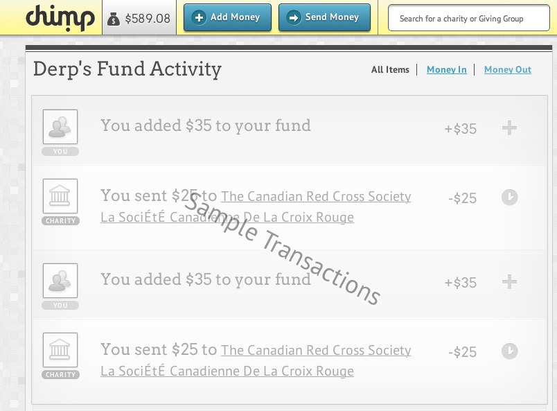
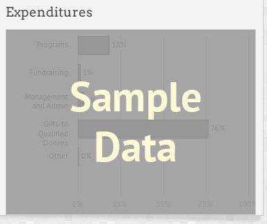
I've generally replace the space (where dashboard elements will live) with sample images. I grey them out and actually slap copy that says "Example Transactions" or "Example Data" ..what ever makes the most sense. That way your users aren't faced with big empty spaces and they become acclimatized to how the app will look with regular use.

Here's a couple examples:

enter image description here

enter image description here

2

We built something similar in the past and solved it with two separate ideas.

First is to include a short interactive tutorial if the users starts on a blank dashboard. We used guiders.js (ported to mootols in our case). We had about 6 or 7 steps to show how elements are added, altered and removed from the dashboard. This way, the user has not only seen but done the "first steps" (of course we added a link to skip the tutorial and one to restart it later from the dashboard).

Second idea was to create one or more sets of configurations the user can choose from. I don't know the purpose of your dashboard but maybe you can "group" the users in (just examples) sales staff, executive staff and so on. You can then deliver a different preconfigured dashboard to them which fits their needs best. Netvibes does it this way, too (although you have to click through some dialogs before you can just try it out). You can enter a custom topic there or choose from the ones they offer.

2
  • This answer makes the same mistake mine (which I deleted) did... he is talking about a fully configured dashboard that has no data (and thus looks empty) rather than a blank canvas to add charts to. Commented May 10, 2012 at 16:26
  • guiders.js is nifty! Commented May 10, 2012 at 19:27
1

I was stuck with the same situation once and did a lot of trial and error to understand the actual user will be willing to do from such a state of screen. We tried with Sample image and wizards as suggested by others.

Once thing which gave the best response and kept the users engaging was to make the entry for short and crisp and then asking them additional information once the user has created the account. Once he has the blank dashboard, we asked the user to give some additional information of their transactions. We made it like a game where they were willing to give additional information rather than being forced to do so when they sign-up.

I am not sure what type of application you are working on, but this idea paid for us. We had more users and as they started filling up the details we were able to articulate a lot of information which resulted in better dashboard result.

0

Create sample items like basecamp or WordPress do.

Your Answer

By clicking “Post Your Answer”, you agree to our terms of service and acknowledge you have read our privacy policy.

Not the answer you're looking for? Browse other questions tagged or ask your own question.