0

I'm building a status update box similar to the one found on Facebook and Google+. Mine will allow for multiple types of posts such as status updates, code snippets, images, projects and applications. I'm just looking for suggestions on the layout. I do like the Google+ layout with grey icons at the bottom right representing the different types of posts, but I'm not sure how clear it would be what you can post. My options are a bit unique. Facebook labels their choices, but I feel they have more of an outdated look with small colored icons. So I'm looking for a combination of the two where I can use icons, but somehow make it obvious what can be posted. I'd also like to possibly incorporate the arrow keys on the keyboard to choose what you're posting.

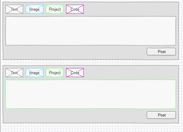
This is what I have so far and I really don't like how it looks.

enter image description here

4
  • Have you come up with any ideas so far yourself? If so then can you post an image or mockup for us to make suggestions against.
    – JonW
    Commented May 6, 2012 at 23:09
  • Added screenshot.
    – Hawkee
    Commented May 6, 2012 at 23:27
  • I would definitely keep the text labels. Icons alone cannot accurately depict the concepts you described: Status, code, images, projects, apps.
    – Jung Lee
    Commented May 7, 2012 at 19:41
  • Thank you Jung. Now I just need to figure out how to make it look better.
    – Hawkee
    Commented May 7, 2012 at 21:16

3 Answers 3

1

Colour Coded Difference

How about a colour coded difference. Klicking in one would give the input field another colour. Or hovering over "image" would give an example text that appears in the input box and dissapears when you are "mouse out"

3
  • I like your idea of the placement. I'd like to use greyscale icons with labels that appear upon hover.
    – Hawkee
    Commented May 7, 2012 at 15:36
  • 1
    Yes, icons would look nicer but keep the labels. Even if they are small.
    – tamimat
    Commented May 8, 2012 at 9:27
  • Maybe I can overlay the labels over the icons, possibly the bottom right. I found a very nice set in which I can create 32x32 icons.
    – Hawkee
    Commented May 8, 2012 at 13:39
0

I feel using the image icons make for a nice visual and minimalist look. Out of curiosity, people do tend to hover over to see if there's any tooltip to explain the required functionality.

You could also have a little icon on the corner which can "Toggle" the labels with the images to allow users to hide/show the labels if required.

This way you can use both the ideas and allow visitors a little personalization in addition to using well perceived conventions as little icons that they are already familiar with.

1
  • I'm not sure exactly what you mean. Can you create a mockup? Balsamiq Mockups is nice.
    – Hawkee
    Commented May 7, 2012 at 14:08
0

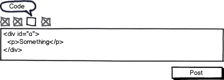
If you're feeling ambitious (assuming this isn't something you've already got on the roadmap) you could have your update box auto-recognize the type of content being posted, and highlight the corresponding icon:

mockup

download bmml source – Wireframes created with Balsamiq Mockups

1
  • Interesting idea, but each type of post has a unique form with particular elements.
    – Hawkee
    Commented May 7, 2012 at 21:15

Your Answer

By clicking “Post Your Answer”, you agree to our terms of service and acknowledge you have read our privacy policy.

Not the answer you're looking for? Browse other questions tagged or ask your own question.