5

I'm working on a game that teaches the alphabet. It runs on Android phones, currently (including tablets). One of the features I have in my settings screen is the ability to select which subset of the letters to display.

For example, the default is to show all letters from A to Z. The user wants to be able to select a subset, such as from C to M.

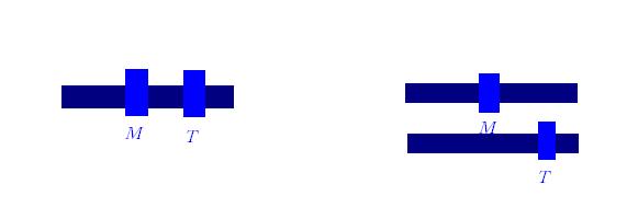
See crude diagram below:
enter image description here

My first thought was the option on the left -- a slider with two handles. But it seems awkward to use, especially if the handles get too close and the click detection gets a bit shady. Plus it has the complexity of "don't let the first slider overtake the second" -- which means moving from a small range (A to C => M to O) is hard, you have to move them in the right order).

My second thought was the option on the right -- two handles. But this takes more space (options screen is already full), and it's not clear which is the "start from" and which is the "end at" letter (albeit it's implied by the order and both can be interchangable -- but this must be learned).

I know I'm missing something; there must be a better way to represent and manipulate the range of letters I show.

Also, the letters are Arabic (which is a right-to-left language), so I'm not sure if I should put the first letter on the left side or right side, as all players will bilingual or polylingual.

0

3 Answers 3

5

My concern with your approach is that a slider fitting the width of a phone containing 26 individual points (or more depending on the language) isn't going to be very easy to use accurately, especially with a finger. There is no indication as to where each 'notch' is, and it is likely the user has to try to make pinpoint changes with their finger (which is much large than a mouse cursor) to change a 'N' to an 'M'.

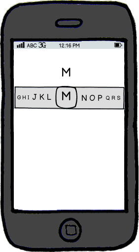
My suggestion is to provide all the letters within the slider itself as part of a custom control. You don't need to show all the letters at once, just an indication that it is selectable and that you can scroll left to right to choose your item.

It is also advisable to show the currently selected item while you're using the control outside of the control itself (because your finger will be obstructing it while you're using it).

An example of this is below.

mockup

download bmml source – Wireframes created with Balsamiq Mockups

1
  • I really like how you avoided the notch problem, I didn't realize that before. Arabic has 28 letters, so it's pretty hard to squeeze. I will probably combine this with @RogerAttril's solution for general navigation.
    – ashes999
    Commented Apr 27, 2012 at 14:30
2

Using a slider is inaccurate at the best of times so on a touchscreen of a mobile it's even harder. I would normally suggest a tap/select mechanism.

However, choosing from a 'set of characters' seems inappropriate for this scenario since you are teaching the alphabet in the first place - i.e. displaying the alphabet in order to select a character from seems counter to the goals.

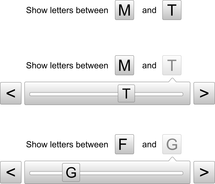
I'd definitely avoid the double handled slider for the confusion it can cause, complexity of implementation, and unfamiliarity of use. You could certainly ease the use of the independent sliders by allowing a left right tap to increment the letter in one direction or the other.

To save screen space, maybe combine the use of a tap and a popup slider to modify.

Try auto-shunting the other character if the slider attempts to go beyond the other end of the range. For example in the image below, when the user wants to change the letter T and moves the slider past M, the other letter would change to the letter before M, and so on.

This could help learn about the letters in the process of doing the selection.

enter image description here

3
  • This seems like a perfect compromise for quick general navigation and an easy way to fine tune the selection (e.g. E -> G is 2 taps). Commented Apr 27, 2012 at 13:24
  • +1 nice, I actually like this solution a lot. I may combine this with @JonW's idea, since he's right that slider notches, etc. are tricky.
    – ashes999
    Commented Apr 27, 2012 at 14:28
  • Also, to clarify again, this is for the options screen -- some users only want to see a subset of the entire language alphabet. So it's not really counter-intuitive. When teaching kids a foreign alphabet, it's easier to start a few letters at a time.
    – ashes999
    Commented Apr 27, 2012 at 14:32
2

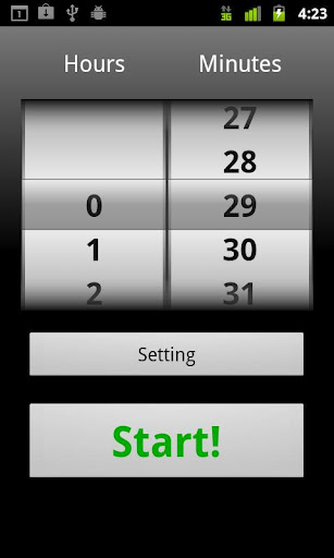
one of the interesting widgets to use here could be a set of time type spinner widget for android where you have a letter highlighted for both start and end of range, user can slide up or down to set a new range value.

enter image description here

The proposed widget could be a mini version of this so that it doesnt take up as much space.

As far as localization is concerned, it should depend on your maximum user group. If it is Arabic, this can follow Arabic style (right-to-left) and otherwise.

BTW, maybe your app can detect the regional settings from the device and pick up a layout (left-to-right v/s right-to-left) based on whether the user prefers Arabic style or English style.

Alternatively, you can just use clear labels to indicate start and end range. Then it should not matter much whether its Arabic or English for this purpose.

1
  • Just to clarify, it's not about regional settings. The game audio, menus, text, etc. are all English; it's about teaching Arabic alphabets.
    – ashes999
    Commented Apr 27, 2012 at 14:27

Your Answer

By clicking “Post Your Answer”, you agree to our terms of service and acknowledge you have read our privacy policy.

Not the answer you're looking for? Browse other questions tagged or ask your own question.