4

Is there a best call to action color for "Add to Cart" buttons. Does the color of this button have any effect on decision making?

I read somewhere that the color red may trigger "eating" so most of fast-food companies like McDonalds, Burger King use red on their logos. So is there a similar color for add to cart action?

2
  • The important thing isn't color, it's attention and the clarity of the offer. What color works depends on your color scheme, thinking "Should I use red" is a bad place to start.
    – Zelda
    Commented Apr 14, 2012 at 13:01
  • In addition, I've always heard the Red/Orange = hunger finding only pans out for a whole room that's that color, and that just a button on a web page won't do it. I asked a question here cogsci.stackexchange.com/questions/723/… to find a proper source.
    – Zelda
    Commented Apr 14, 2012 at 13:58

6 Answers 6

14

Instead of saying one colour is better than another for your "add to cart" button, I suggest you carry out a multivariate test with different colour and text combinations. You'll soon discover which colour results in the most conversions. (This all assumes your website has enough traffic to conduct the tests in a sensible length of time).

2
  • Really good answer! +1 Commented Apr 14, 2012 at 4:51
  • 1
    I guess that saves me from having to type up a long answer about solving the wrong problem...
    – Zelda
    Commented Apr 14, 2012 at 14:03
9

Most of the answers here imply that color is a carrier of meaning and mood. It is not. Moods and meanings are invoked in the brain, not by the color but by the environment in which -admittingly- colors play a crucial role. But then it's not about the color, but rather about the colors (plural). More in particular: it is about the relationship between the colors.

So, in some cases, red may be a suitable color for an 'add to cart' button. In other cases other colors might be more suited, depending. It's hard to say without examining the context and circumstances.

Here's a simple example of varying emotions, associated with red. enter image description here

7

A while ago I wrote an article titled "Call to Action Buttons and the psychology of colors" where I explained that every color evokes a different feeling or mood with people and therefore result in a different reaction when seeing the color. There is also a bit of color theory involved. It all comes down that there is a best-performing color to use in CTA's (in your case the Add to Cart button) but that it is also different for every website. Too many variables (such as surrounding colors) are involved which could influence the outcome. Only one solution really: simple A/B testing!

1
  • 1
    Hi Paul, you might want to check out colorguru.net (Currently in Dutch only, sorry...) Commented Apr 14, 2012 at 10:07
3

Red does appeal to the mind as a trigger for food, but it is also a color related to danger. In a button where we want to encourage actions it's not 100% appropriate with either. Green is a color associated with approval and with nature and while that might indicate a suitable response in a buy button it is also a colour we do not pay as much attention to.

What you want is a color that act as a attention-grabber that draw the attention of the visitor and then you need to work with copy and persuasive design to convince the visitor to complete the purchase. Orange is a common color as it is an attention color that we are used to from traffic lights as a signal for "pay attention".

The color of the button is however just a minor aspect of the process to get people to go through with a purchase, but it does not mean it should not be taken seriously.

Paul have some great bits of information in his blog post that I think you will find useful (great post Paul!) and you might want to look for studies of color psychology in general and Neuro Web Design in particular to find the right solution for your design.

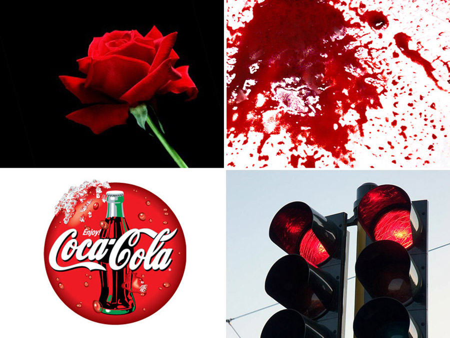
2

I read nationally the color red also encourages customers to rethink options as it also means STOP in many many many coutries. Just an additional thought.

1
  • 1
    Can you cite your reference for where you have read this? It may well be true so if you can support your statement that would improve this answer.
    – JonW
    Commented Apr 14, 2012 at 8:53
2

I've come across a few reports in the last couple of years claiming that red outperforms green for all call-to-action buttons.

I would have to second whatterz notion though; carry out your own A/B testing for the most accurate results. Human color-meaning interpretation is directly influenced by the environment that color sits in (surrounding colors, shapes, whitespace).

Go with red if you want a simple solution, or Test your environment if you want to explore maximum conversion rates.

4
  • 2
    Are you able to reference these reports? Otherwise your answer is just a subjective opinion.
    – JonW
    Commented Apr 14, 2012 at 8:53
  • "Use red" is pretty bad advice unless you have a use case or some reproducible research to back it up; as has been noted, colors need to match and be unique following with color theory. A red button is going to perform like crap on a site with red background colors.
    – Zelda
    Commented Apr 14, 2012 at 13:03
  • The "go with red..." structure above was a poorly worded way to imply "don't take the easy way out". In an argument regarding color and the relationship to it's surrounding environment, I thought the context of that phrase would be understood.
    – copperkid
    Commented Apr 14, 2012 at 18:19
  • Red vs Green A/B test: blog.hubspot.com/blog/tabid/6307/bid/20566/…
    – Nate
    Commented May 29, 2015 at 18:45

Your Answer

By clicking “Post Your Answer”, you agree to our terms of service and acknowledge you have read our privacy policy.

Not the answer you're looking for? Browse other questions tagged or ask your own question.