14

I am designing a drop down panel which houses a collection of quick links / bookmarks to other areas of an intranet. Users access the intranet through a laptop or desktop pc running windows or mac osx, as far as I know no one is likely to access via a touchscreen device.

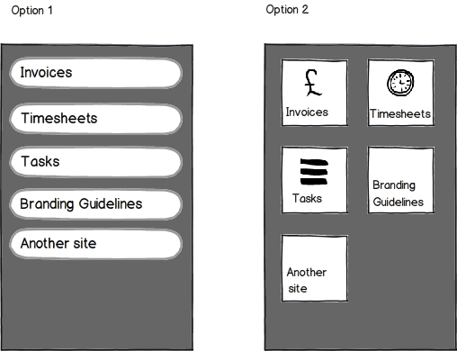
I am currently trying to choose between two options of how to layout the links in the drop down:
enter image description here

The tiled view is inspired by the new windows metro ui, and I think would end up looking aesthetically nicer. But which do you think wins in terms of usability?

Or perhaps, what are the usability pros and cons of each?

7
  • How is the rest of the interface designed, for example the drop down panel itself?
    – micromilk
    Commented Feb 23, 2012 at 12:04
  • It will be included across a few applications so the interface behind is variable. The drop down panel will be triggered by hovering over a link/button position top right of the page.
    – benb
    Commented Feb 23, 2012 at 12:45
  • with the vertical list, why not have a smaller icon in each item: {[Icon] Invoices} ... Commented Feb 23, 2012 at 16:21
  • 1
    @benb: For which OS is this project? Also, it would be great if you went through your older questions and accepted the solutions that helped (if any).
    – dnbrv
    Commented Mar 20, 2012 at 2:54
  • 1
    Could you clearly state if this is meant to be used with a touch screen as the increased square area of the second option might be better than the first on those systems.
    – Dan D.
    Commented Mar 20, 2012 at 5:05

7 Answers 7

12

1. List:

+ Easier to eye scan title texts as the texts of all items are aligned,

+ Allows longer title texts,

+/- Implies an order,

- Slimmer click/tap area risking selection of an adjacent row.

2. Grid:

+ Easier to remember where an item resides, spaciously,

+ Easer to click/tap without mistakes,

+ Allows higher detail of icons,

- Implies row or column wise grouping of items,

- Forces texts to be short.

Conclusion

Choose option one if you have an interchanging list of items, detailed item title texts, or a linear sort order of items. Choose option two if you want to optimize for frequent users who learn where an item resides spaciously and afford them to navigate fast without having to read the texts.

0
4

Option 2 is aesthetically superior. The biggest argument against it is less space, though this debate is completely relative to your content.

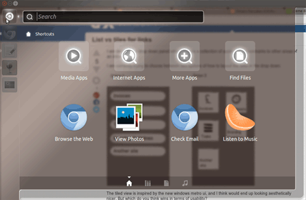
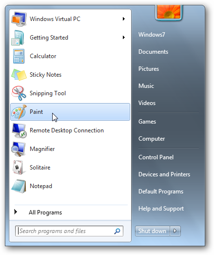
Ubuntu Unity Windows 7 Start Menu

In the screenshots you see Ubuntu and Windows dashboards, same functionality but different formats. They're both very well done it's incredibly difficult to find true fault in either. Maybe someone else can?

That said, I think the key element in your menu will be a search bar, and that should be placed in the most prominent position.

2

The Tiles Give good look and high usability The list saves you space and for those who just want their work done in a jiffy

If your target is to deliver some information as quickly (say realtime) use lists If your content is more of Static kind use Tiles

Personal Choice: allow your user to choose between both the layouts

1

I would prefer Option 2.

The big icons make it faster for the user to find the searched item and i think in a grid, it is generally easier to reminder where an item was.

1

Real estate space - Definitely Option 1 will accommodate more items in comparison to Option 2

User response - Top-to-down approach in glancing the information in Option 1 would be straight forward whereas in Option 2 there will be lot of gazing and un-pretended consequences to search an item.

Affordance & Context - Reason to have a tile option in design needs appropriate overview against Option 1, if we look at a splash screen and having a tile view (option 2) is definitely good enough on affordance, but the same if it needs to appear in a sub-page screen needs to be overlooked - as the context to have Option 2 will not provide a transitional feel, since Option 1 is more tilted in favor of the transitional feel, since it puts information at the center. Aesthetics should not overrule usability context at any time.

Iconification - This is brilliant in Option 2, since the metaphor and icons are well laid and easy to pick, naturally in time - user will be speedier in picking the correct item.

I would choose Option 1-if its transitional - momentary or otherwise if it needs just like a doormat feature, then it should be Option 2, which will be apt to the finger size.

0

Scannable lists grouped in to some form of logical columns would be my pick. That's your basic 'mega menu' model.

Metro UI doesn't make a whole lot of sense to me in a drop down menu. Especially an icon based one for Intranet links...unless these are really identifiable icons.

0

If limited to a few items tiles are OK. However, over 10 tiles I find a list visually faster to scan for the item of interest - especially if some of the tiles look similar. I dislike Windows 10 tiles and wish there was an option for a compact list of all applications.

Your Answer

By clicking “Post Your Answer”, you agree to our terms of service and acknowledge you have read our privacy policy.

Not the answer you're looking for? Browse other questions tagged or ask your own question.