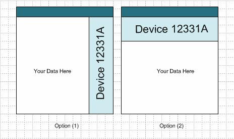
I am working on an application that has a GUI-based control panel window that can be switched between several similar devices. Many typical use cases have users walk up to the panel, select the specific device they are interested in, glance at some key status information, initiate some simple commands, and leave. One type of error that occurs is that our users either think the screen is already configured to control the device they are interested in, or they (accidentally) select a different device and then proceed to initiate their commands (to the wrong device). We would like to reduce the occurrence of such errors.
What types of visual cues for a GUI screen that can be used to control different devices that can effectively aid users to quickly recognize that the device they think they are controlling is the one actually being controlled?
The control panel is about 900x600 pixels in a 1280x1024 screen. Real estate on this panel is somewhat limited. The indicator that selects / indicates the connected device is currently in the upper-left corner, and about 80 pixels wide and 20 pixels high.
Note -- One cue we have tried is to have the device number watermarked into the background of the panel. This has helped a somewhat. I am currently experimenting with background colors. We have up to 8 devices that share a control panel, so the colors need to be different enough that they are readily distinguishable, and certain colors (red, orange and yellow) are off limits, as area all "bright" colors. The colors have to be saturated sufficiently so that the primary control graphics (lines, text boxes, simple graphics and buttons) are clearly visible.
Note -- we are also looking at changing the selection mechanism, but there are significant training procedures and manuals in place that make this a much longer term solution.

