1

I hope this question is on-topic here; apologies if it is not.

I develop a system for a student association, that lets the students participate in determining the association budget. Each student has a right to suggest an allocation of the budget among several issues, and there is an algorithm that aggregates the students' proposals into a single budget (see budget proposal aggregation for more technical details; see also participatory budgeting for the general idea). This is the first time such a system is used; in previous years, the student association managers determined the budget.

My dilemma is how to present the final outcome to the students:

  • I can just present the final budget allocation, with no explanations. This is simplest, but I fear it will not let the users feel the difference from previous years. I want to give the students a feeling that this year, in contrast to previous years, their voice has been heard and has had a substantial influence.
  • I can go into details explaining how the algorithm works. This has the advantage of transparency: the students see exactly what steps are taken in order to compute the outcome, and they can verify that all votes are counted. But the process is long and complicated, and I am not sure most students will understand it.
  • The reason I use a complicated algorithm is because it has a mathematically proven fairness guarantee: each group of students has a power to control a proportional share of the budget. In particular, every single student has a power to control 1/n of the budget, where n is the number of students. So, I can show each student how their 1/n share of the budget has been used; in particular, I can show them that their share has been spent only on issues that they support. The problem is, 1/n of the budget is a small amount, and might lead students to feel that their influence is negligible.

What other options are there to explain the results to the voters, such that they feel that they have a substantial influence over the outcome?

I will be happy both for novel ideas, and for research papers examining what kinds of explanations work best in such situations. Although my focus is on a particular budgeting scenario, references on other kinds of voting could also be useful.

1
  • It sounds like your goal runs somewhat counter to reality. If there are 100 people, each individual allocates 1% of the budget - their individual influence is negligible, and they personally do not have "substantial influence" over the outcome of the budget as a whole (99% of the allocation has absolutely nothing to do with their own preferences). It also sounds like you're trying to illustrate that there is a difference from previous years, without actually knowing that the results are different to begin with. Commented Sep 25 at 17:11

2 Answers 2

1

Your suggestions imply a increasing level of detail, so they might be useful to different demands on information about the whole process.

  • results: At a quick glance or if not interested in details, the end result of the budget might be sufficient.

  • details or transparency/reproducibility: If details are wanted, explaining the algorithm is surely beneficial to increase trust in the system.

  • traceability: If a user wants to track their "money flow" or "vote flow" this could be a very interesting thing and also a feature to build up trust and a unique key selling point of the software. It is like those tracking codes on frozen fish etc. to identify where and when they were caught.

    To address the "problem" of substantial contribution you would need to incorporate the results of other members of the voting. Something like: "21.4% of all voters have voted like you did" (very simplified). In fact, don't show the flow of the own contribution only, show the flow of all the contributions (which number of votes to which goal, resulting in how much budget) and mark/highlight where the own contribution is part of therein.

  • comparability/history: If wanted, results over the years could be shown with a history function. Budgets would probably only be needed in aggregated form (maybe also with traceability of the own contribution if a user wants to "recall" what the own votes were).

    Important is to always show how much 100% is. In one year there might be 7000 participants in another one just 6422 etc. This is significant if the application just shows percentages the "feel" for absolute numbers can be lost ("how much money is 11%?"), while it is useful for comparisons of course.

1
  • The idea to incorporate results of several voters together seems very useful. Thanks! Commented Sep 26 at 18:55
1

I think your problem resides on how to show the data. This link to data-to-viz has a diagram that might help you identify the best plot for your students and how each one of them sums up their contributions to the whole.

Graph

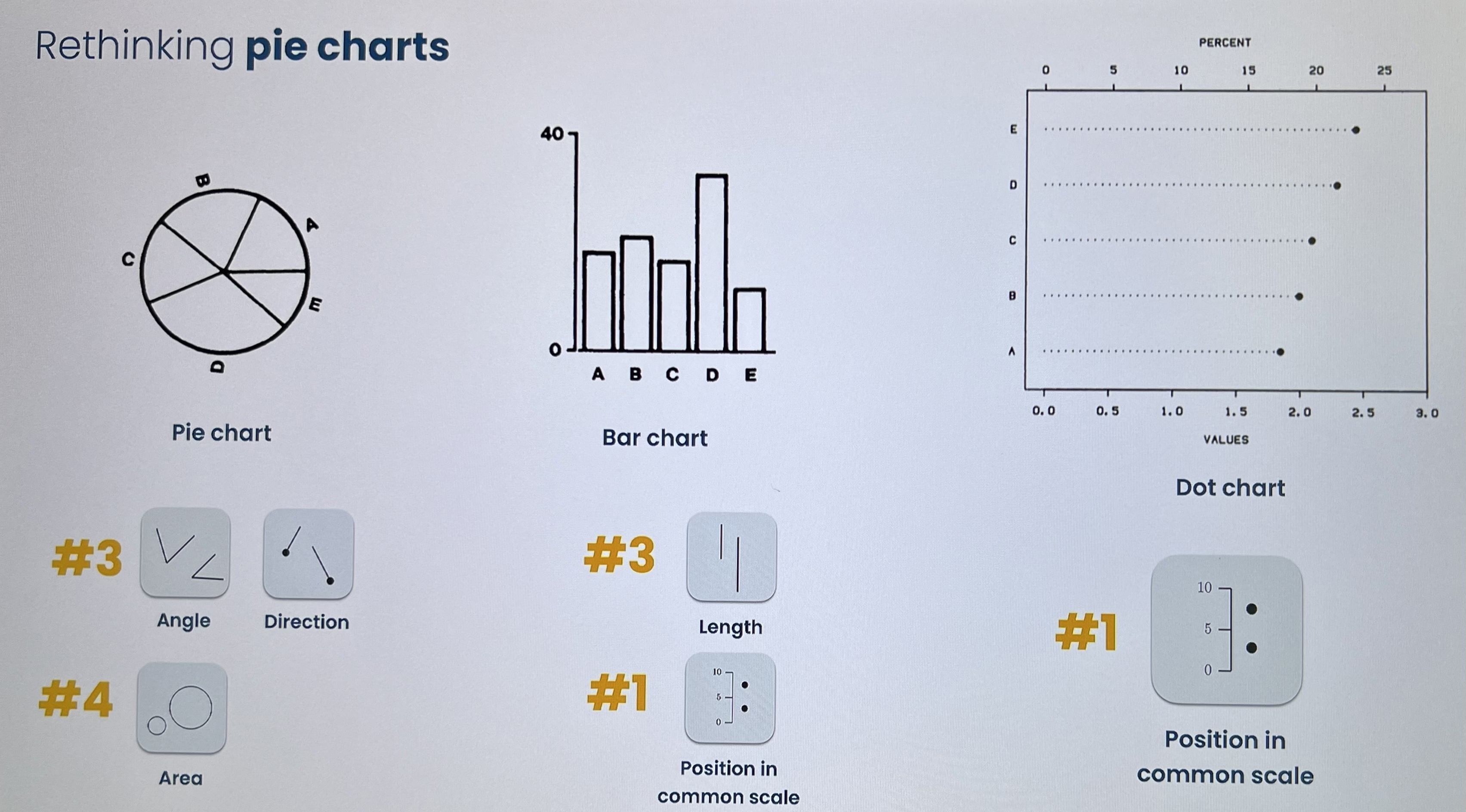
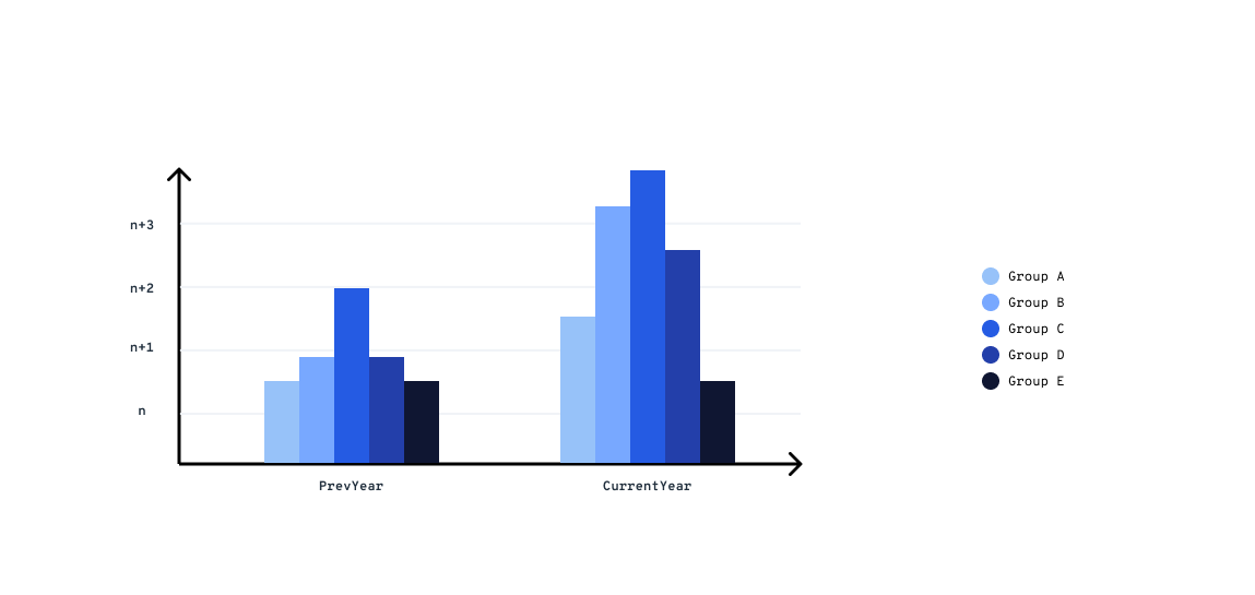
I think you should use an histogram that shows the prev years and how each group or budget allocation changes over the time. There are some ranking that will help you make the graph easy to read and those are:

#1 Position in a common scale #2 Position in a non aligned scale #3 Length, Direction and Angle #4 Area #5 Curvature, Volume #6 Shadding and Color saturation

"Cleveland & McGill (1984)"

Example:

enter image description here

I'll keep the links for more reference.

Data-to-Viz , Betterfigures

4
  • 3
    This is a link-only answer, while this link may answer the question, it is better to include the essential parts of the answer here and provide the link for reference. Link-only answers can become invalid if the linked page changes.
    – Danielillo
    Commented Sep 24 at 14:21
  • Thanks for the clarification. I'll work on my response. Commented Sep 24 at 15:43
  • There are hundreds of different graphs. How can I choose the right one? Commented Sep 25 at 7:56
  • @ErelSegal-Halevi If you don't know what you need, take the most basic one and easiest to understand approach. Probably the 2D bar chart and gather experience with it. A pie chart seems tempting but has its downsides when it comes to arrange very thin slices closely together or discerning the difference between similar large pieces (20% and 21% for example).
    – Antares
    Commented Sep 26 at 14:18

Your Answer

By clicking “Post Your Answer”, you agree to our terms of service and acknowledge you have read our privacy policy.

Not the answer you're looking for? Browse other questions tagged or ask your own question.