0

I'm working with developers who are implementing responsive design, but we're struggling with maintaining proportionality and visual harmony between elements across different screen sizes. For instance, padding and spacing that look good on desktop can feel cramped or overly spacious on mobile/tablet. What are some effective ways to help developers grasp and apply principles of proportion and harmony in their designs?

As a designer, I’m finding it exhausting when developers don’t maintain the proportions and harmony outlined in the design sketches. Despite having detailed sketches and design reviews, we still encounter issues where the design doesn’t translate well into the final product. They’ve tried using CSS clamping, but the outcome is inconsistent because different values are applied to different elements, resulting in a wonky, unbalanced layout. I’m looking for frameworks or best practices that could help developers better grasp the importance of maintaining design harmony.

Any recommendations?

3 Answers 3

1

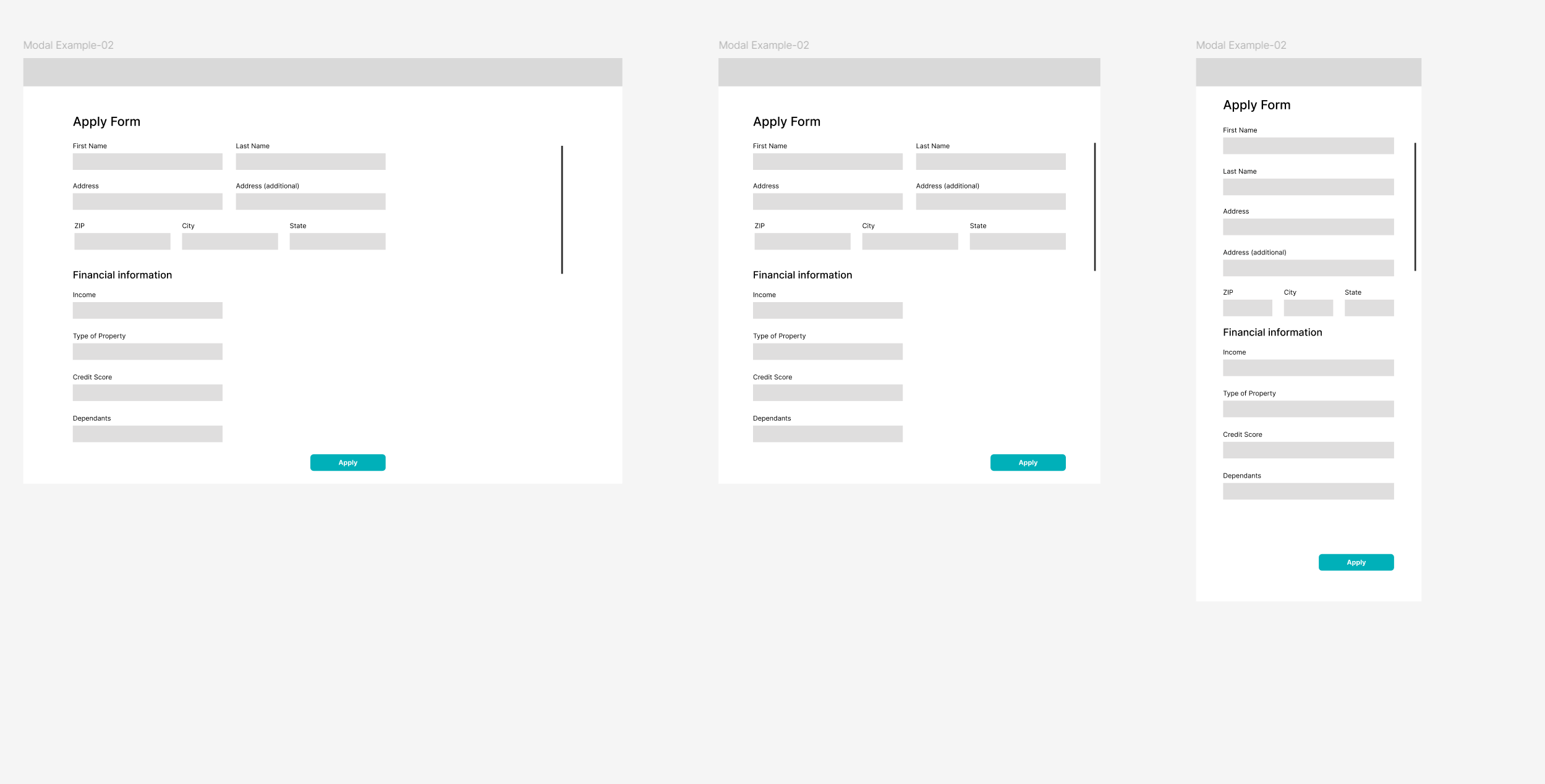
One recommendation that I have is that you define the breakpoints for your site and with figma you could design how the components will respond to each one of them.

enter image description here

Another suggestion is to use rem on your text to make it proportionate on each breakpoint that you have set. You can learn more about this issue in the following thread (px vs rem)

Once you define that, there will be an agreement on what are the right measures and how the website will look.

1

There are a lot of elements to having a consistent design and requires good collaboration between the design and the development team. This is the reason why most large software companies publish their design guide making them public. Coming up with a good design guide is a long process which will not be an immediate solution if that is what is needed at the moment.

Material Design Guide

As an immediate solution, it will perhaps be better to start using a javascript library which is comprehensive and customizable. It will come with all the components already built in and will be consistent in look and behavior even out of the box. However, good libraries are mostly paid. The other flaw about javascript libraries is that once you adopt one you have to continue using the same for every other thing as well within the same org.

0

Building on top of what everyone else is saying here -- great answers from everyone.

You also need to understand what the developers are using as their spacing. I've found that developers try to match spacing by putting their developed page and your design next to each other then hardcode a number as padding.

This then isn't used as a consistent variable and results in inconsistent UI during development.

Sometimes the development team will have their own spacing system and use that instead of what you put in your designs. I've found it easier to work with what they already have and communicate change if it doesn't work well.

Ultimately, since padding changes between breakpoints, you need to make sure you "pixel push" with your developers and get the spacing right.

Welcome to the dark side of UI/UX.. Nobody really talks about pixel pushing but it's a crucial part of pushing your designs through production (especially in early stage companies without established systems).

Your Answer

By clicking “Post Your Answer”, you agree to our terms of service and acknowledge you have read our privacy policy.

Not the answer you're looking for? Browse other questions tagged or ask your own question.