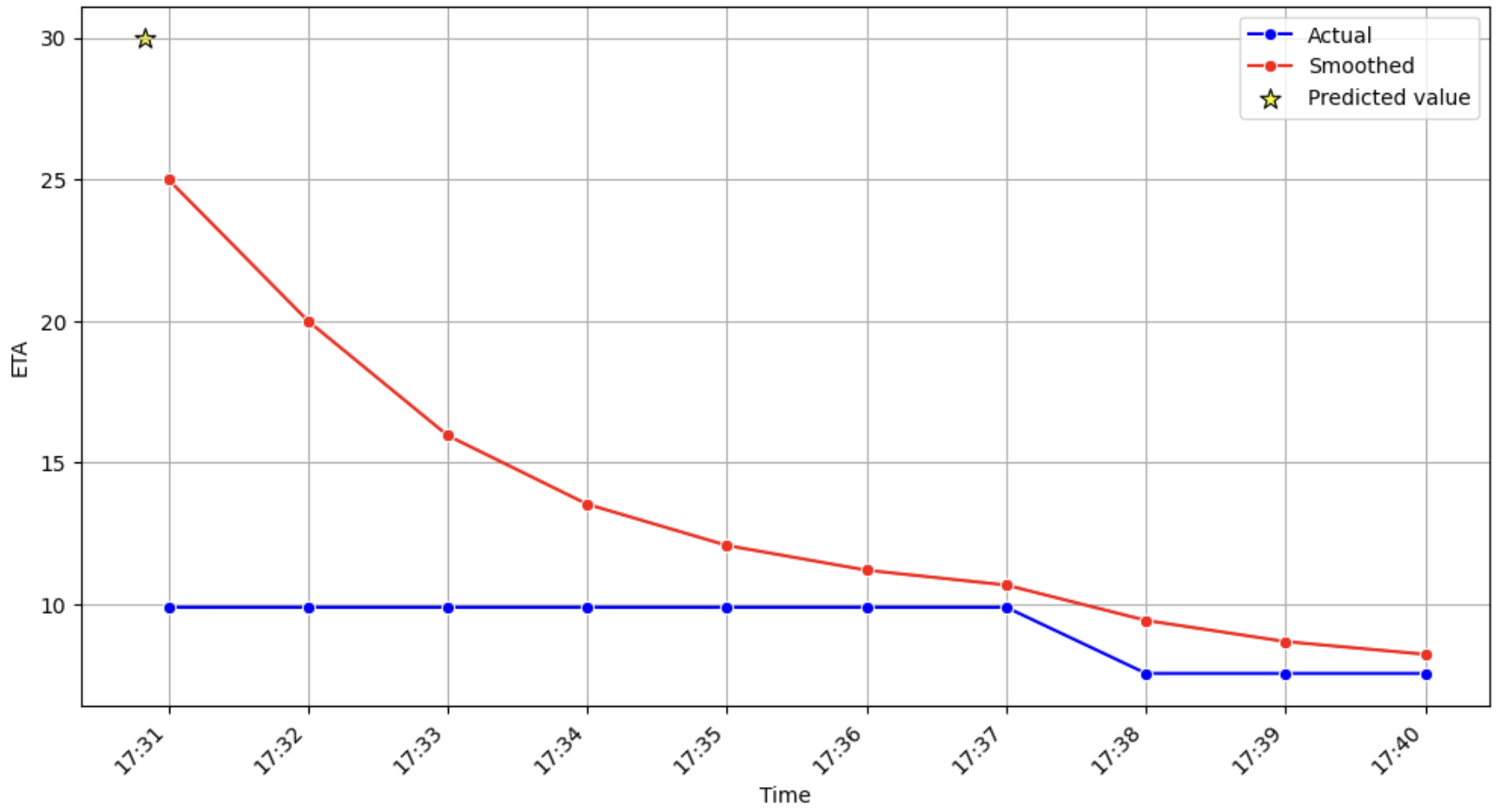
I'm working on displaying the ETA (Estimated Time of Arrival) for an item delivery using a predictive model that evolves over time. The issue I'm facing involves smoothing the transition between initial and subsequent ETA predictions and how to show it to customers.
Problem Description
The model initially provides a very inaccurate ETA (the star in the figure attached represents this initial prediction). As time progresses and more information becomes available, the ETA predictions become more accurate. This can result in a large gap (20-30 minutes) between the first and second predictions. After the second prediction, the ETA often remains constant for a period before eventually updating. For instance, in the provided figure, the ETA remains at 10 minutes from 17:31 to 17:37 before starting to decrease slightly.
I am smoothing the ETA values to handle the transition from the initial inaccurate prediction to the more accurate subsequent prediction, using a simple exponentially weighted moving average. This leads to the smoothed line (red) being extremely different from the actual prediction (blue line).
Question:
Is there a user experience-based reason to adjust the model's behavior, and thus displaying the red smoothed line, or is it acceptable to display the actual values despite huge jumps and ETA value remaining the same for a few minutes at a time?
Any insights or suggestions for improving the display of ETA predictions would be greatly appreciated.
